

Equinox Remix
amitg


Source (link to git-repo or to original if based on someone elses unmodified work):
2009-06-03 - 0.5
* Better support for gnome color schemes
* Panel background has been removed
* Toolbar now again made glassy
* Selected bg color now much lighter
* Added new color schemes (blue & gold)
2009-06-01 - 0.4
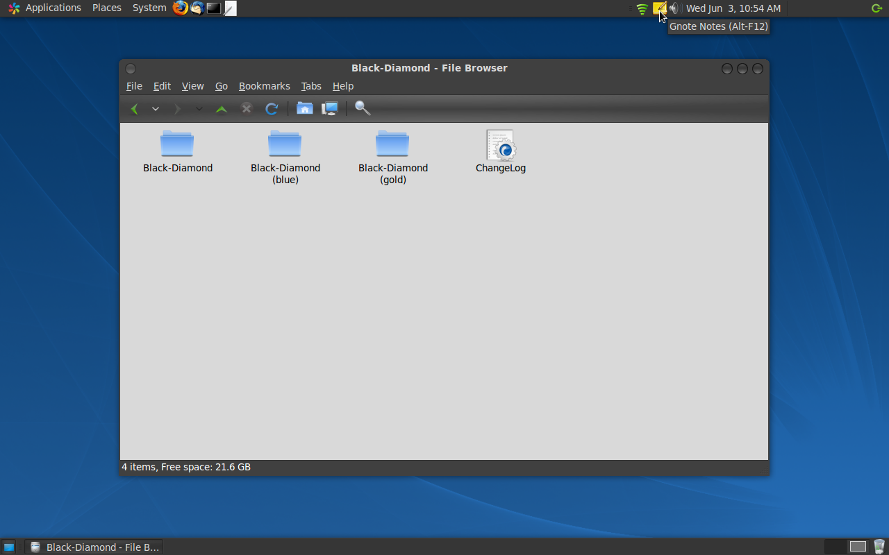
* Black-Diamond metacity (based on Humanoid-OSX-Black)
* Flat menubar & toolbar
* Default icons changed to `Simple icon theme`
* Found it's home on Launchpad.net 
2009-03-27 - 0.3
* Updated to Murrine svn r170
* Improved progressbar style
* Improved scrollbar style
* Gradient menubar
* and more...
2008-12-25 - 0.2
* Somewhat lighter background color
* Greyish text/foreground color
* Better custom color scheme support
* Included sample custom color scheme
2008-12-09 - 0.1
* Initial release


More GTK2 Themes from amitg:
Other GTK2 Themes:


Ratings & Comments
11 Comments
great theme, thanks super!!!!
This is very beautiful and modern-looking. i like especially the darkroom-version. but could you make a brighter human-version? It is not necessary that you use exactly the human-colours. that would complete your colour-schemes! thanks for making our desktops looking beautiful.
The theme doesn't work well with lighter background colors, it's based on DarkRoom theme and is designed for darker colors. I'll try to make a somewhat lighter (still dark) version of `gold` color scheme. Thanks for those words ;)...
Look at my other theme http://www.gnome-look.org/content/show.php/Blue-Crystal?content=81401, which is better suited for light colors. I just added a Human color scheme to that theme. Enjoy!
yeah, i like it..
Hi there! First of all, let me congrat you for your work. It has a very good look. I like the gray background and it seems to be a little-dark theme. The 'little' word fits here because of the WHITE. I think that for a non-light theme, this one shouldn't have come with it. Other thing I was wondering is about the selection color. Maybe orange could be more attrative to the eyes but there are others who would prefer blue instead. Personally I like blue for the selector and orange for the 'task in progress' bar. The window title is white, this is where(and the only place) white would perfectly fit. If this is a dark theme, then it's window title should be white. ok. But is it really necessary to be in bold? If you want the end user to know which window is being used, then he shouldn't look for it's window title, it's the window decoration that should let him know. My suggestion for the background: instead of using white, try concrete. This theme has everything to be the one of GL.O's greatest themes. That's why I voted good. Keep up the good work! Merry xmas everybody!
It's difficult to remove/replace that WHITE as lots of websites are not designed for dark themes keeping in mind. I tweaked the theme so let your prefered selection color looks perfect (See the attached color scheme, blue glow). Thanks for your comments, but I think, the original Ubuntu DarkRoom creators deserves it most ;) Happy New Year!
nice theme here! good work... i voted good, i personally would make the white less white, for the rest very very neat.
Is that a textmate icon I see in your panel? If so, do you have it installed? If so, how did you install it? :D Great theme, this is one that warrants a test drive. Thanks for the great theme, Chrelad
Sorry, I now see that you probably just used a mac icon set and had it execute gedit... Never mind :) Crushed hopes aside, great theme!
What you like the most about Textmate? If you explore few plugins of GEdit, you'll found it as powerful as Textmate. Check the `Snippet`, `Snap Open`, `Smart Spaces` plugins... ;) I did some work on `Snippet` plugin but not finished yet. I'll share my work once it gets finished...