Description: A mod of the fab WoW -theme, with breadcrumbs from elementary. All credits to the original authors. I use it with elementary-nautilus, elementary-metacity and global-menu. This is a fast ugly do with bugs, since I only modded some parts to fit my preferences.
original artwork (check it out, it rox): http://gnome-look.org/content/show.php/WoW?content=125065
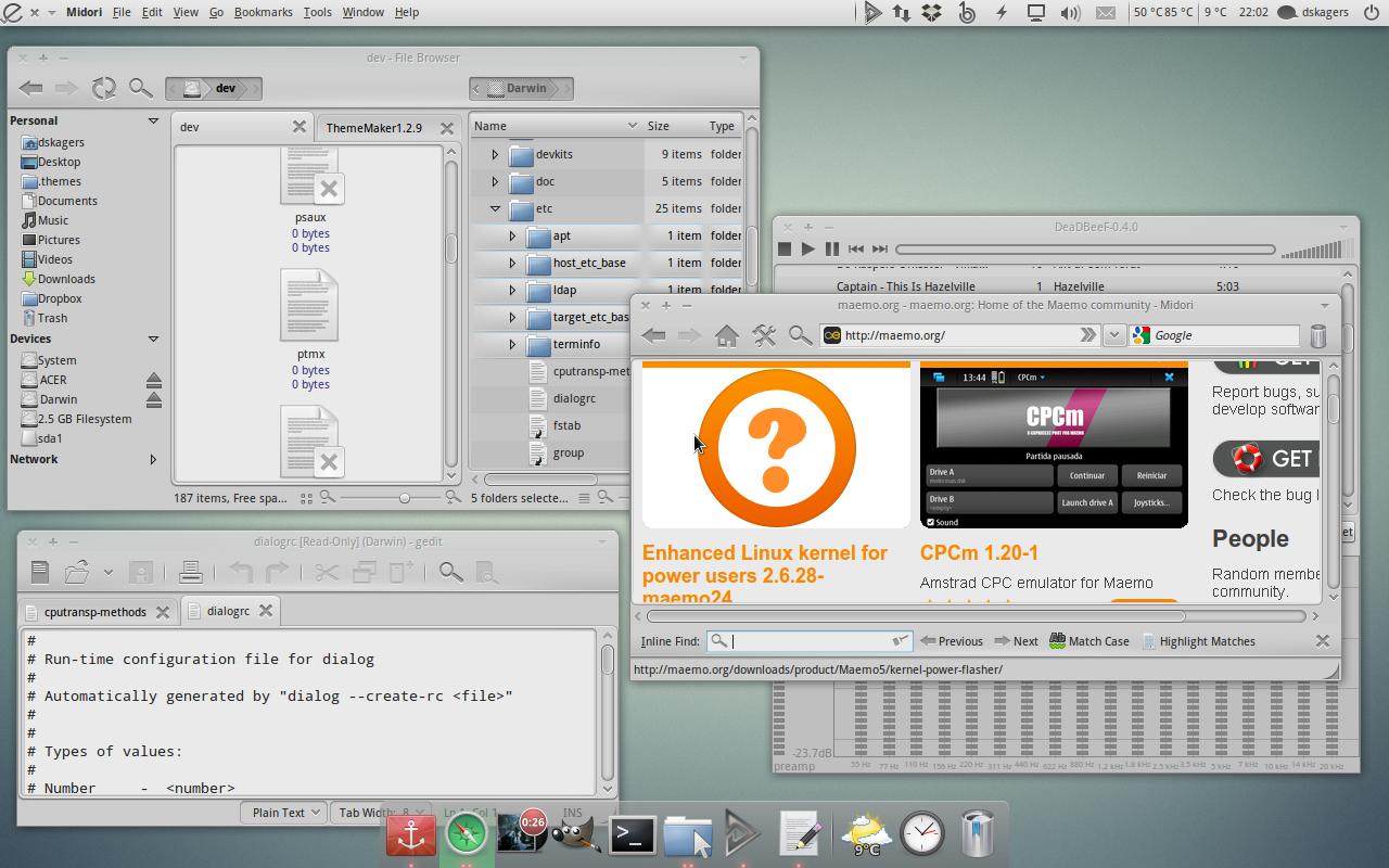
One of the reasons I fell for that theme was how it facilitated a unified look in full-sized windows due to the fixed icons. To get it visualized check out screenshot #3. In fullsize mode you can divide the screen in two parts. Program-mode on the left side, where you have information and elements related to the active application. Whereas on the right side you've got system-related information. I would move the application-menu there too, but my wife complained... There is no reason why the icons and elements in these parts need colors. Only icons that let you know something is happening needs coloring, like notifications and why not windicators, which I would place on the left application-side. When you use an application you soon get a grip of where everything is located and do not actually need these highlighted. On the workspace on the other hand colors might be helpful. For example whilst browsing for files color-clues helps you to find what you are looking for.
############################## #There are 3 bugs that I need your help with.# ############################## 1. Switch for icon-view in nautilus. 2. Buttons in mines-games 3. Volume applet. I would like a black background in the slider. Possible??
Some parts from elementary are licensed under gpl v2. Commented in the package.Last changelog:
v. 0.002 * progressbars * toolbar * toolbar buttons * selected listitems * added mediaicons from elementary icon-set (gplv2)
v. 0.001 ===================== * tabs * progressbars * slider handle * colors * separators * small pixels here and there
one more thing: in nautilus, if you rename a file/directory, you can't see where is the cursor.
the text isn't highlighted or so, no blinking cursor, etc...
also present in WoW.
BTW, on my box, i've tweaked your theme:
- selected menu item are "blue" instead of white
- default menu text is "more" white: standard text is too "dark" and too similar to "disabled text".
PS: keep up this good work!
I'll check it when I come near my box.
The text in menus have a low contrast, it fits for some screens, while it's worse on others. I'll keep that in mind.
i'm using the nautilus elementary ppa.
cursors is taken from here (sharekan, if i remember well).
now i'm at work (with xp :( ), but as soon as i can i'll post a screenshot.
thanks!
ok, here it is: http://img514.imageshack.us/img514/8726/rename.png
clic on a file, hit "F2" and, as You can see, there's no way to know where is the cursor or if some part of the text is already selected.
Now I could replicate this. I can't do anything about the cursor, but the selected text will get a fix in the next version, which will be a little bit due since I've got a lot on my hands right now...


Ratings & Comments
17 Comments
nice, but the previous version was better, imho. now button "hover" is worse than before.
Yes, in fact that was my first thought too. But I wanted to try this anyhows to get the feel of it and get others opinions too. So thank you.
one more thing: in nautilus, if you rename a file/directory, you can't see where is the cursor. the text isn't highlighted or so, no blinking cursor, etc... also present in WoW. BTW, on my box, i've tweaked your theme: - selected menu item are "blue" instead of white - default menu text is "more" white: standard text is too "dark" and too similar to "disabled text". PS: keep up this good work!
I'll check it when I come near my box. The text in menus have a low contrast, it fits for some screens, while it's worse on others. I'll keep that in mind.
It seems like I can't duplicate the rename-bug. Which version of nautilus and cursor do you use?
i'm using the nautilus elementary ppa. cursors is taken from here (sharekan, if i remember well). now i'm at work (with xp :( ), but as soon as i can i'll post a screenshot. thanks!
ok, here it is: http://img514.imageshack.us/img514/8726/rename.png clic on a file, hit "F2" and, as You can see, there's no way to know where is the cursor or if some part of the text is already selected.
Now I could replicate this. I can't do anything about the cursor, but the selected text will get a fix in the next version, which will be a little bit due since I've got a lot on my hands right now...
amazing theme thank's very beautiful
Theme may look not correct because the engine "" not found... Please check your theme file...
I'll check if I can replicate this. Most parts are pixmaps but some are murrine.
Is nice, thanks!
for some reason with this theme my taskbar buttons are black
You're probably right. I'll look in to it.
yeah I want the icons too
hi, whats your icon themes?
It's elementary, but the icons in the toolbar are a part of the gtk-theme. Check WoW-theme for original author.