
Archiplex
Source (link to git-repo or to original if based on someone elses unmodified work):
Description:
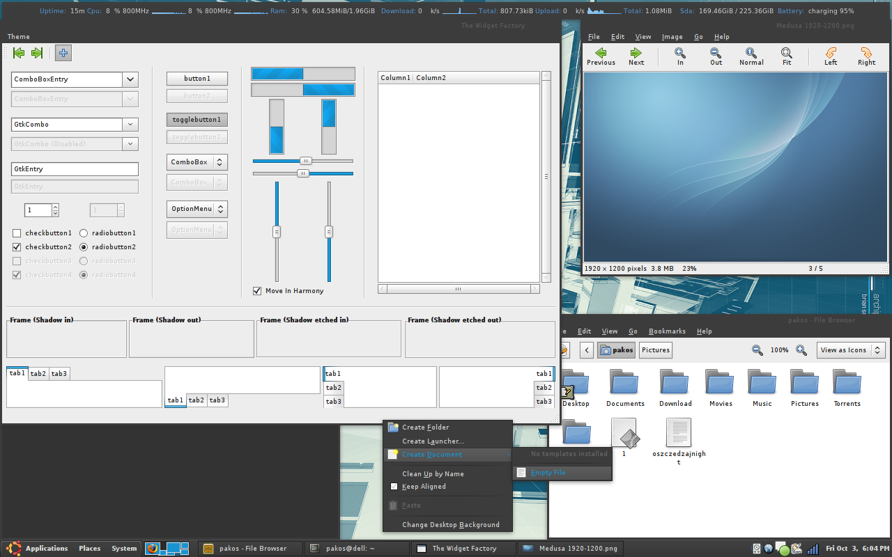
Hello, let me introduce to you my newest theme - Archiplex.
It's based on Shiki-Colors by perfectska04 however you will see some changes:
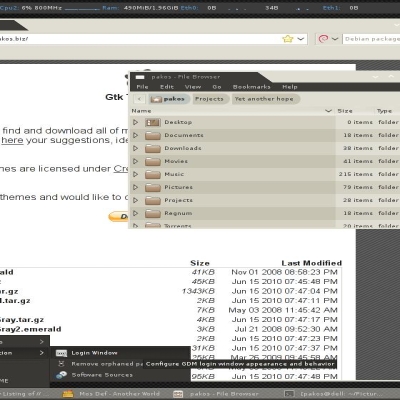
completely removed roundness
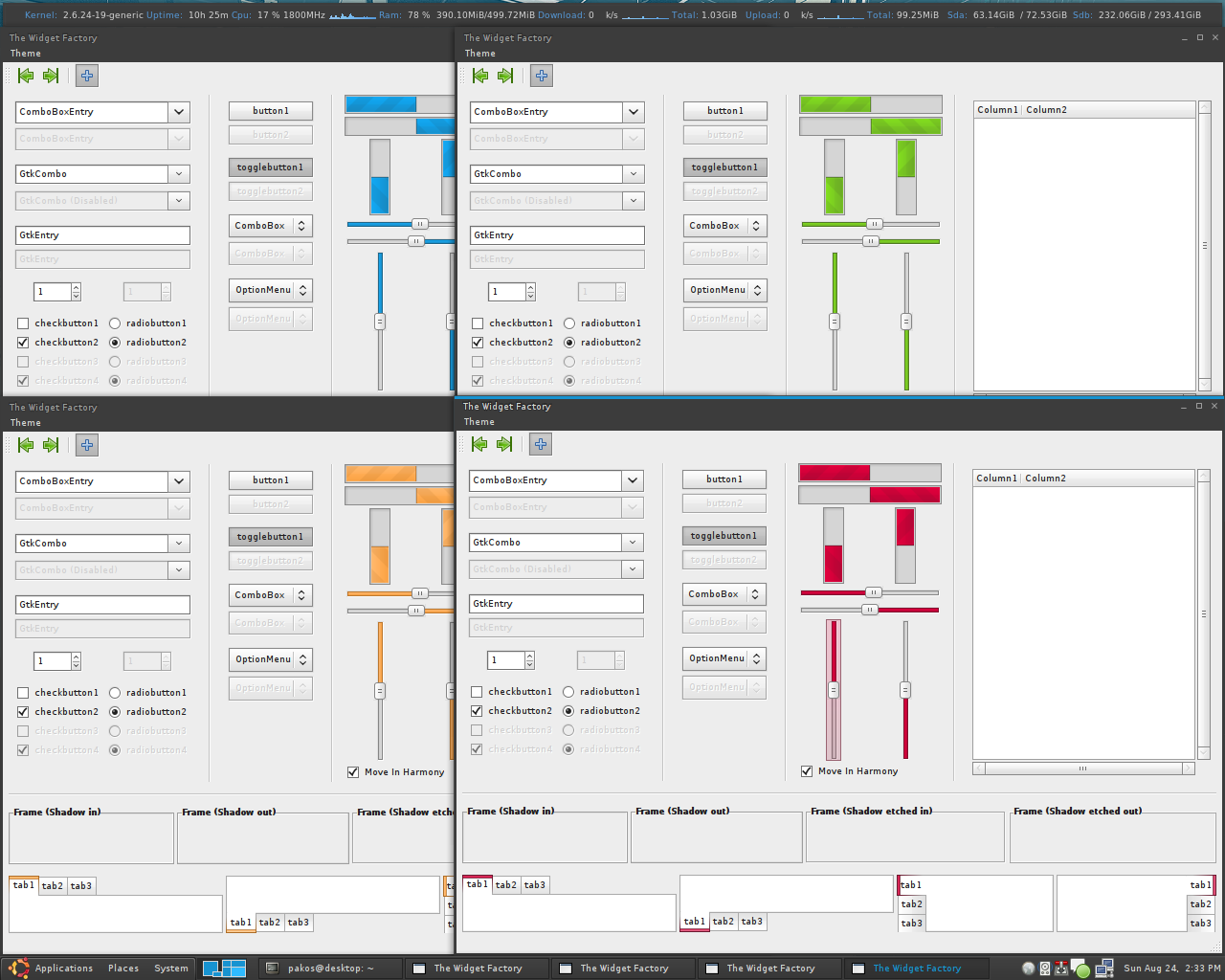
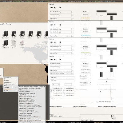
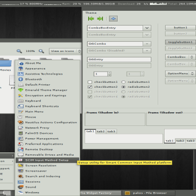
different colors (background, prelight and so on)- atm there are 4 different sets: blue, green, red and orange.
different panel design
smaller icons
and more
Theme is using 3 different engines.
Clearlooks and Pixmap are required. There is also used Mist engine however it's only removing shades from inactive text so it's not so important and theme will work fine without it.
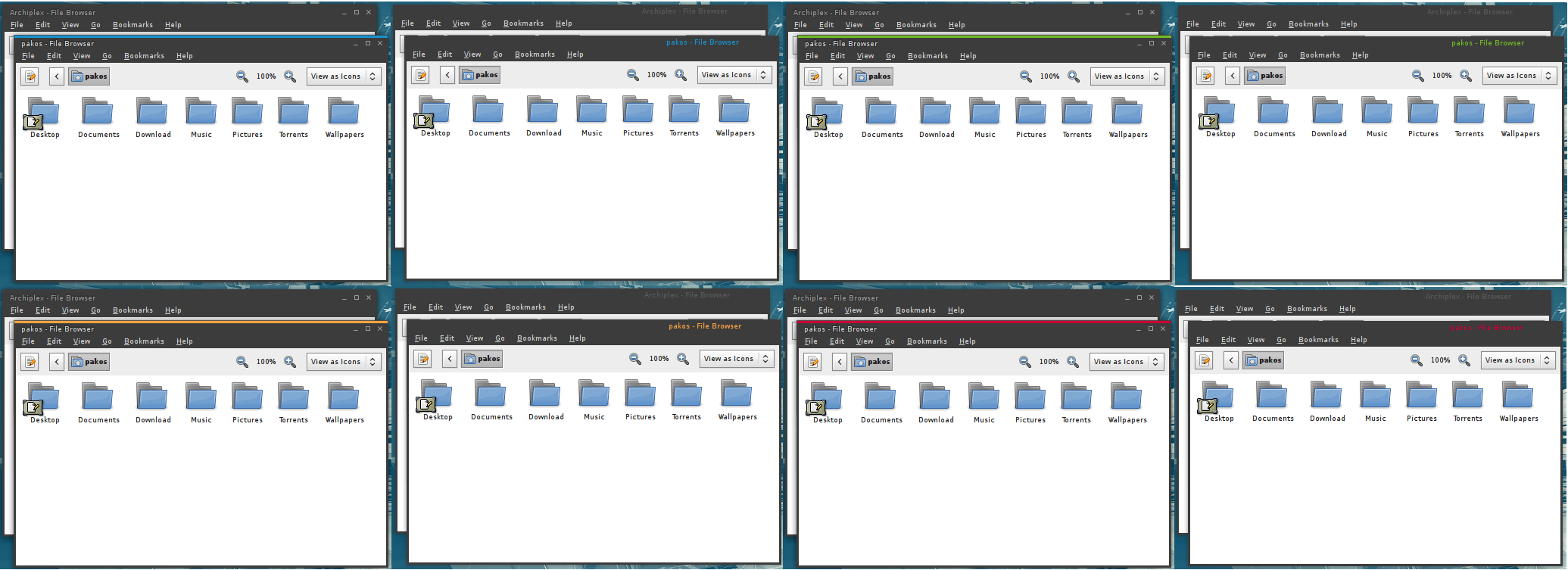
Emerald themes are also included, 2 different styles which means 8 themes.
Let me know about some bugs or ideas, everything would be helpful.
If you must vote down leave a comment so I can improve it! Last changelog:
It's based on Shiki-Colors by perfectska04 however you will see some changes:
completely removed roundness
different colors (background, prelight and so on)- atm there are 4 different sets: blue, green, red and orange.
different panel design
smaller icons
and more
Theme is using 3 different engines.
Clearlooks and Pixmap are required. There is also used Mist engine however it's only removing shades from inactive text so it's not so important and theme will work fine without it.
Emerald themes are also included, 2 different styles which means 8 themes.
Let me know about some bugs or ideas, everything would be helpful.
If you must vote down leave a comment so I can improve it!
0.7 - fixed font color in combobox
0.6 - fixed bugs in evolution and combobox, added bold menu and clock in panel
0.5 - added 4 new emerald themes
0.4 - fixed minor bugs
0.3 - changed blue color and added 3 more versions (red, orange and green)
0.2 - updated panel images
0.1 - public release








Ratings & Comments
28 Comments
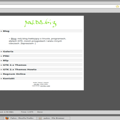
I use Archiplex theme and firefox 3.5. But I have strange diagonal lines in urlbar and serchbar. What is it and how fix it? urlbar and searchbar clear with other themes. Sorry for my english)
I see it too. Isn't it purposeful? I kind of like it...
actually i see it too but i have no idea why ;P
i think that is very good theme, i like so much, and i think that can look better in black ;)
I noticed a strange diagonal line over firefox textbox when they are not focused. When focused, the line disappear (only to reappear again when i leave textbox focus). Is it only me or someone else encountered this? Btw, I'm using firefox default theme
Hi, nice theme using it now! Can u tell me where to get that background shown in your screenshot? thanks
Wallpaper? It's in the package ;)
May we please get a screenshot at your font propertites? Cygoku
sure, http://pliki.pakos.biz/img/2008-10-13-150245_1280x800_scrot.png
Strange enough, I don't have this DejaVu Sans Book. I tryed to download one it ttf format but it doesn't show up in the list (even after a complete reboot). Help ?!?! Cygoku
In debian and ubuntu package is called ttf-dejavu
Is it just me or are all of these GTK+ themes starting to look alike?!?
It's normal, good themes are usually reedited with minor changes.
Pleaase share your conky config. Its beautiful.
Sure, http://pliki.pakos.biz/files/conky14
please upload it to GNOME-Look.org (category: other) like some other does... http://gnome-look.org/content/show.php?content=52896 Kind Regards, Mark.
I think this is a great port of the Shiiki theme, keeping it simple. I only have 2 griefs: 1. A metacity 2. I have a border in the panel: http://farm4.static.flickr.com/3250/2905062381_35aa7b4254_o_d.png 3. Maybe the colors should adhere to the GNOME-Colors Palette? But all in all great theme
I still ended up with 3, go figure... ;-)
1. mtacity: well there is a little problem, I haven't ever made a metacity theme. I was thinking about removing roundness from Shiki theme but I don't know how. If anyone could tell me would be great. 2. You mean border around menu (Apps/Places/Sys)? Or what? Because there is used a image with little roundness in corners but unfortunately it's mainly designed for bottom panel. 3. Well i'm not sure yet, basically they are based on colors from different distributions, for example blue one uses color from arch logo, green from suse, red from debian and orange from ubuntu. Of course it's not a big deal to add different colors, but probably when i'll fix some bugs. I'm thinking about evolution and i heard about some issues in xfce but they're not confirmed. Anyone with xfce could check panel menu/plugins and report me if there is something wrong? Or anywhere else ;)
http://www.ubuntu-art.org/content/show.php/Shiki-Colors?content=86717
Next time read the description, there is written that it's based on shiki and of course perfectska04 allowed me to do this. Pathetic.
Thanks, just one more thing, where is the gtkrc file ? *size (lol)
never mind, found it myself. Thanks again
Lovely Theme, any chance that you could explain how to get bigger icons ? It's a bitch to change songs in Banshee quickly. Thanks.
Sure, open gtkrc file and you should see this line: gtk-icon-sizes = "panel-menu=16,16:panel=16,16:gtk-button=16,16:gtk-large-toolbar=16,16:gtk-small-toolbar=16,16" Changing gtk-toolbar to lets say 24 should help you.