

Gnome Legacy 2
Exodist


Source (link to git-repo or to original if based on someone elses unmodified work):
ver 1.1.6 - Bug Fixes.
- Fixed bug where text wouldnt change to white when progressbar overlaped progressbar text.
- Fixed bug where some error and tooltip messages where shown with black text on dark background.
ver 1.1.5 - Many Updates!
- Storm, Ruby Red and Pink Ice color themes are now uploaded. Users can download the 3Pack and drop it in the theme manager window and enjoy all 3 color variations.
- Many hours went into refining the code base and the graphics of all 3 themes.
- No new screenshots will be uploaded to Gnomelook but you may view my picasa page link above to see much higher resolution images of all 3 themes or click the easy link below.
ver 1.1.4 - Color Update
- Ever got a new monitor and just then realized your color was shot on your old monitor? I did today! Theme color seemed to yellowish and was not supposed to be. Double check with a few friends and also on my slower eMac and noticed theme color scheme was way off from what I had intended. I set all the color to follow a more modern greyish scheme and this monitor is set at 6500k color.
- New screenshots are being posted so users may have to reload the webpage for updates to show.
ver 1.1.3 - Minor Update
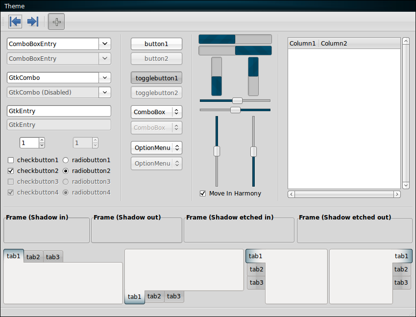
- Corrected issue where GtkComboBox list box color was shown as black on black background. Changed to White.
ver 1.1.2 - Minor Updates.
- Fixed issue where horizontal line (menu separator style) wouldn't show on some drop down menus.
- Few minor adjustments to button insensitive state colors so they don't appear as bland.
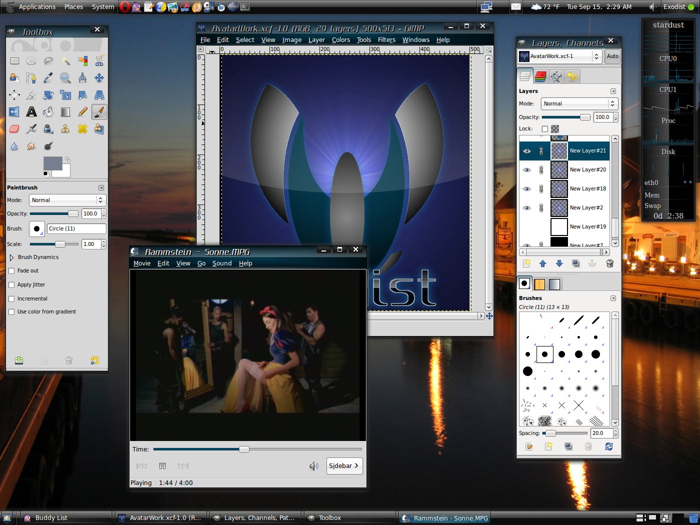
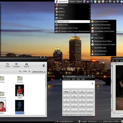
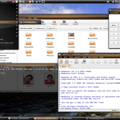
- Uploading a screen shot of TWF to show minor adjustments only.
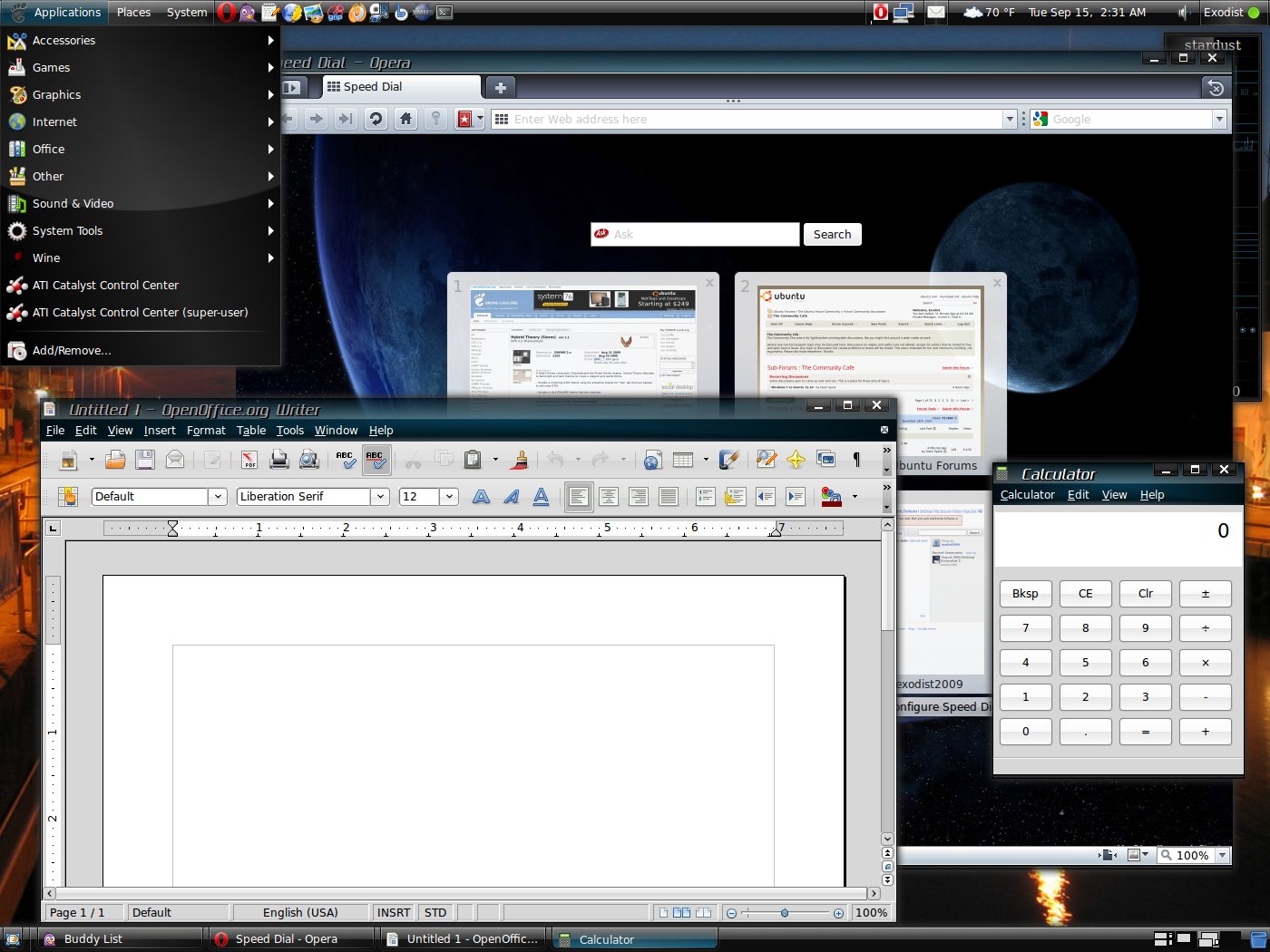
ver 1.1.1 - Minor Updates.
- Small Adjustment to background color.
- Worked on the clarity of the task bar application buttons.
- Corrected Drop-Down-Menu overlay stretch border distortion on large stretch.
- New screenshots :-)
ver 1.1.0 - Big Update!
- Theme now includes a complimentary GTK1 theme, in addition I have also put together a slick GKrell Monitor theme that is also included in the theme file.
- Metacity theme was totally reworked into a more refined look that should look more professional as well as elegant to the user.
- Radio and Check buttons contrast has also been adjusted for more clarity.
- New screenys being posted as well.
ver 1.0.8 - Many new changes!
- New drop-down-menu Check and Radio buttons have been added to help with contrasting to the dark menus.
- Added a shiny new menu selection box for the drop-down-menus.
- Reverted back to the original title/menu bars style. They fit better with the new additions.
- Fixed handle active/prelight where the handle went white and the user was unable to see it.
- New Screenys to show changes.
ver 1.0.7 - Slightly changed the Title and Menubar images. Old files are still included for those who prefer the old style. In addition new screenshots have been uploaded.
ver 1.0.6 - Dropdown Menus now updated with same design but now using higher resolution graphic. 64px --> 256px. Original lower resolution graphic still included for those have slower systems and possible slower render problems.
ver 1.0.5 - Changed menu backdrop. The blue was to over whelming. XCF files are included for those who may wish to customize the theme to their on personal prefs.
ver 1.0.4 - Initial Release


More GTK2 Themes from Exodist:
Other GTK2 Themes:


Ratings & Comments
35 Comments
This morning Hybrid Theory hit another milestone for 5000 downloads. My appreciation goes out to everyone who has helped make this happen. :-)
for the late comment! your theme is realy nice...good job!!! thx
Many thanks. :-) I am happy you like them.
I have fixed the error msg/tool tip bug. But before I went to upload the corrections I noticed today that I removed the progress bar style that changes the color of the fonts contrast based on the progress bars defined color workaround... So check back tomorrow morning for those corrections to be uploaded. Also if anyone else notices any other bugs please feel free to send me pics of them and what you was doing when it happened that way I can correct them.
Here's my two cents worth based on my own personal preferences. I like your theme very much and so far, according to my tastes, is the best usable light-dark theme I've seen. Previously, I tried the gorgeous BlueSpace II theme but it is not usable. There are problems in certain areas with black text on a black background or white text on a white background (e.g., Sun VirtualBox window is unreadable). Your theme works fine. I love the glossy back and teal in the dark part of the theme. The light part, however, is a little too plain for me. I would like to spruce it up and make it mesh better with the dark part. What I would like to see is a colorful toolbar such as in BlueSpace II or some of the Linsta themes instead of boring grey, Also it would be great to use your teal on the scrollbar as well instead of white on the same boring grey. In short, I prefer dark themes over light because they are much cooler looking. The theme you have created is a major step towards creating a cool-looking theme that is also usable. Now if we could keep going in this direction and make it even more beautiful or at least make it easier for us to customize your theme to our tastes.This could be done, for example, by adding more of the usual theme png folders where we can easily replace toolbar and scrollbar images, etc., according to our whims. I am relatively new to Linux and don't yet have the skills to edit the gtkrc file to get the customized look I want. All in all you have created an excellent theme. Thank you for sharing it with us!
P.S. I just voted and put you over 66%!
Many thanks for the comments I will defently see what I can tinker with and try a few of the ideas out. Also many thanks for the positive vote :-)
Thanks, I look forward to your next version.
Just a little shout out about up coming color variations. I have decided to go only with Storm, Ruby Red and Pink Ice color themes. Blue and Green themes have been well over done and the green theme color didn't show as vibrant as I hoped it would. In addition the blue wasn't looking much different then the dark teal from the Storm color scheme. I already have the red theme completed and out to a few friends for evaluation as well I am already working on the Pink Ice theme for the ladies. :-)
The graphics have always been first class but this version has an improved gtk color scheme which I think has been a good decision. one to watch...
TY CB, My other monitor colors where way off. I guess it is getting old. Hopefully the color shows a little better with this monitor from here on out. :-)
Many thanks to everyone for your positive feedback. I planned from the start to release a few color variations. I am almost done with testing the first color variation "Storm". I will then take that code and make other variations of the same theme. Current color variations planned are: Ruby Red, Emerald Green, Sapphire Blue and Pink Ice.
This is the nicest hybrid theme I've seen so far. I like your "hybrid theory" of combining the best of the dark and light themes. I much prefer dark themes but they are not very practical for everyday use (note the usual loss of OpenOffice icons with the dark themes and black text or black icons on black backgrounds with some of those themes). What you have come up with is an excellent workaround. We get some of the dark theme coolness but can still use OpenOffice. I love your use of glossy black and the gorgeous shade of teal. Overall it looks great! I'll use it for awhile and let you know if I have any suggestions. Thanks for sharing. Keep up the good work!
Now the colors are perfect. I had changed the color myself because I thought that should be so. Good update. :) Regards
Yea didnt know the color was that off on my older monitor. :-) Hopefully I can choose more accurate and better looking color shades now.
Maybe add an xfce theme to the pack. I have XUbuntu installed on my laptop, and I use this theme along with a stock xfce theme. Also this theme would look killer with a crimson/magenta version. There arent alot of "good" themes out that use reds very well, and this one would be a great candidate. Other than that you really cant improve perfection.
Red is a color I have been considering. Soon as I get the final touches added to this theme, Crimson Red will be the next version I will work on. :-)
I like it more and more. Keep it up! Great work!
Many thanks Laga :-)
I have both the new version and the one with the teal coloring on the menu and metacity. I kinda like the older version better because its so different and original looking. Maybe you should do a few versions/variations of this theme, Id sure use em, and it seems alot of others would too. As a matter of fact your themes are the only ones I have on my main PC now LOL.
I think I can do something about that :-) I still got the original files. I got a few minor details to correct on next update. I will just include them in the theme tarbal so all you will have to do is rename the #menubar.png back to just menubar.png in /hybridtheory/gtk2/menu and then the #titlebar-mid-focus.png in /metacity back to just titlebar-mid-focused.png. Sounds complicated but it can be done in about 10 secs with a little click - rename - del "#" done. May take me a few days to release the next update tho, I am currently working on a XMMS theme also to go along with the theme package.
I would just like to thank my fans and supporters for your positive feedback and your vote. Yesterday afternoon the theme hit its first mile stone of 1000 downloads and already this morning as of posting this its already over 1300. Again to everything many thanks. :-)
It's got great graphics really nice finish.
Many thanks, I really appreciate the positive feedback :-)
It looks really great but I think that the window color does not fit with the other colors. Thanks for the recommendation of my icons. I feel very honored. :)