

xl_cheese
xlcheese


Source (link to git-repo or to original if based on someone elses unmodified work):
Added support for the Lucid feature to move the menubar.
my 2 year old feature request was added!
https://bugzilla.gnome.org/show_bug.cgi?id=500437
Just a few refinements.
Fixed some bugs that have been posted below.
Also added a link to a nice metacity theme that mimics the Emerald theme.
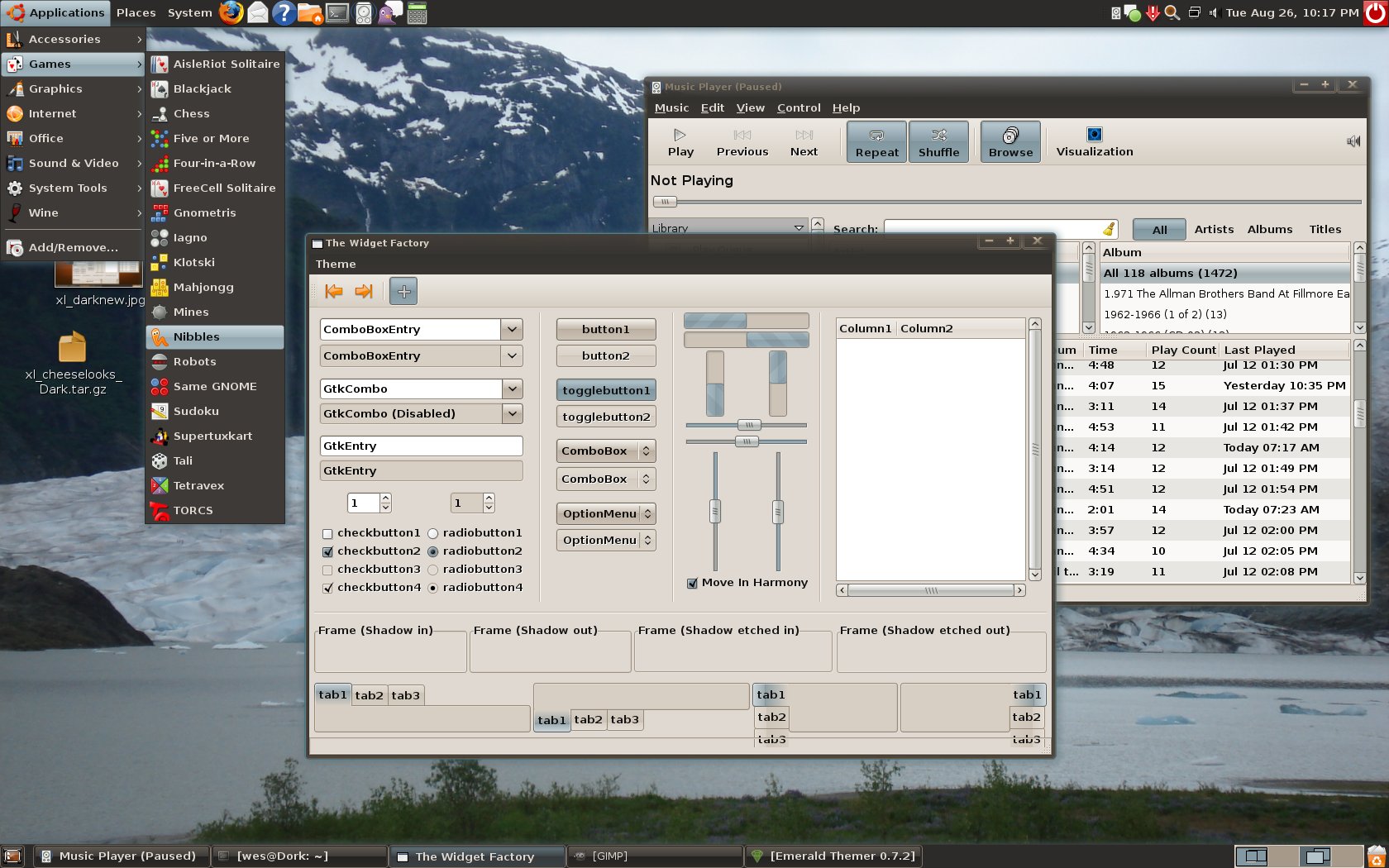
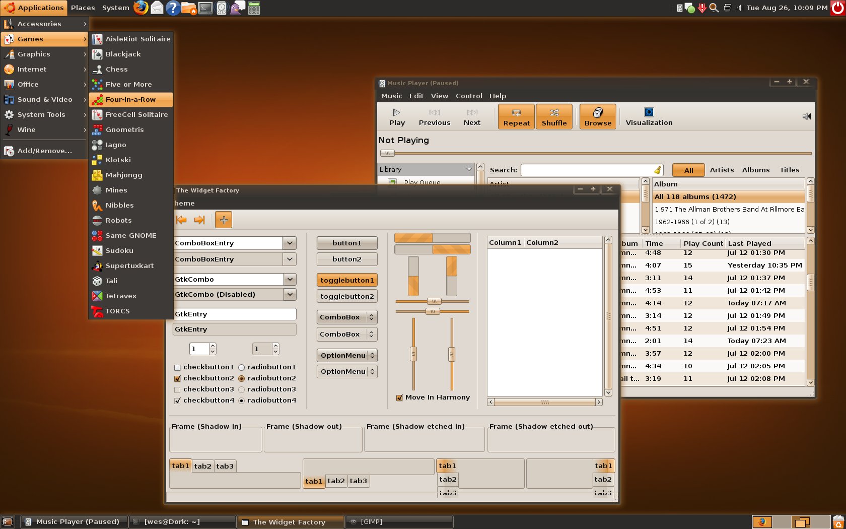
To do: Update the Dark style of the engine so that checkboxes on the menus are light instead of dark.
Look into wrapping all this custom engine junk up into a .deb.


More GTK2 Themes from xlcheese:
Other GTK2 Themes:


Ratings & Comments
13 Comments
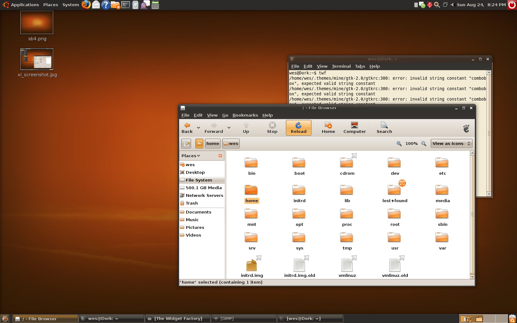
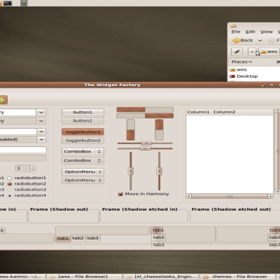
How to reduce the size of the arrow > ? What to write in gtkrc?
Sorry for the duplicate. This is the result updates page.
How to reduce the size of the arrow > ? What to write in gtkrc?
Can you show a screenshot of your question?
http://s47.radikal.ru/i115/1005/07/e51e48535b7f.png http://s48.radikal.ru/i122/1005/5e/f24d0ba95663.png
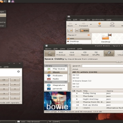
the checkmarks are much better now that they are white. I still think we need a userChrome.css file in order to fix the unclickable text in menus. Right now it's black on the dark gray color. There is still the issue of the mouseover display for banshee but i can't image how this could be fixed...maybe look at how it's done in the Shiki-colors theme? Also, I personally think that you should make a panel background that is the current color of the default but is slightly transparent. This will make it look cooler and decrease the clutter that all the window list buttons make. It looks better if the only outlined button is the active one on the panel IMO.
http://img300.imageshack.us/img300/2558/screenshotvf4.png http://img357.imageshack.us/img357/7372/screenshotpanelpropertiiu1.png there are two of the things i noticed. the emerald theme still doesn't look perfect to me. I think it should be a solid color even on the sides for the inactive window.
Thanks. I played with it some last night and thing I've found a fix for it. I also stumbled across a fix for the add custom launcher dialog. I also agree with the emerald borders needing to not have opacity. I'll try to fix that in the next few days.
cool i think the engine is the most appealing part of this. I will really love it when its working perfectly.
this is REALLY good! people need to get the engine so that they can see how great it looks! Great job on the engine and this theme! I love it! its like the perfect ubuntu theme!
OK well i don't know if these issues are problems with the theme or the engine, but seeing as you made both, i figure you can fix them either way. one place where a theme problem happens is in the panel properties window. The "Orientation" dropdown box is white-on- white invisible. I'm sure there are similar problems elsewhere . Also, in Banshee music-player, the mouseover for seeing what is playing is black on dark color. In general, in menus the unselected text should be grey not black because then you CAN"T read it if you want to.
two other color problems: The "lock to panel" checkmark is black on dark color instead of a white background checkmark. In firefox, the addressbar suggestions have some text that is also black on a dark background. I dont know how you could fix the second one aside from maybe a userChrome.css file or something idk. dont abandon this theme or your engine! radio buttons look weird outline or something idk much about them.
Really appreciate the feedback. I'll look into those problems. Possible that you can provide some screenshots? The firefox menu is firefoxes fault, but can be fixed with a userChrome.css file. I'll try to provide one.