


Human 2
kimmik


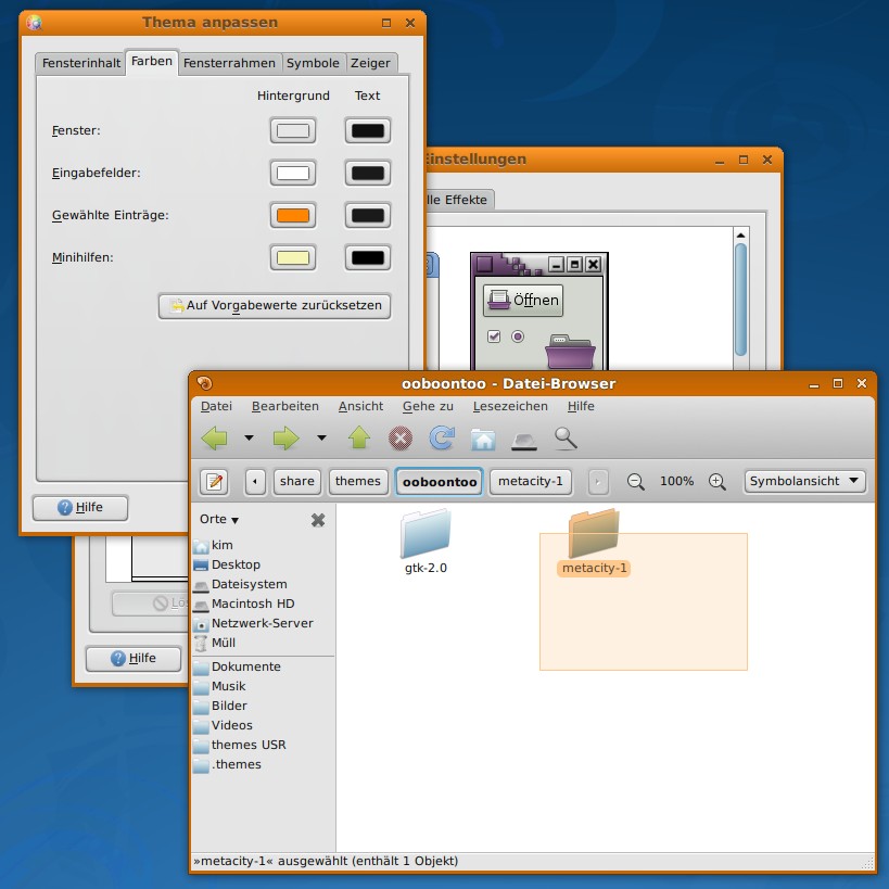
Source (link to git-repo or to original if based on someone elses unmodified work):
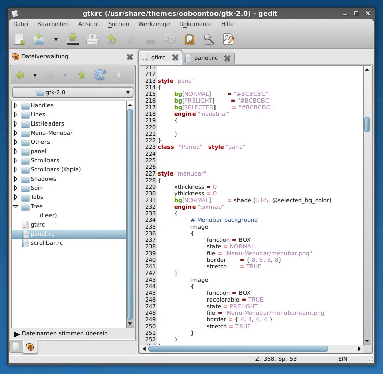
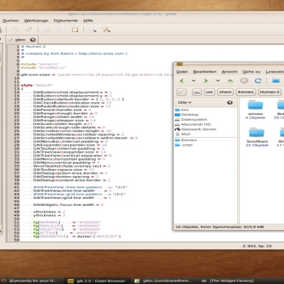
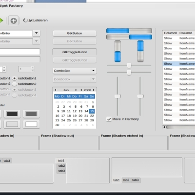
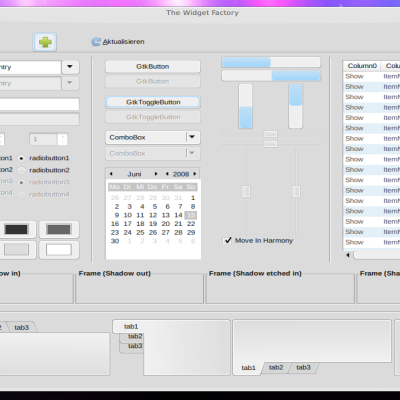
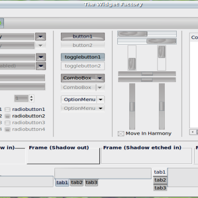
- Panel-widget-bgcolor fixed (looks consistent now)
- New check and radio-buttons
- Consistent colors (progressbar, selected entrys/buttons, listheaders)
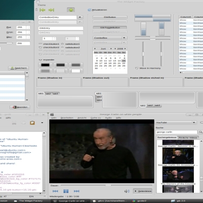
You can see the changes in the third screenshot.


More GTK2 Themes from kimmik:
Other GTK2 Themes:


Ratings & Comments
18 Comments
the whole theme is not working and i have both engines installed, i double checked on that one... still, when i apply the Theme, my Desktop takes on the Theme of a standard X-Windows Environment which is disgustingly ugly. Do i need ANYTHING else beside the two engines ?
I've have pixmap and aurora engines, and everything seems to work except the progress bar. Can you fix it or enlight me to make it work? Thanks for sharing your art
I recompiled aurora, and that fixed my problem. Weird, the aurora themes were working well. Now that i see it and use it, i love it. It's an excellent work. Congratulations!
I think the theme looks perfectly fine, imho themes just look alot better when they have a very unified look. Here is where there comparison to Mac OSX comes in. OS X has a very unified theme, from first pixel at the title bar all the way to the last pixel in the status bar (status bar?) so this is where i think people are thinking it looks like OS X, and the light blue on the scrollbar of course. It would be nice to see more Gnome themes that where more unified, like this one, of course that is just my opinion, and it doesnt necessarily mean that is looks like OS X. Keep up the great work Kim, i always keep checking your blog for the new stuff, some of your themes help me out alot when i need to make something original myself.
Its very nice to see artwork featuring elementary-icons. Especially darker themes like this one. Very good job :)
very very nice theme i try it and adopt it it is clear and fonctional , very nice maybe just i make a desktop menu panel with a little effect with relief and gloss lighting about black-green green and blanc effet but it just for perfect design that make a little bombing style effect :p thanks for your work
Hi Kim, I like the ideas in your themes and the way their look like. But in my opinion everyone of your themes seemed not finished in my view. For example, the panel ist just flat grey. And there is no possbility to change this because, the starter applet is still grey. The corner around the sunken buttons is to little bit to fat. And yes, it looks very macish. But please keep on going ! Maybe you're interested to create a them with me together, I live in germany, too. BYE!
I finished the theme with this update, it looks now more consistent. Panel: I wanted the panel to look as simple and unobtrusive as possible, so it doesn't get in the way when you manage the windows. Mac-like look: It's true, it looks somehow similar to OSX's style, but I don't know why that is a bad thing. It's not like all of this theme is stolen from OSX. I think it is unique enough. :) ps: It looks less like OSX when you choose a different iconset (although I wouldn't recommend that, because the elementary-iconset is really great).
Finish??? Kim I think that you are a very artist, I use your leopard theme since the moment that you made it, now I want to change and I've choosed your theme, it's very nice!! Works good on many applications but not in pidgin... the window's color (note the quotes ^^ ) looks too flat. Can you improve this? Don't give up pleeeeaase!!
looks also the progress bar of totem or banshee... it looks like a wall without paint..
Too mac-like. Thumbs down.
kim does his magic once again! We should all be very thankful :) good vote ofc //Robert
Hehe, thx
I wish this could already be downloadable. Cygoku
It is, scroll to the bottom of my blog entry (big green download link). :)
Oh I'm sorry, under the first screenshot we can read : "Still some details (like checkboxes, new scrolls) to do, download it here soon. :)" Cygoku
Oh, thx, thats really misleading. I deleted that line.
nicee! will try it.