


Moomex-Ultimatum
moomex


Source (link to git-repo or to original if based on someone elses unmodified work):
2008.07.04 - v 0.7.1
=============
Metacity Fixes
2008.07.03 - v 0.7
=============
- Improved the metacity style.
- Fixed panel bugs.
- Better menubar style.
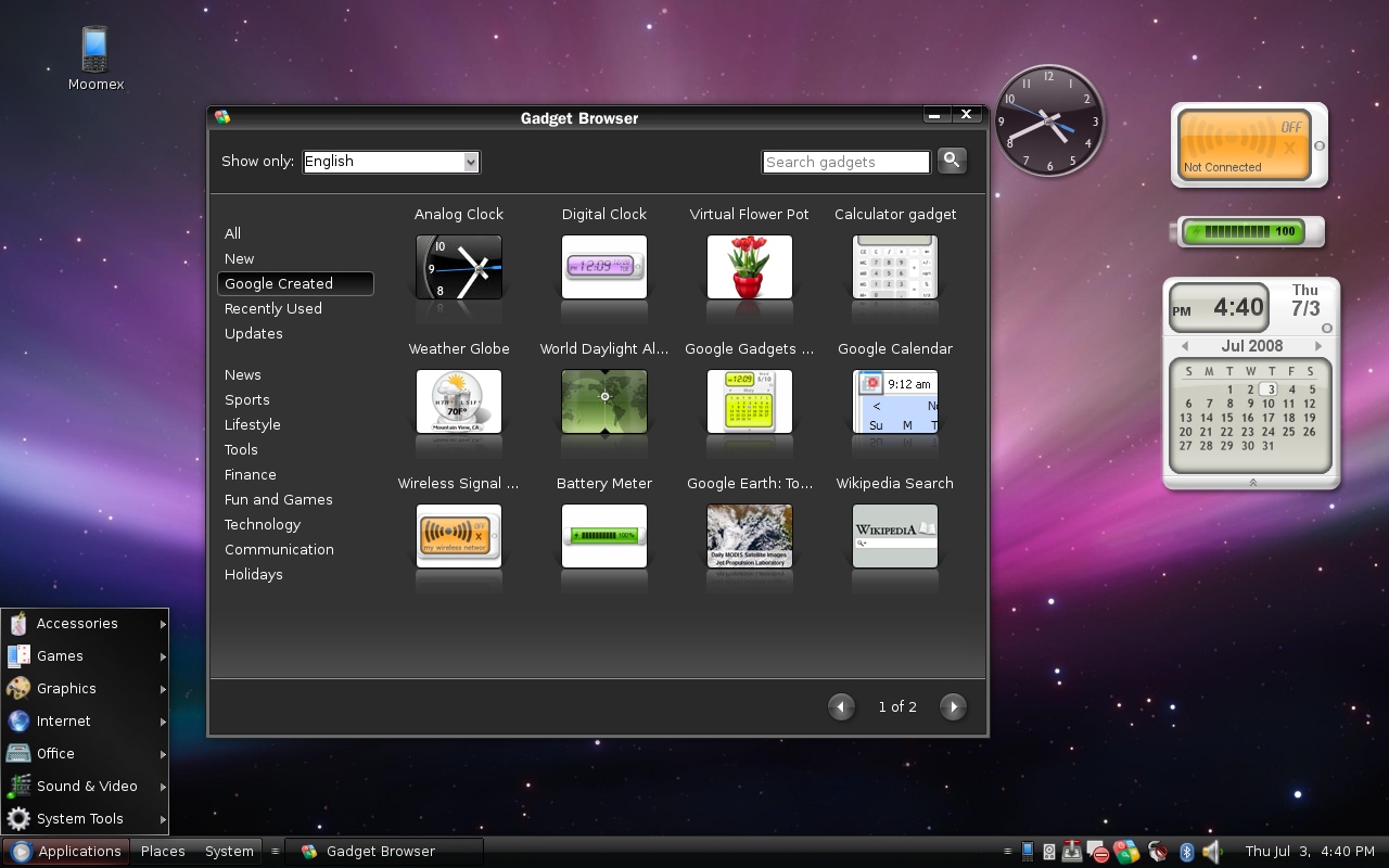
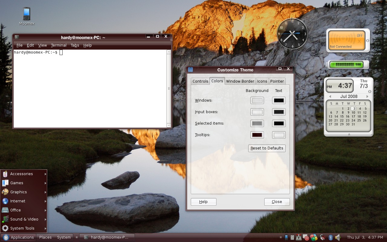
_ Panel, menubar, menu-item, and metacity can be colorized through the gnome-theme-manager (3rd Screenshot)
2008.01.01 - v 0.6
=============
- Fixed a Bug where the shutdown dialog shows the panel style ( Foresight, Gentoo).
- Fixed a Bug where "Mail Preferences" in Evolution inherits the panel style.
- Fixed text color issues in some widgets (e.g GtkCalender, GtkCellView, etc)
- Fixed the drop-down menu list button.
- Brought back the clearlooks GLOSSY style lost due to version 0.5
- Black menu style ( can be customized)


Other GTK2 Themes:


Ratings & Comments
182 Comments
A dark theme that looks good, thanks! :)
hy im newbe in linux mint, i cant isntal moowex theme.. can u tell me how to instal moowex theme?
I'm using Ubuntu, but I'll tell you how I do it. If your using Gnome, Go to System->Preferences->Appearance. Open up the folder where the 57063-Moomex.tar.gz is, drag the file into the Appearance window. It should say successfully installed, click Ok, and scroll down until you see Moomex. Click it, and it should be applied.Tell me if you have problems.
Hi I'm using Ubuntu as well, but if I follow your instructions I cannot get this theme working... what do you drag to the theme window? the tar.gz or the uncompressed folder? I tried both but without success... Thanks
all i done was dragged the .tar.gz into the Appearance window, and it installed it,im using Ubuntu 10.04
Do you have to add one at a time for days.. It looks good though!!
Hey, first of all - really nice theme! I would like to ask you if I can use this theme as base for the next version of my gtk theme CT-gtk (http://gnome-look.org/content/show.php/CT-gtk?content=106036). I know your theme is GPL'd but I didn't want to start without your approval.
Just my problem for some days now. Anyway here is a solution : You go to Moomex> GTK 2.0> gtkrc, open it. Then find line 156 and change GtkWidget::focus_padding = 6 replacing the 6 with 4. Hope it helps you too.
Is it possible to jhave smaller panels? 31px is really big, I wish I could make it 24px. How can I do it?
I've been looking other themes, but this one is the best dark theme I found. I hope this theme will be continued and updated through new Gnome/Ubuntu versions... Well done work!
gimp edit ~/.themes/Moomex/gtk-2.0/Panel/panelbutton-1.png color,map, color rotation (translated from french...) : make your stuff... save and reload the theme.
How do I get the blue bar??? Also, earlier, the buttons on panels used to glow blue but now it glows somewhat brown. How do I get the older one???
I love this theme, it's very nice! One question I had was how do I change the color the minimized windows glow when I scroll over them? Thank you!
Great theme!
If you can do a dark-blu version, I'm going very fun :)
Hello. I'm using this theme, and I think it's fantastic. There's only a thing I don't like too much: window list and notification area separator ( http://img410.imageshack.us/img410/6120/desktopdx4.png ). I tried to change it, because I thought it was only a image file, but I don't found it. Can you tell me, if it's an image file, where it is? Or if I have to edit other file, what one I have to edit. Thanks for your time and your theme. PD: Sorry if I made a mistake writing, my english is not very good. Regards from Spain
It's an image file and is located in $HOME/.themes/Moomex-Ultimatum/gtk-2.0/Pixmaps The fie name is 'handle-v.png' P.S. Sorry for the late reply
Hello, I love this theme. Its the very best in my point of view (much better than windows or mac). Very elegant and when you need its perfect also with bold fonts for bad eyesight. I have also a request I would like to have the possibility to have a button to invert the background/fonts contrast in some circumstances for at least three writers: 1-edit 2-open office 3-console My point is that it is sometimes much better for bad sight to work with green fonts on black. Yes just like the old consoles! The reason is double. Green is the colour where the eye has the best sensitivity. So you do not sollicitate too much yours eyes...and another advantage is you can work with low level luminosity and hence spare the drain on your battery. This is something quite simple which can greatly improve ergonomics. Obviouly I can set it myself and does it quite often....But you sometimes have to switch quickly between black fonts on white background to green fonts on black background. A propper applet would be apprciated. Thanks anyway for that almost perfect theme on ubuntu. I do not found any defect till now.
I think you can change the background and font colors for these three writer using gnome theme manager. If not I will update the package soon but no promises on Open Office since it is not a GTK app and it's very buggy when it comes to dark themes.
you can absolutely change that using Gnome Theme Manager. Change the input boxes Background and Text colors to match your needs
Thanks, I will try I use Moomex with "sereno" wallpaper...almoste the perfection Francesco44
Hi. First, I love this theme. It looks awesome. It makes everything look like black glass and is really good on the eyes. Second, I have noticed an issue with the maximise/unmaximise button in that the divider line is not consistent between the hover and non-hover versions. This causes a few discrepancies. When hovering over the button, it expands the button to include part of the close window button. When hovering over the close button, it changes to red and the divide line between the buttons is still visible. When I extracted the theme I noticed the divider lines towards the end of the pictures max-blurred-normal.png, max-focused-normal.png, restore-blurred-normal.png and restore-focused-normal.png. To resolve the issue they need to be moved to the end of the pictures. I'm not very skilled in the art of graphic editing otherwise I would edit them myself but thought I would let you know so you can change the theme as the theme owner. That way it would look as good as the rest of the wonderful theme, not looking like a crappy fix that it would be if I did it!
This is a known bug. The close, maximize and minimize buttons must have the same width (due to some limitation of mtacity). However, the close button is supposed to be wider, as a result the maximize buttons are affected. I know this not professional, but I will find a better way to resolve this bug. Thanks for your feedback
I love this theme. An extra layer of class for Gnome. Thanks so much.
How were you ever able to change the ubuntu icon at the bottom left? you know, the one that's always next to applications?