


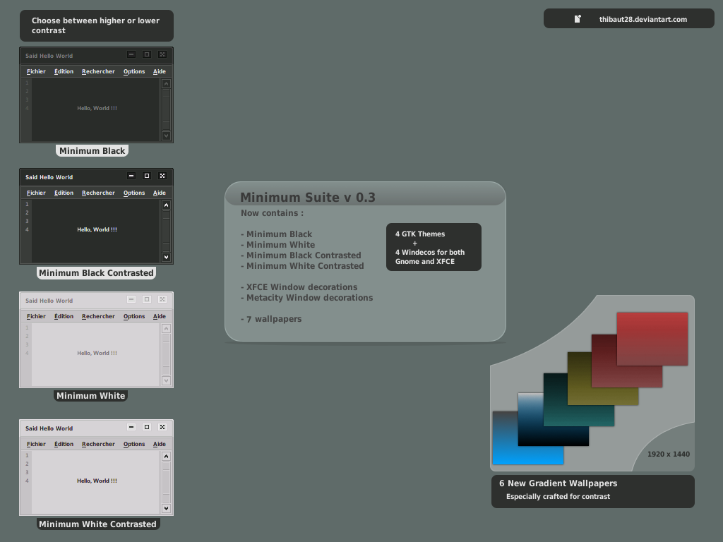
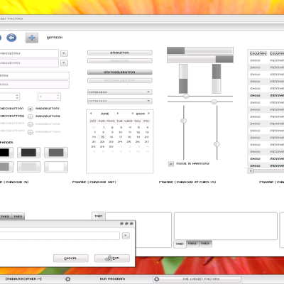
 I present you "Minimum", made using only contrast, and a few gradients
  It comes in Black and Black value reversed => White.
The archive contains :
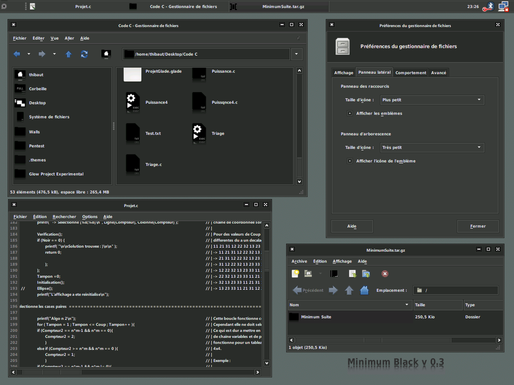
- Minimum Black GTK Theme
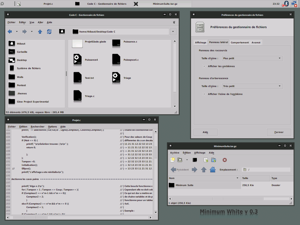
- Minimum White GTK Theme
- Minimum Black Contrasted GTK Theme
- Minimum White Contrasted GTK Theme
- XFCE Black Windeco
- XFCE White Windeco
- XFCE Black Contrasted Windeco
- XFCE White Contrasted Windeco
- Metacity Black Windeco
- Metacity White Windeco
- Metacity Black Contrasted Windeco
- Metacity White Contrasted Windeco
- Gradient wallpapers
Have fun with it, download, try, comment, etc...


Ratings & Comments
26 Comments
Nice try, the contrasted white theme is somewhat easier to use. Good work with the progress bar. I think there are still some minor problems regarding the contrast. Of course, this is a matter of taste. - The scroll bars are still pretty much indistinguishable on the first glance. You have to search for them in order to find them. - The same with the active tab. Maybe add a more distinctive border? Anyway, thanks very much.
hey what engines does this theme use? i copied the folders into /usr/share/themes but nothing is showing up in the appearance prefs window so im assuming i dont have the correct engine installed.
Well it uses only "pixmap" and "mist" engines, but it seems there are issues when using it on Ubuntu. But if it doesn't show up in the list, I don't think it's an engine problem. Did you unpack all the themes ? or just the big folder containing the 4 archives and the wallpaper folder ? Maybe check your installation and if it's not the problem, I'll help you further ;)
Yeah I'm not a noob with this stuff, I've been doing it for years. I know I'm installing it correctly but not sure why it's not working... I'll check what engines I have installed when I get a chance.
But, did you plan a QT_Version, because i got some QT-Apps ( just k3b, krusader) and they look weird with this nice theme. Or did you know a theme that fits with yours? Greetings Seraphyn
Well I'll see if I can make something looking close to this under QT, maybe with QTCurve and an associated color scheme ;)
So my ion3 will look close to My , and maybe some other users, basic idea how a desktop should look alike. Greetings
Good work, this is a very nice theme. I agree that the white one should have a little more contrast: If you make the menu fonts black, and give a little more contrast to the scrollbars and the tabs, this is going to be perfect.
hey i still like your dark version very much...
This is Great, thanks for the nice work. I like it like that, no glossy, no blingbling, fine. Keep up the Good work
Thanks a lot for the fav ;)
Thank, your theme is quite good. Almost every control looks really cool. But.. It's very hard for me to look at this because of low contrast. Can you try to make some experiments with it, make some changes to colors? I suppose not only my eyes tire of colors like that. =] Thanks.
What about making an alternate version, where I would change the color of the font : Strong white for the darker, strong black for the whiter ?
Well, I think it would be nice.
Yeah, it's threadbare and doesn't have a lot of glitz all over, but it's pretty fat. Wide scrollbars, big buttons, a lot of wasted space. Take a look at something like Clearlooks-Flat-Compact or Aurora-Compact. The idea of a minimalist GTK theme is no wasted real estate, and unfortunately I see a lot here, although I -really- like where it's headed.
Well well, here they are : http://gnome-look.org/content/show.php/Aurora-compact?content=64792 http://gnome-look.org/content/show.php/Clearlooks-flat-compact?content=74918 I can't agree with you on the scrollbar, neither on the buttons. I don't know, just fire up twf and you'll see. That's the same. Plus, the size of the button depend of the font size. I think we don't have the same notion of what minimalism is. For me, this is this kind of thing : http://fratrip.deviantart.com/art/Wobachi-Retro-102040644 http://fratrip.deviantart.com/art/Black-Wings-102693679
Tell me, though, what's inherently minimalist about that theme. That seems "minimalist" because it's on a desktop with no panels, no icons, no conky, no screenlets, and a blank wallpaper. The GTK itself is just lacking gradients and sharp contrasts. The reason I brought up the compact versions of those themes is because that aids in minimalism. I'm an Arch/Openbox user that likes to have things as seamless as I can with as much real estate usable as possible. What you've done here is eliminate constrast and sharp edges, which is less "minimal" and more "eye-straining". And as for TWF, all I know is that when I use Aurora Compact, Clearlooks compact, and a few others of the same ilk, buttons are smaller. This one has large 'uns. Also the toolbar row in the file manager is way bigger.
Look, I don't really have the feeling this talk is leading anywhere... My toolbar is definitly bigger, I guess 24x24 against 10x10 or something. You got that right, but what's the point anyway ? Minimalism notion isn't anything binary. This is not because your given examples are more minimalist (by your conviction) that this theme is not... Tell me, what do you want exactly ? By my conviction something minimalist is something like you said without all the "glitz" around.
No I agree, and I really like the overall design here, it just has a lot of unused blank space and that's keeping me from using it full-time. I'm currently using the ASN Suite I found here (http://visionsofart.deviantart.com/art/ASN-SUITE-95339568), and I think a really compacted theme here would be pretty spot-on. I didn't mean to come across like I was insulting ya or anything, on the contrary I never comment on themes I outright dislike, only the ones that I really like but would love to see one or two tweaks on.
Well, I'll see if I can make a more compact version of this theme, taking ASN as a basis ;) Sorry for the misunderstanding...
It's all good, I came across as more abrasive than I meant to. My bad, there.
This is very nice looking. I actually imagined a theme similar to this recently and then I found this one. It needs a little more contrast for me to be usable, but very good!
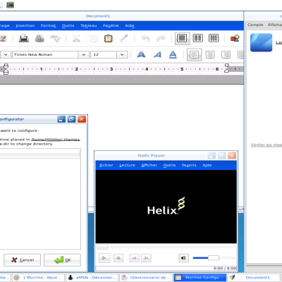
Thanks, the white theme needs a rework on the menu at least I think. I didn't updated the page, but I ported the Xfce windeco theme to Metacity, so now it's also possible to use it completly under gnome.
I use Xfce anyway. I didn't try the theme, sorry. But it's definitely good. (I'm using one I made myself)
i like the darker version! :)