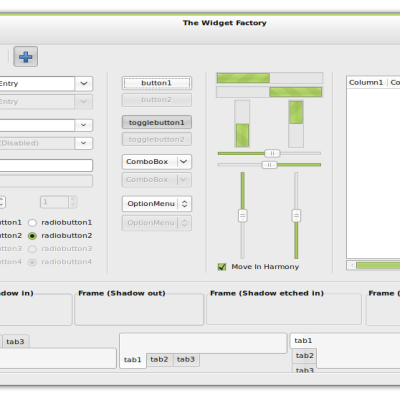
Description: This theme is aimed for people who just want a simple, fast and native interface with many color options. It's also designed with new linux users in mind, by providing simple, thorough instructions. A matching set of Icons, Wallpapers, GDM themes and Usplash screens can also be downloaded separately.
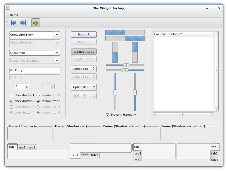
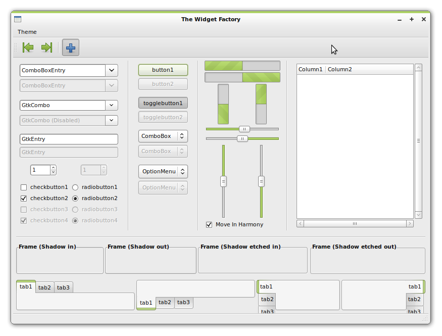
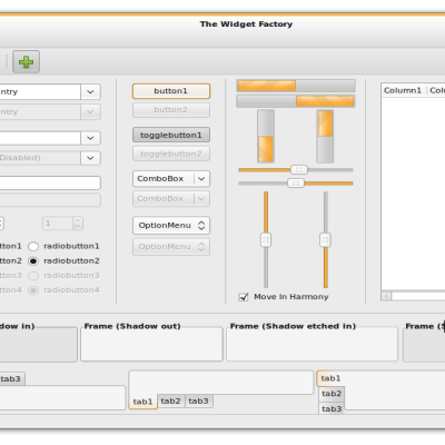
There are four color variations (Orange, Blue, Green, Red) and TWO designs; light and dark. You can create even more color-schemes through GNOME's appearance preferences, using the included tango palette for color suggestions!
This theme is designed for Ubuntu Hardy/Gnome 2.22. It will not work in earlier versions.
Important, must read or clowns will eat you: - Inside the gtkrc files there are extensive line-by-line instructions and tips for customizing most aspects of the theme!
- GNOME-Colors are set as the default icons for the themes. Be sure to download them to get the full experience!
- This theme uses gradient panel backgrounds by default. If you plan to use Transparent/Custom panels, please disable my panels by editing either the gtkrc or panel.rc files like the included instructions tell you to.
- My X-Colors metacity borders are not selected by default, due to their non-conservative nature. You can choose them in gnome's appearance preferences if you wish to use them.
- Some linux apps are not too friendly to dark themes yet. It's up to their developers to improve this. Keep this in mind when using any dark theme.
- If you want root/super user applications to be themed, you must type in a terminal: sudo ln -s ~/.themes /root
- Feel free to try Murrine-Colors or Nodoka-Colors for alternate takes on this theme.
Please: If you must vote down, or if there is something you dislike, leave a comment so I can improve it!Last changelog:
2.0 (09/12/0: -Minor improvements. -Minor improvements to metacities/emeralds. -Now based on Shiki-Colors' newer gtkrc, for better instructions and easier modifications.
A shame the cleanlooks-colors (and sister themes) aren't supported anymore. They are still my favorites. I prefer bright themes, so shiki-colors is not really an alternative for me.
A small request. Would it be possible to upload the "old" style x-colors metacity theme? The one with gradients. I love that version, so it would be greatly appreciated.
Thanks for your great work. :)
These themes are deprecated, they still work but the code is old and may not work under certain configurations.
Shiki-Colors is the successor to these themes and is actively developed, but these are just provided as is for anyone who may still like them.
Yeah, when I tried installing this theme yesterday, the buttons that displayed were the square Clearlooks ones, not the sleek ones that show in the screenshot. It made me sad because I prefer this look over Shiki-colors. In Shiki, I'm trying to learn to appreciate the menubar being black, but I feel like the transition from the black menu bar to the gray toolbar is jarring. The entire theme is very smooth and rounded, but the transition from the black menubar to the gray toolbars is just a flat, solid color line. Maybe a slight gradient would fix this. I don't know, just an idea. I know many people love the theme as is.
regarding x-lite metacity - i really love it, especially with clearloks-human, gnome-colors human and gnome global menu panel applet, but my question is if i may ask you for some tweaking ?
if you look at both top corners they are IMO too much sharp and some soft rounding would be nice if you could implement. i've looking into metacity code if this is and bitmap issue, but unfortunatelly all is written code which i don't understand :(
this is only part which disturbs me http://img266.imageshack.us/img266/6033/metacitycorners.png
what do you thing, it's possible?
Another jaw-dropping theme. I don't know how you do it, but every last detail of this theme (and your shiki colors theme) is simply outstanding. Gives a new look to Linux. Very sleek, elegant and professional. I'll be making easy to install packages for:
- shiki colors gtk
- clearlooks colors gtk
- gnome colors icons
- gnome colors gdm + wallpapers
I think this theme is amazing and credit to you! But I have a problem; my close, maximise, minimise; are the Ubuntu default, how do I make it look like the sexy ones in the preview?
You can just click on the theme "Clearlooks-*color*" in appearance preferences, in order to use the theme's default window borders as well, instead of Ubuntu's. If you want something like in the previews, you have to either use the included emerald themes if you use emerald (recommended) or click on 'Customize' and select X-Colors/X-Colors Lite under the 'Window Border' tab.
i installed the theme and its great :) but in some apps like gtkorphan or some windows in ubuntu update i see no theme and the windows is very ugly :D Some1 can figure out the problem? Thanks
Yes, I've seen it before. If i'm not wrong, it's an older version of the tango palette.. I decided to include the official one because it looks best with most themes. This one however, has better greens/reds, which is why my wise/wine themes' colors are an in-between mix of the official palette and this one. Then again, they are just quick color suggestions, so everyone should try around until they find the color that suits them best.
Hi,
Very nice, but
is there any possibility to get old style tabs (no stripe but smooth gradient) like in earlier versions of clearlooks?
best regards
Marek M.
Hey, there are two ways to get the old-style tabs.
1. go to the notebook section (clearlooks-notebook) and add the following below the line that says "contrast = 1.15":
style = GLOSSY
This will make the tabs gradient, however since they are rendered with glossy style, inactive tabs will look glossy.
2. use my nodoka-colors theme. it's based on this one, and features gradient tabs by default.
Oh, and I forgot a third option. You may also get those gradient tabs by installing the nodoka engine, and changing the engine from "clearlooks" to "nodoka" in the clearlooks-notebook section of my theme.
The theme is fantastic and i'm using it since the beginning. Unfortunately i can't go past 1.4 because u altered the orange colour from the dark theme...
I don't have time to learn how to change it and that's a real problem- because...again... i really love it. Thx 4 you great work :)
the dark colors in 1.6 are brighter and better than 1.5. also, you can change any theme's color in gnome's appearance preferences :). use the included tango palette for a list of good color choices!
you can also alter any of the emerald themes so it fits whatever color you create.


 :
:


Ratings & Comments
87 Comments
A shame the cleanlooks-colors (and sister themes) aren't supported anymore. They are still my favorites. I prefer bright themes, so shiki-colors is not really an alternative for me. A small request. Would it be possible to upload the "old" style x-colors metacity theme? The one with gradients. I love that version, so it would be greatly appreciated. Thanks for your great work. :)
Hey perfectska04, any chance you can include these themes in a PPA?
I second this request.
These themes are deprecated, they still work but the code is old and may not work under certain configurations. Shiki-Colors is the successor to these themes and is actively developed, but these are just provided as is for anyone who may still like them.
Yeah, when I tried installing this theme yesterday, the buttons that displayed were the square Clearlooks ones, not the sleek ones that show in the screenshot. It made me sad because I prefer this look over Shiki-colors. In Shiki, I'm trying to learn to appreciate the menubar being black, but I feel like the transition from the black menu bar to the gray toolbar is jarring. The entire theme is very smooth and rounded, but the transition from the black menubar to the gray toolbars is just a flat, solid color line. Maybe a slight gradient would fix this. I don't know, just an idea. I know many people love the theme as is.
regarding x-lite metacity - i really love it, especially with clearloks-human, gnome-colors human and gnome global menu panel applet, but my question is if i may ask you for some tweaking ? if you look at both top corners they are IMO too much sharp and some soft rounding would be nice if you could implement. i've looking into metacity code if this is and bitmap issue, but unfortunatelly all is written code which i don't understand :( this is only part which disturbs me http://img266.imageshack.us/img266/6033/metacitycorners.png what do you thing, it's possible?
forget it - running on gommoso colors now :)
Here is screenshot: http://picasaweb.google.com/lh/photo/WfaBJMQv3pXl2-Y5rN6yWA
I think something in the latest evo is causing it. I'll take a look when I can.
I have the same problem with Evolution but also with Abiword. Take a look at this screenshot : http://www.noelshack.com/uploads/Capture019373.png
Another jaw-dropping theme. I don't know how you do it, but every last detail of this theme (and your shiki colors theme) is simply outstanding. Gives a new look to Linux. Very sleek, elegant and professional. I'll be making easy to install packages for: - shiki colors gtk - clearlooks colors gtk - gnome colors icons - gnome colors gdm + wallpapers
I think this theme is amazing and credit to you! But I have a problem; my close, maximise, minimise; are the Ubuntu default, how do I make it look like the sexy ones in the preview?
You can just click on the theme "Clearlooks-*color*" in appearance preferences, in order to use the theme's default window borders as well, instead of Ubuntu's. If you want something like in the previews, you have to either use the included emerald themes if you use emerald (recommended) or click on 'Customize' and select X-Colors/X-Colors Lite under the 'Window Border' tab.
Original. Widgets all look good in Firefox, (if its not a dark theme) and attractive. Rated Good. Keep it up.
i installed the theme and its great :) but in some apps like gtkorphan or some windows in ubuntu update i see no theme and the windows is very ugly :D Some1 can figure out the problem? Thanks
ops :) problem fixed i didnt themed apps for root user
Personally I find this palette more suitable. Have a look: http://faktory.deviantart.com/art/Tango-Palette-55263147
Yes, I've seen it before. If i'm not wrong, it's an older version of the tango palette.. I decided to include the official one because it looks best with most themes. This one however, has better greens/reds, which is why my wise/wine themes' colors are an in-between mix of the official palette and this one. Then again, they are just quick color suggestions, so everyone should try around until they find the color that suits them best.
I registered especially to vote this up. I like your dark themes.
Hi, Very nice, but is there any possibility to get old style tabs (no stripe but smooth gradient) like in earlier versions of clearlooks? best regards Marek M.
Hey, there are two ways to get the old-style tabs. 1. go to the notebook section (clearlooks-notebook) and add the following below the line that says "contrast = 1.15": style = GLOSSY This will make the tabs gradient, however since they are rendered with glossy style, inactive tabs will look glossy. 2. use my nodoka-colors theme. it's based on this one, and features gradient tabs by default.
Oh, and I forgot a third option. You may also get those gradient tabs by installing the nodoka engine, and changing the engine from "clearlooks" to "nodoka" in the clearlooks-notebook section of my theme.
The theme is fantastic and i'm using it since the beginning. Unfortunately i can't go past 1.4 because u altered the orange colour from the dark theme... I don't have time to learn how to change it and that's a real problem- because...again... i really love it. Thx 4 you great work :)
Don't mind me... i got it
the dark colors in 1.6 are brighter and better than 1.5. also, you can change any theme's color in gnome's appearance preferences :). use the included tango palette for a list of good color choices! you can also alter any of the emerald themes so it fits whatever color you create.