
Creamy
Source (link to git-repo or to original if based on someone elses unmodified work):
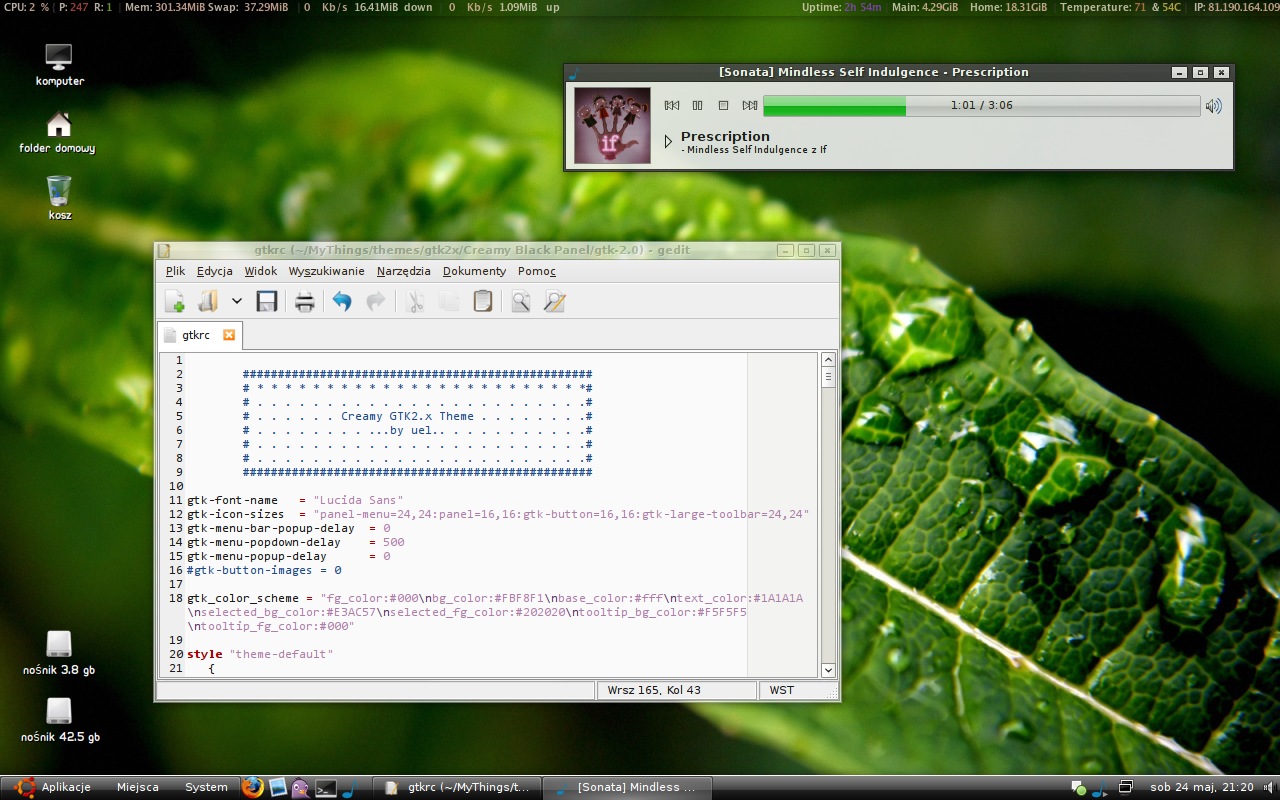
Perfectly looks with Ubuntu Linux.
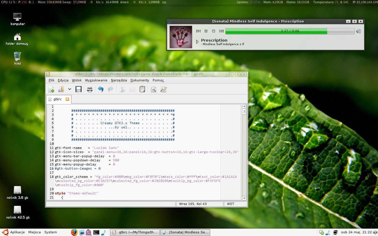
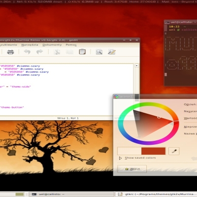
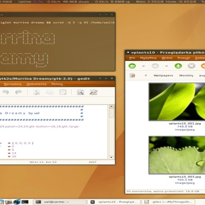
On top of screenshot you see Conky. My .conkyrc:
http://wklej.org/id/72b803c86d
FOR DEBIAN USERS:
You must install gtk2-engines (requisite in version 2.12.2 from SID repository) and also gtk2-engines-pixbuf packages.
24.05.2008 - 1.3
============
+ too many things.
19.04.2008 - 1.2
============
+ new scrollbar, panel in black panel version (from Apotheosis theme), new colouring.
24.03.2008 - 1.1.5
============
+ Added new color of scrollbar and buttons and other.
17.03.2008 - 1.1.1
============
+ Added new slider (range), radio/check button and other small trifles.
15.03.2008 - 1.1
============
+ New Look! Very Hot ![]()
28.02.2008 - 1.0.9
============
+ news design o buttons and menuitem (now is already background for item in right mouse click) and other.
20.02.2008 - 1.0.5
============
+ fixed a lot of bugs!
19.02.2008 - 1.0
============
+ ohh, too much! Menubar-item, Menu-item, Notebooks, Buttons and much much more.
13.12.2007 - 0.9
============
+ Getting rid of caramelish menubar for a weal of everyone. Meantime I delete Creamy Classic.
+ Optional themes:
- with black panel
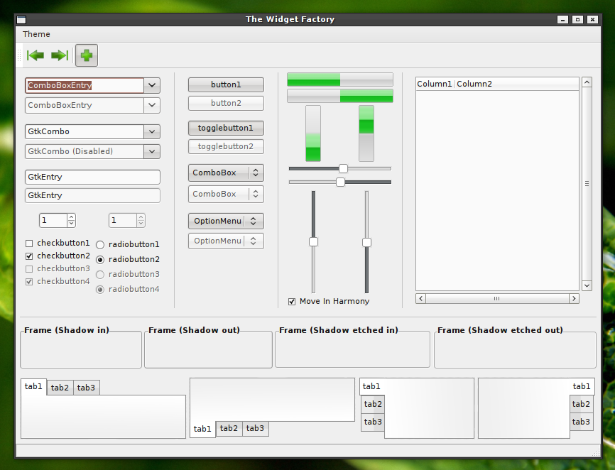
- with Caramel menubar (3rd screenshot)
12.12.2007 - 0.8
============
+ refreshed: buttons, notebooks, scrollbar and other.
06.12.2007 - 0.7
============
+ new menubar, menu-item (now black).
+ solved problem with menubar color font in Open Office and Firefox.
02.12.2007 - 0.6
============
+ new buttons, corrected:
notebooks, bg and other.
26.11.2007 - 0.5
============
+ corrected:
buttons, notebooks and bg.
24.11.2007 - 0.4
============
+ new look of almost all:
buttons, notebooks, progressbar, and other.
18.11.2007 - 0.3
============
+ new design of buttons
+ new scrollbar color
+ small hotfix
10.11.2007 - 0.2
============
+ new design of buttons
+ changed color on a tab - imho looks better
+ new scrollbar color
07.11.2007 - 0.1
============
+ first release







Ratings & Comments
69 Comments
Thanks! I have one more question ;-) One day ago i've made a fresh install of Ubuntu 8.04 and as before i would like to change default theme to Creamy buuut...unfortunately it seems smth is not working properly... the colors are bad I've checked at synaptic those packages and they're installed any ideas what can be wrong?
Hey, could you tell me (us?) which font do you use? I'm looking for nice and not too big app font :-)
Look at this shot ; > http://img186.imageshack.us/my.php?image=fontsvg6.jpg
How can I install the theme as a whole? I can select the Creamy controls, but I can't find the window border you are using in your screenshot for example. I don't see the "Creamy" theme either in the "Themes" panel after I click "Install..." and select your theme package. This theme looks very nice though. Very simple and useful.
The metacity in question is the standard Murrine theme! Here's the link to Murrine Metaicty! Hope that helps! http://gnome-look.org/content/show.php/Murrine+Metacity?content=57999
Awesome, thank you very much!
Hm... In 1.2 version I can't get panels full transparent. And this white 1px line around panels is a awful when I've hidde buttons on on panels. And some icons like Tomboy have white background (see nothing on transparency).
As I said before - bold fonts in panels won't work out. I think it focuses user's attention unnecessary. Green progress bar also doesn't match the design for color at all. It is really interesting though. You may use it in some other design (?).
I join the former requests. The color balance of your former versions, caramel brown with warm, creamy white, was perfect for ubuntu. Now, with the neon colors and dark titlebars thrown in, it is just a different theme for different people. Can you fork your work into two themes - one for the beautiful, unique human version, and one for the new, bold and bright version?
No offense, bu I preferred your older theme, when it only had the creamy brown/white color. Can you upload this too (0.9 I think it is)? Or maybe make two separate themes, because the updated creamy is very different from the previous?
Thanks Uel for this awsome theme! It looks great with Murrine Metacity! As we have pretty ugly weather in Poland right now, my desktop looks more fresh! Cheers!
Hi, I'm not using Debian/Ubuntu, and wonder what the engines except for pixbuf/map is needed?
clearlooks?
LOVE the update :-D
Looks better now that things highlight again :-D. Still dont like the stock bold, but that was fixed easily with find and replace :-D
I really like this theme and want it as my one and only. However, I still can't - as in the current version (1.05) there is no hover effect on menu items (I use the simple version, no caramel bar or black thingies). I cannot tell which menu item is currently selected, so I am never sure when to click on it. If this little thing is fixed, I will be very very happy.
Oh, and the bold text in menus and on app names in the panel is also quite hard on the eyes. Can this be changed to normal too? I agree with the guy claiming here that bold text looks good only on window titles.
Emerald, Methacity ... ? :( Cygoku
Metacity, called Murrine.
Generally I'm against using bold fonts in the interface (excluding window's title bars). Also I think, that the way of selecting items in menus (orange/brown highlight of the text) is a bit strange ;) Keep trying Uel, I'll be waiting for new releases.
I think its better to use the system fonts... Also, i don't like the new change to changing the text color and not the background color on the menu items. It bothers me... a lot. lol
Like the theme, but what is it you are using to monitor the system in the screen shot at the top?
Uel, I've never thought I would say this, but You screwed this version (1.0) up. Really ;) Fix it, please ;)
What exactly I'll have to fix now? Olek ;) please, answer to the point.
Mhmm... All of bugs was desired. Fonts. Panel and Menubar have a other (and BOLD) font, required is install font called Segoe UI Bold. Right mouse menu and Menubar. They don't have anymore highlighted background, only fonts are illuminated (shadow inactive font - in fact - I must fix. Soon.). Please, give me your screenshot, it help me.