
LxG-Egalite
Source (link to git-repo or to original if based on someone elses unmodified work):
*** Thanks you ally scores and download. =D ***
-------> Please Coments...
icons:
--> http://deviantdark.deviantart.com/art/hydroxygen-iconset-100826865
__ If some errors it notice write PM. __
v1.04
small bugs
v1.06
menubar, progressbar, panel, handles, combo, Check-radio, icons size (menu), tabs, small bug
v1.10
buttons, toolbar, Rage, small bug
v1.10.4 (CF)
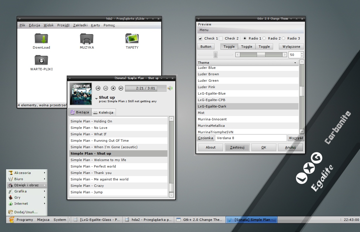
Carbonite Progressbar, buttons, progressbar, Check-Radio, Frame-gap, Toolbar, Repear gtkrc, tabs
v1.10.4 (GPB)
Glass ProgressBar
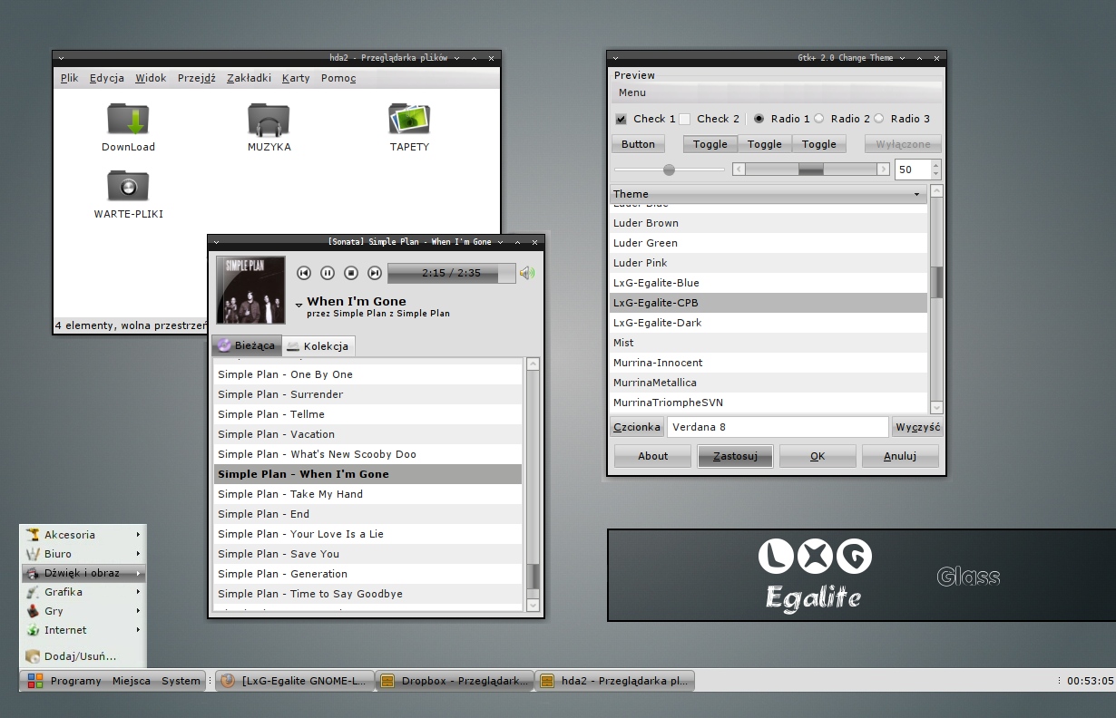
v2.1 (Glass)
create new glass style, add listHeaders, Buttoms, correct small bug, listHeaders, Buttoms, gtkrc code, menu lines, gtkrc + tab_style_theme
v(B5)
Tabs, range, Arrows, Panel (not all), Combo, listheader, change gtkrc + tab_style_theme
update 2.4 (All)
→ Error corrected GTK+
update 2.5 & 2.6
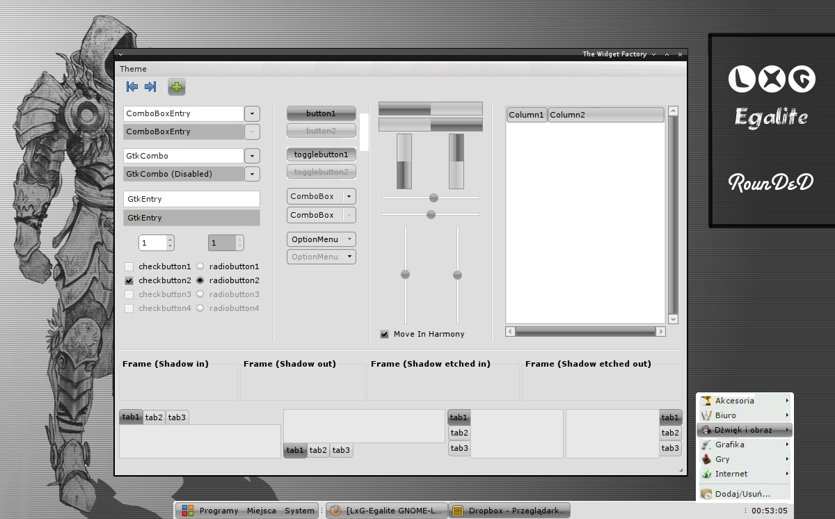
→ Rounded special wallpaper
→ change tabs
→ edit gtkrc
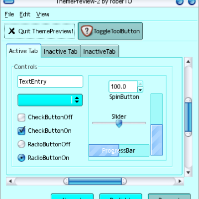
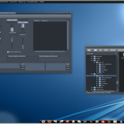
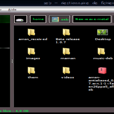
→ screenshot update, repar small bugs







Ratings & Comments
26 Comments
You should take a screenshot with a twf window open instead. Cygoku
Please for you very specially screen TWF (rounded).
I like this theme very much. Some issues I've found in this theme so far: - Images not shown on buttons - List coloring in alternate rows and selected row is confusing Thanks a lot for your effort creating such a good theme.
The newest version of the Glass variant doesn't match the preview. The preview shows sharp, rectangular features on the panel, but the gtk theme applies the same look as what's in the Rounded variant.
It is made so as I must delete error in editor menu. http://www.flickr.com/photos/xrfang/3002697640/
Please consider modify tab color style as illustrated in this image: http://www.flickr.com/photos/xrfang/3002291803/ Since install this theme, I often get confused which is the active tab in my firefox ;) Thanks a lot!
Also, it may be a good idea to use white font on dark tab background? I am not sure, you may try it ... :)
Try to make as you say. We will see as it be look =D
I am happy that the problems are fixed SO QUICKLY... I like the rounded B5 edition -- a bit round, not too round like apple's button :D Also, the tab color change is good! A question: is the B5 edition not as "glossy" (or not as shiny as) the original edition? Is it a kind of "carbonite" edition? or it is my incorrect feeling?
I do not know if i have apprehended well, but style was first version is "Carbonite" Later "Glass", And style on somebody request of "Rounded" But that it is not similar for apple :) And I thank finally and please, ask next proposal... =D
This is an excellent theme! very elegant and shiny... I found a small bug, see this image: http://www.flickr.com/photos/xrfang/3002697640/ (this is the dialog that edit menu item properties) Hope it is fixed in next release ;) Thanks a lot!
Error will be repaired due to for informations.
Gtk2 engine that uses the theme? and installed it but I said that the lack gtk engine to operate directly. As I install it? Thanks a greeting P.d sorry for my english.
I will introduce these corrections today else: *Lines in menu *rounded corners of the taskbar You have some suggestions else or notes ? :-)
I've tryed the Rounded Beta 1 version but doesn't make the corners rounded at the Task Bar. This is an image that explain what I'm talking about. http://s1.subirimagenes.com/imagen/1387239pantallazo.png
Sorry but i did not have time today. Motive "LxG-Rounded" will be in stable version tomorrow. Please wait.
Hi again, man I was thinking... Is there a way to make the corners of the taskbar, rounded?
Can you add break lines in the menu? This theme take those lines away and it looks awful in the menu
what menu in you on thought ? 1,2 or 3 http://dl.getdropbox.com/u/158713/inne/lxg-glass_2.1.jpg If no of it please It check off on picture.
I mean like in the menu Applications, places or System. You got like breaklines in places between folders and harddrives, then a breakline before network. There is atleast 3 breaklines in places menu. And with your team there is no breakline at all. Whole menus look awful without them. Here is the breaklines im talking about: http://img386.imageshack.us/img386/5957/skrmbildvv7.png
Besides the Elementary project, this is the second theme I really appreciate.
Thanks you and please scores.
Good Job, I really Like it. Thank U!
Sorry to post again, but I wish to know what icon's are you using on the screenhots.
I using hydroxygen icons: ----> http://deviantdark.deviantart.com/art/hydroxygen-iconset-100826865