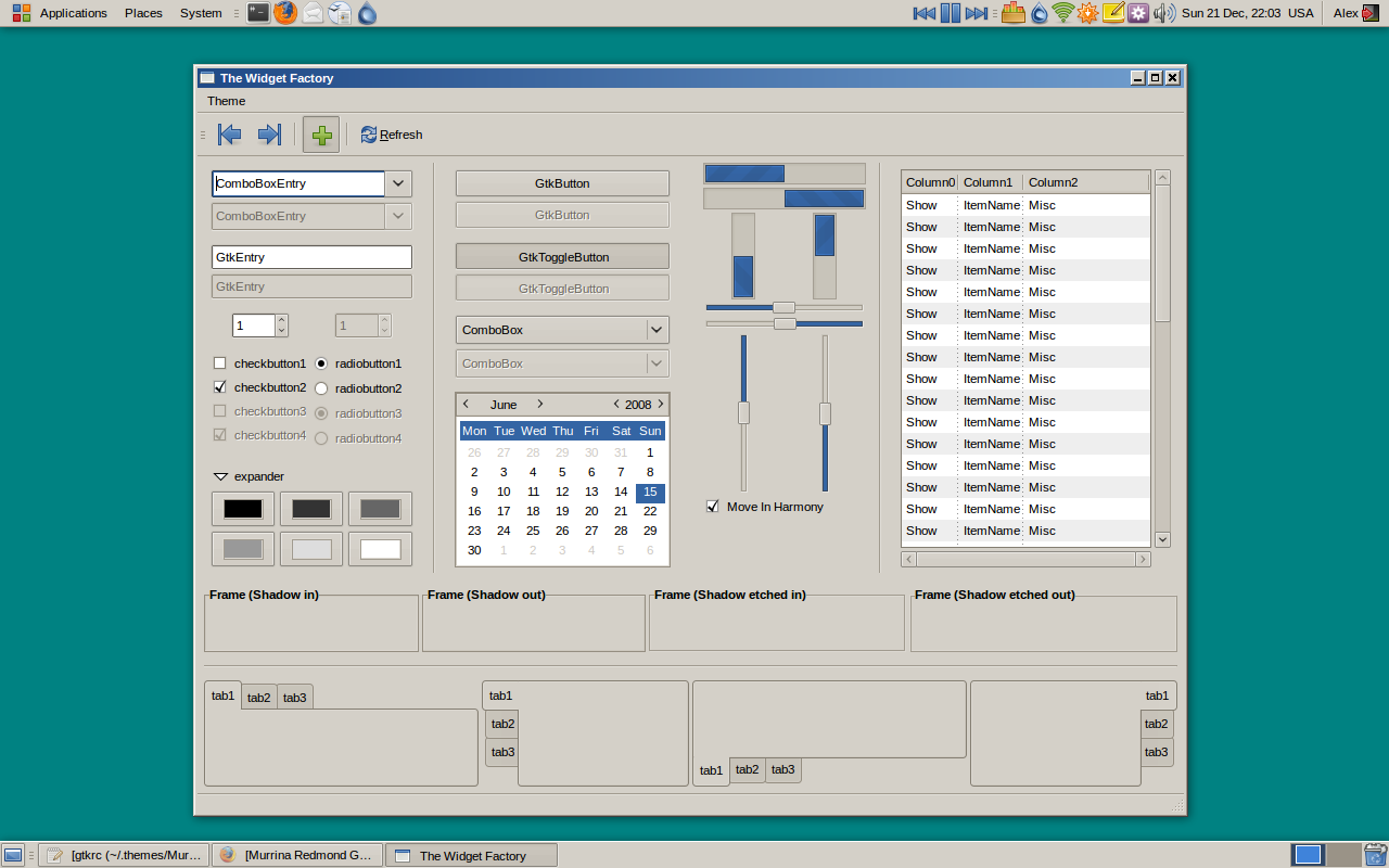
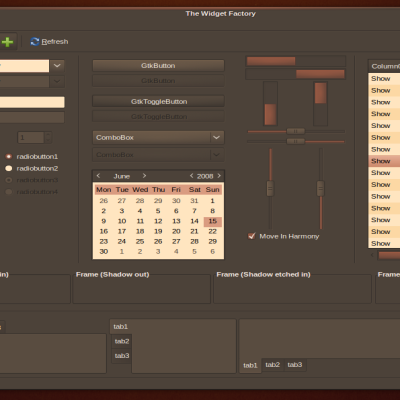
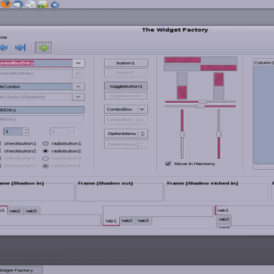
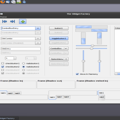
Description: I always thought that Windows 95/98/2000 had a clean if stark look. This is an attempt to keep the less is more spirit of the original, but updating it for the modern desktop.
Some notes: * Requires SVN murrine, which ships with recent versions of Ubuntu and, I assume, other distributions. * The colour scheme is not entirely faithful to the original. If you want to try it out (and see why I changed it) look for the two values you need to change in line 6 of the gtkrc. * The background is #008282 * If you decide to comment remember that this is not the proper forum to express your opinion of Microsoft or its products. This is a website for Linux users, so I assume we all know where we stand. Right?
1.1 - Made the selection background conform to the tango palette for a more gnomeish look. - Includes a modification of Look 2000 metacity decoration that uses the tango palette. - Adjusted the value of the background. It's now identical to 2000/Me. - Corrected the colour of tooltips. - Made insensitive text darker for better visibility. - Fixed inconsistency with unselected radio/check in menu. - Fixed combobox bug I introduced with 1.01. - Enlarged size of sliders by 1px (closer to original, but still sideways). - Slight alternation (by 0.05!) in the prelight and active value, to match scrollbars - Fixed nautilus location bug
1.01 - Wouldn't you know it? A minute after I release this I realise I have stumbled into a known murrine bug. Switched the menus to a different style. Sorry folks!
The window border gradient effect isn't showing. it's just a solid blue bar. I'm using the Redmond window manager that comes with Xubuntu, should I be using something different?
In xfce, the window title bar doesn't have the gradient effect, it's just a solid color. Is this supposed to happen? I would prefer the gradient effect for nostalgia's sake :)
normally I crap on windoze themes from a great height but this one really works well...
...and for the authentic font look try Tahoma 8 - full hinting and no anti-aliasing (smoothing).
Excuse me? I think that you are a very very mature person then. If this is so, then you can understand that in this site are many people that work hours and hours (free) in the hardness process to make something different, something original and creative for self express your own capabilities in the art to make themes.
The present theme is poor in some aspects, and the point is very simple, If you find windows to have a beauty environment for you and work better for you, then use Windows.
This site is for Gnome development, to have many new ideas to improve the desktop for the different SO based on.
And, my Good votes are for Good themes, for people that work hard every day.
Thank you.
Please. Just because I like the look doesn't mean I like the OS. I've been using *nix long before you hopped on the Ubuntu train.
Quit being such a fascist.
Hi,
I like this theme! :D To bad the Metacity theme look's like crap for me on Ubuntu 8.10. :/ I've uploaded a picture here: http://pici.se/pictures/ZANRJWnoM.png
As you can see the left icon gone missing and the buttons to the right looks really strange?
/Hund
I know about this problem. The metacity is based on 2000 Look, a theme made in 2006 when smaller resolutions were common. I'm working to create a better alternative. But in the meantime either use a smaller font or use another decoration. (I like Mist ;)
I've tried a smaller size on the I'm using (Sans Bold) but I can't get it to look good anyway. :/ Any tip on a font and size that makes it looks good? :)
Try Sans Bold and in the GNOME Appearance Preferences manually enter a size of 8.8.
This seems to be the largest value that does not break the theme.
I personally use liberation sans (they're available with most distros) with a value of 8.6 regular for applications, 8.6 bold for the metacity, 9 for documents, and 9 bold for the desktop. I like small fonts, I used the artwiz fonts for years :)


Ratings & Comments
34 Comments
The window border gradient effect isn't showing. it's just a solid blue bar. I'm using the Redmond window manager that comes with Xubuntu, should I be using something different?
In xfce, the window title bar doesn't have the gradient effect, it's just a solid color. Is this supposed to happen? I would prefer the gradient effect for nostalgia's sake :)
Perfect!
Nice theme, but I wish there was more contrast between the scroll bar and scroll bar background.
Could you add this to your theme? GtkEntry::honors-transparent-bg-hint = 1 This fixes a weird white outline on the Firefox 3.5 url bar.
Mozilla needs to match XUL to GTK+, X11 and not vice versa.
But this one does really work great, I love it. Good work, seriously!
normally I crap on windoze themes from a great height but this one really works well... ...and for the authentic font look try Tahoma 8 - full hinting and no anti-aliasing (smoothing).
I have to say that months later, "crap on X from a great height" is a terrific snowclone.
hehehe... also, very good and simple theme.
vote++
Its an awesome work, it doesn't matter if its a windows theme, this is better than others works I've seen here... All the best
Awesome???
More Windows XP look, excuse me: NO please.
Grow up. You don't like the classic Windows look? Fine, don't use it. I and apparently lots of others do.
Excuse me? I think that you are a very very mature person then. If this is so, then you can understand that in this site are many people that work hours and hours (free) in the hardness process to make something different, something original and creative for self express your own capabilities in the art to make themes. The present theme is poor in some aspects, and the point is very simple, If you find windows to have a beauty environment for you and work better for you, then use Windows. This site is for Gnome development, to have many new ideas to improve the desktop for the different SO based on. And, my Good votes are for Good themes, for people that work hard every day. Thank you.
Please. Just because I like the look doesn't mean I like the OS. I've been using *nix long before you hopped on the Ubuntu train. Quit being such a fascist.
Hi, I like this theme! :D To bad the Metacity theme look's like crap for me on Ubuntu 8.10. :/ I've uploaded a picture here: http://pici.se/pictures/ZANRJWnoM.png As you can see the left icon gone missing and the buttons to the right looks really strange? /Hund
I know about this problem. The metacity is based on 2000 Look, a theme made in 2006 when smaller resolutions were common. I'm working to create a better alternative. But in the meantime either use a smaller font or use another decoration. (I like Mist ;)
I've tried a smaller size on the I'm using (Sans Bold) but I can't get it to look good anyway. :/ Any tip on a font and size that makes it looks good? :)
Try Sans Bold and in the GNOME Appearance Preferences manually enter a size of 8.8. This seems to be the largest value that does not break the theme. I personally use liberation sans (they're available with most distros) with a value of 8.6 regular for applications, 8.6 bold for the metacity, 9 for documents, and 9 bold for the desktop. I like small fonts, I used the artwiz fonts for years :)
THank you very much. It's looking nice finaly! Cygoku
This theme is quite nice. Brings back the cleaness of the classic Windows look. Thanks for sharin'. :)
I'm impressed by this theme. Not my kind of thing but it is so well made. You deserve it! +1 Good!
Where is it ?!?! Cygoku