

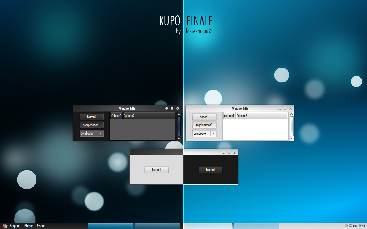
Simpleton
lassekongo83


Source (link to git-repo or to original if based on someone elses unmodified work):
1.01
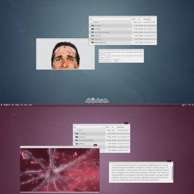
- Made some text colors in the dark theme brighter.
- Changed the bg color on tooltips.
- Fixed the Gimp rulers by using the murrine engine.


More GTK2 Themes from lassekongo83:
Other GTK2 Themes:


Ratings & Comments
11 Comments
Wow, peobably the most elegant GTK theme I've ever seen in my life man. Incredible. Awesome. I love it. Can you please contact me via mail? I'm the OpenGEU Linux distro leader, I'd love to develop e17 versions of your themes. You know, OpenGEU is always about Sunshine and Moonlight and these themes just fit the spirit and are incredibly elegant and nice looking. My mail is luca dot darkmaster at gmail dot com
excellent theme! can you upload the wallpapers and the font? i would really appreciate it and im sure others would too... ive tried to find them online but cant :(
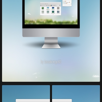
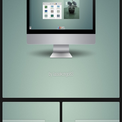
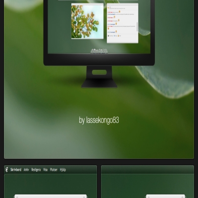
The wallpaper is KDE4's and is licensed under LGPL license, not under CC. You can find it easily by searching "Air" if I remember correctly it's name. But it is KDE4's default between 4.2 and 4.3 releases.
...the required "GTK+ theme engine " is not installed. What have I to install?
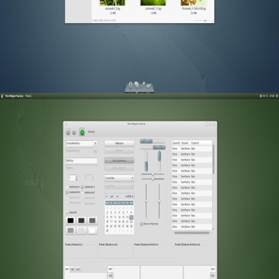
For this style to work correctly you'll need: gtk2-engines-pixbuf gtk2-engines-murrine gtk2-engines-mist (It may still display a message box in the Appearance window, but it can be ignored.)
very clean looking.
For my taste. But the theme is good.
Very good! Tell us: Which font are you using in the screenshot? Check the Black Theme again. There are some texts that are same color or nearly same as background. With epiphany browser and in evolution (search field) I can see a border around the URL when not focused which is not supposed to be there (black in dark theme, grey in light theme) Oh and the disabled buttons have unreadable text in the dark version. One more thing - just a suggestion - make the active buttons visible (for keyboard users) and also highlight the active input field better. Some buttons are carved in and some are stamped out (see evolution - new button is carved others are stamped) or font dialog for example - is this by design?) I would prefer stamped, also for dropdown boxes. Still I like it very much! Thanks! Voted good of course...
The font is Futura. I've updated some of the text colors, so most of them should be visible now I hope. The search field in epiphany is supposed to be like that. The black border styles many other applications too in different areas. I'll see what I can do about the higlights when I have time. :) The Combo boxes in Firefox, evolution etc are bugging me too. I haven't managed to find a fix for this yet, but I'm sure it's possible to do something about it.
When you put your mouse over a button from your Emerald theme, the tooltip balloon that popup up can't be read. Same color on same color. Cygoku
As said on dA, this is your best pixmap theme, IMO. /izo