


Ambiance-Humanlooks
scarrs


Source (link to git-repo or to original if based on someone elses unmodified work):
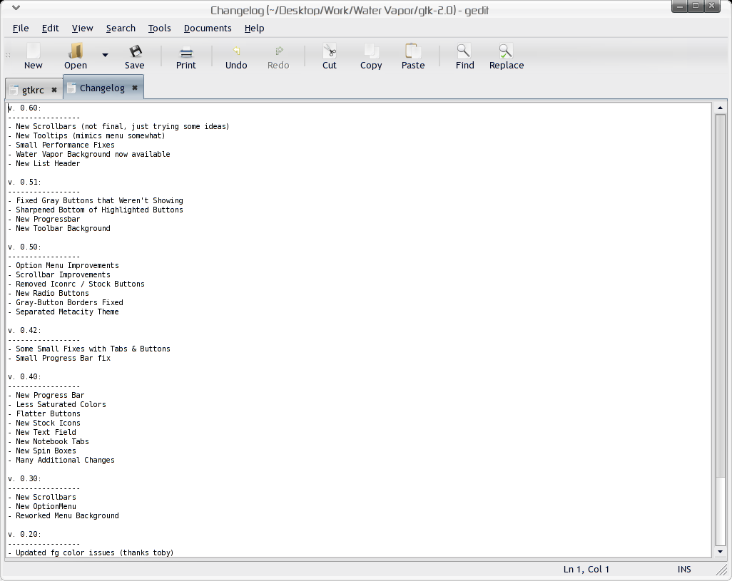
v. 0.70:
-----------------
- New Tab Graphics
- Tabs all same size now
- Added a Menu Background Gradient
- Gave tooltips a little more gloss
- New checkboxes
v. 0.60:
-----------------
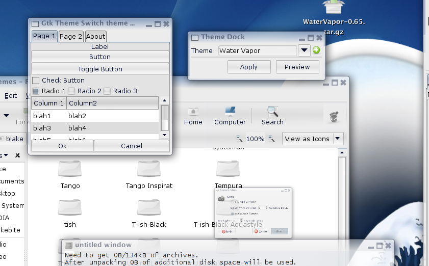
- New Scrollbars (not final, just trying some ideas)
- New Tooltips (mimics menu somewhat)
- Small Performance Fixes
- Water Vapor Background now available
- New List Header
v. 0.51
-----------------
- Fixed Gray Buttons that Weren't Showing
- Sharpened Bottom of Highlighted Buttons
- New Progressbar
- New Toolbar Background
v. 0.50
-----------------
- Option Menu Improvements
- Scrollbar Improvements
- Removed Iconrc / Stock Buttons
- New Radio Buttons
- Gray-Button Borders Fixed
- Separated Metacity Theme
v. 0.42
-----------------
- Some Small Fixes with Tabs & Buttons
- Small Progress Bar fix
v. 0.40:
-----------------
- New Progress Bar
- Less Saturated Colors
- Flatter Buttons
- New Stock Icons
- New Text Field
- New Notebook Tabs
- New Spin Boxes
- Many Additional Changes
v. 0.30:
-----------------
- New Scrollbars
- New OptionMenu
- Reworked Menu Background
v. 0.20:
-----------------
- Updated fg color issues (thanks toby)
- Changed default buttons to gray
- Steepened Menu background gradient
- Added Prelight for Option Menus
- Some other crap, etc etc.
v. 0.10:
-----------------
Initial Release.


Other GTK2 Themes:


Ratings & Comments
75 Comments
Excellent on the eyes. However, the site that was hosting your background image is apparently no longer in existence. Can we get a mirror?
Indeed. I love it.
Very good.
I would first like to say that I liked your theme and that I wouldn't take the time to comment it otherwise. Regardless of what I thought of your theme it seems to overload Xorg process in gnome ( most recent stable version from today ) . That wouldn't be a problem for most users, the only problem they would have is a ocasional performance loss. On the other hand, in my case, I am an user which doesn't like ( can't afford ) performance loss due to my system ( it has some hardware issues and can't get too hot ). So, if possible, i would like to suggest you to do a lighter, more useable, theme. By the way I would also like to say that in other computers ( not this one ) i use your theme.
Are you still working on a new version? I'm anxiously awaiting it :-)
This is a great theme! Are you working on a new version? What changes will it include? Also, any chance that this will be ported to cairo in the future?
Glad you like it. I am still developing this theme-- I've just been very busy lately so I haven't dedicated much time to it. After the holidays expect a major update! Next release should include: - More scrollbar work-- mainly redoing the arrow buttons. - I feel like the tabs need more work too. - A colorpack - I'm going to start with a clean, boring black/grayscale pack first. - the radio buttons and checkboxes need major work as well. - I'm not sure what else.. suggestions for improvement are appreciated! As far as porting to cairo, I'd love to at some point. Right now it's based on the pixmap theme engine, and I think to get the effect I want I'm going to have to use a different engine or build my own..? So to answer your question, yes, at some point I will port this to a different engine, and it would be excellent to make it a cairo/glitzy theme.. i'd love to add some animation a la the recent clearlooks animation hacks.
I can hardly wait... Some suggestions maybe, a background color or texture for the menus would look good. And some speed improvements would also be nice, but I guess that is because of the engine, the clearlooks one is faster, so if you port it at some point in the future, that will take care of itself. Thanks for your excellent work.
i really love this one! some suggestions though, i don't particuarly like the tabs getting bigger when you click them, or at least not as much as they do now the scroll bar can kinda get lost when it is all the way up or down, i keep seeing the light color as the bar, maybe some type of border to make the distinction stand out
i think you should set the ysickness in the tabs section to "1" because that this lets the tabs look nicer
The 0.6 version is simplier, yet much better than previous ones. You may look for sth different as a title bar. The current one is to blended and pale, it looks "sick". Currently, I combine it with "Lush" or "Wasp" titlebar ( which are from Gnome-extras themes ). Also, radio buttons are too much blended, it should be less foggy. The ones from 0.5 version were better, but not very good either. Scroll bar is a different class in comparison with 0.5 version. Two thumbs up! Also you could consider modifying shadows on panels and toolbars, they start now in the middle on panel/toolbar and both edges are bright. It looks unnatural. Shadow IMO should be on the very bottom and maybe occupy the smaller area of the bar. Dont keep us wait long for new versions :) Also, maybe provide some variations to choose from, as other guys do.
You seem to have a high end computer... gtkperf -a with your theme takes 88.76 sec on my 850mhz PIII Laptop with 576 MB RAM, but only 8 MB graphic memory...
Well.. yeah. I do a lot of audio and graphics processing, so I basically built this computer to kick ass. This box is an amd64 3500+ 2.2 Ghz, 1 gb ram, nvidia 5200 w/ 128 mb. Pretty powerful computer, but relatively weak video card. Running a highly tweaked amd64 Ubuntu Breezy. It's damn fast. People who say 64-bit computing isn't worth the trouble must not do much audio/video/graphics rendering. The screenshot is a little misleading though. The first test (16.60s) was Water Vapor, and the second (9.12s) was a Clearlooks theme. I did that for comparison sake. I should have specified that somewhere. Can you give me the full results of gtkperf so I can try and optimize the theme?
Would die for a fast comp like that. But otherwise I could not live without my lappy :) You cannot take a bigtower on your lap to have it convenient on the sofa ;) Here are the values; I remember that I really could see how the radiobuttons were selected and deselected again... mona@valhalla:~$ gtkperf -a GtkPerf 0.40 - Starting testing: Tue Nov 15 19:50:38 2005 GtkEntry - time: 0,33 GtkComboBox - time: 17,36 GtkComboBoxEntry - time: 19,14 GtkSpinButton - time: 2,09 GtkProgressBar - time: 1,25 GtkToggleButton - time: 6,04 GtkCheckButton - time: 6,46 GtkRadioButton - time: 14,78 GtkTextView - Add text - time: 4,51 GtkTextView - Scroll - time: 2,88 GtkDrawingArea - Lines - time: 1,35 GtkDrawingArea - Circles - time: 3,22 GtkDrawingArea - Text - time: 7,71 GtkDrawingArea - Pixbufs - time: 1,64 --- Total time: 88,76 Quitting.. mona@valhalla:~$
Hi, since I complained about scrollbars last time, let me say one thing: The new version looks definately better than the old scrollbars. They fit much better in your theme. However I noticed a small glitch with scrollbars inside tabs. The colour around the stepper arrows is too light. http://img126.imageshack.us/img126/5210/bildschirmfotothemendetails8il.png Thanks for the update
It is really cool and nice, but the only problem is that I don't like some colours so much: 1) On the screenshot menu background is white or something like that and it is really cool, but with the default package it is gray as backgrounds everywhere with this theme. It would be cool if it is like on the screenshot. It would be cool if all menus had that white like background 2) Secondly I don't like the overall gray backgrounds of windows (I mean what is behind toolbar icons, statusbar and so on). It is a bit too foggy/bright or something and maybe even too dark. My eyes doesn't like it. I don't know what would be better, but something more clean and not so contrasty. Something near white, not so bright and foggy maybe. That's my opinion at the moment after trying this theme. Really cool otherwise. I really like the panel background and button hover effects.
OK, actually the gray is not bad, but even nice. Everything is quite cool. Just the brightness (!). Maybe my eyes are too sensitive at the moment. Maybe just more colour themes ... and that white bacground to menus in some themes ... and less brightness in some themes ... :)
Oh, I already like it now alreay. I was too used to the Clearlooks theme I used before I think, but more themes (not only different colours as red, blue, brown and so on, but also themes that has elemements with different variations - lighter gray, white instead of gray etc.) would be cool. Now I don't like the black line below and on the right of the panel. A screenshot of it: http://img397.imageshack.us/my.php?image=taskbar7eb.png It just doesn't seem so smooth and beautiful... Thank you very much for this theme! :D
Thanks. There is absolutely no reason why the background to your menus should look different than the screenshot... I think something is b0rked with your system. Try running "rm -r ~/.gtk*" to clear your gtk configuration, then set your theme again. Let me know if that works. As far as the panel bug goes, I get that too; it happens when you have the "hide buttons" enabled. An easy fix is to go into the panel-properties->background tab, then instead of using "None (use system theme), use "Background Image", and point it to the panel_background.png in the /Water_Vapor/gtk-2.0/ folder. Hopefully I'll figure out a better way to do this soon.
The panel tip worked perfectly, thanks. Removing those files didn't help. It looks like this (your screenshot is opened in the browser in the background): http://img368.imageshack.us/img368/7845/menubgcolour0kk.png In Firefox, Azureus it works like on your screenshot, but in most gnome applications it is like on my screenshot. I use Fedora Core 4. I really like your theme now. I just wasn't used to it earlier. :)
Actually it doesn't work with Azureus too (any more), but only with mozilla products.
I made a research by google and found out (noticed at last) that the default bg_pixmap[NORMAL] takes over the menu background. I made a 10x10 pixels white .png image, copied it to this theme's gtk-2.0 folder and added the line bg_pixmap[NORMAL] = "menu_bg.png" to the menu section. So it looks like this: ... style "wv-menu" { bg_pixmap[NORMAL] = "menu_bg.png" ythickness=3 xthickness=5 engine "pixmap" ... This hack works nicely. COOL!
Sorry, I got this theme mixed with another- The colours aren't mixed up.
Looking good here. I like the graphics used, though they seem to make it rather slower than other themes. Menu and other colours seem to be off slightly, which are probably due to it being unfinished.
hi, after change to your theme my system runs a bit slowly, open "system monitor" i saw xorg using 30% of CPU (viewing all processes), comparing with Industrial theme falls down to 9%. My system is a P4 1.7, 256 RAM, TNT2 M64 32 VRAM (using nvidia drivers). Some other "stylish" themes cause this CPU usage too. There is someting which can change this behavior? Best regards!!!