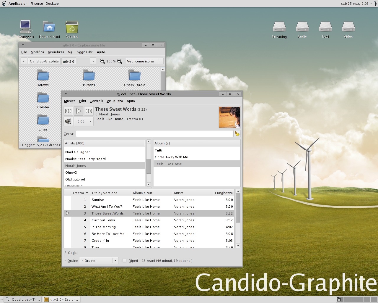
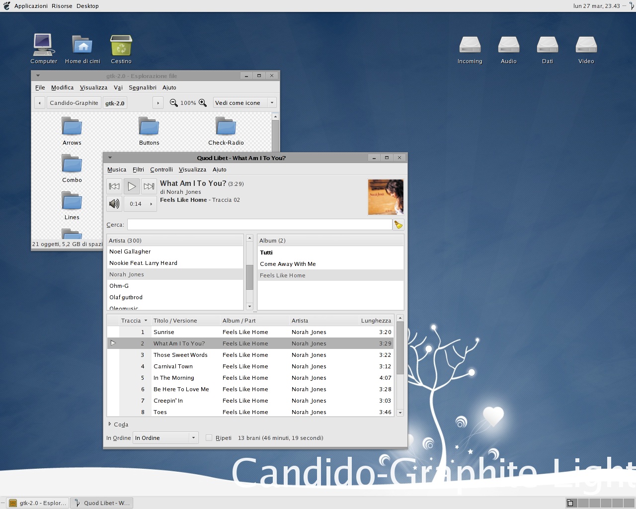
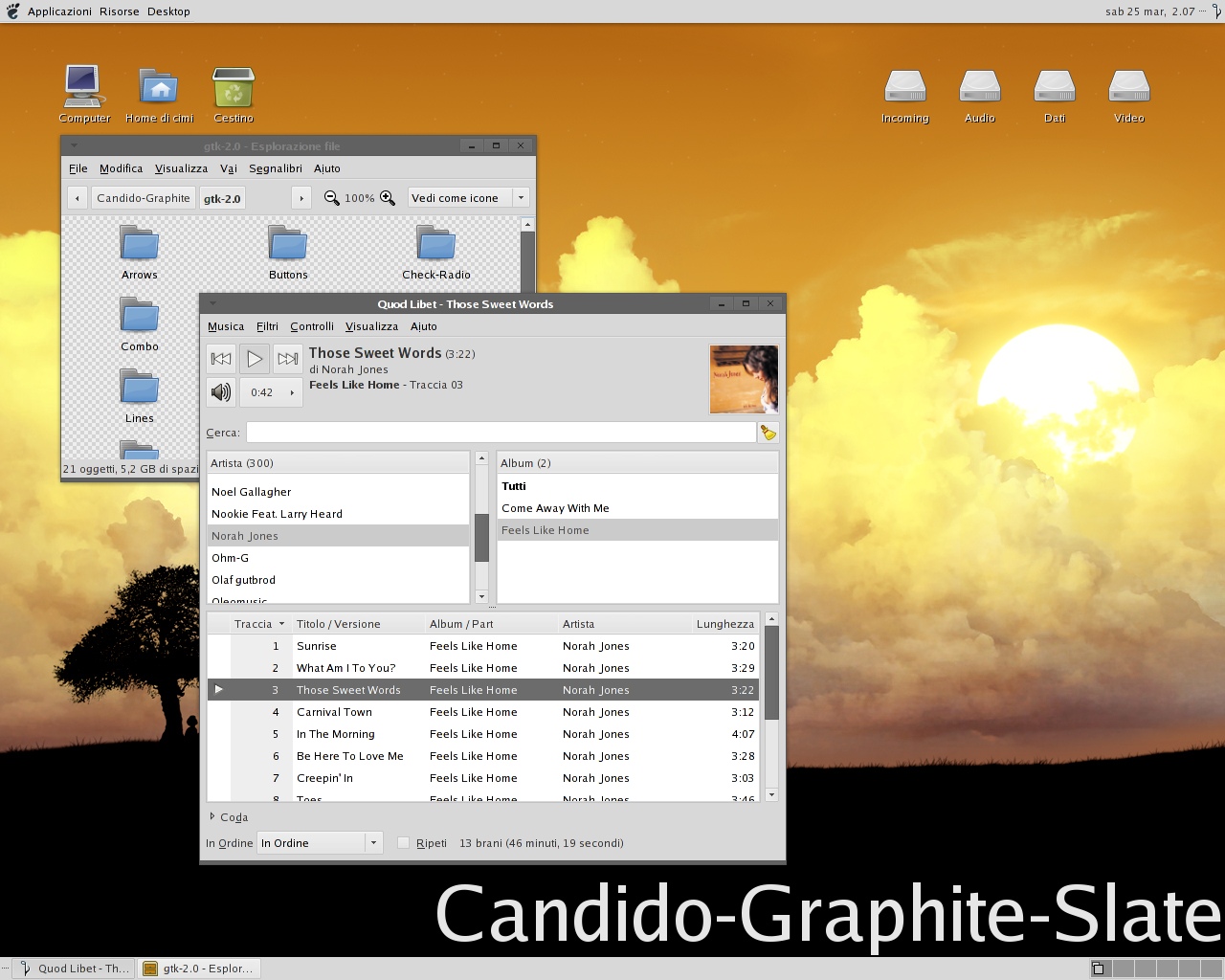
Description: This is my first color modification of "Candido". it is based on a main darken color mod with three variations: the default version, a Light version (which is lighter ), and a Slate version (which is almost black).
You can also download nice style improvements like KDE color scheme to perfectly merge among Gtk apps running Candido-Graphite themes. I've made also two nautilus background. The old metacity (but still updated with main changings of Candido-Graphite themes) are still available for download as "Candido-Graphite-Fat" metacity themes. Under Xfce you can use "Candido" xfwm4 theme (follow the link).
I hope you like my works and my personal taste. Thank you have a nice time with these Candido-based themes.
ADDED LINK TO OFFICIAL WALLPAPERS.Last changelog:
[Jun 11th,2006][1.6] Improved Compiz and Xfwm4 compatibility for window borders, by adding correct line into the gtkrc files.
[Apr 1st,2006][1.5] Adjust some colors in the gtkrc of the three themes (changed for example selected text ans focused items). Updated Candido-Graphite-Fat metacity buttons to 1.4 brighter style.
[Mar 25th,2006][1.4] Made scrollbar-prelight and range-prelight and metacity-prelight buttons more bright in all themes (20% in Slate and 10% more bright in light and default).
[Mar 25th,2006][1.3] New option radio buttons. Modified menubar insensitive color (there were a mistake in the color). Added selected check and option buttons for insensitive state (more usable).
[Mar 25th,2006[[1.2] Made a little shadow for selected buttons.
[Mar 25th,2006[[1.1] Simple but GREAT improvement in looking! "Modified metacity left and right edges", now thin! The theme now looking at its best.
hi, can you please tell me how can i put Gnome icon in tittle bar like you have please?
i have the UbuntuStudio theme installed, and every time i put a new theme the brown ubuntu icon is not replaced, how can put Gnome icon by default in any theme?
I love this theme. I was wondering why the window buttons don't change when I apply it. there the same no matter what theme I use actually. I'm using SLED 10.1
yes, I'm new to linux. very new. but I'm trying to learn. That's where all you wonderful and helpful people come in.
thanks in advace for any input on this problem.
~ pixeltarian
Hello cimi86,
thank you for your great work. I was looking for a theme like this for a long time. Beside the colors I really like the not rounded buttons an the style of the activated toolbar buttons. Some suggestions to improve this fantastic theme:
Menuitems: An activated menu item in Firefox and OpenOffice does not look correct. The icon is outside the box of the hilighted menuitem. In addition to this, the box could be some pixel higher so the icon does better fit into the border of the box. And the box might be more nice as a flat box without a gradient.
Scrollbars: Since I'm used to see darker colors as background I always try to click beside the scollbar-button. So I would prefere to change the colors, or even better to implement the scrollbars from "Ubuntulooks Graphite" that is really nice.
Buttons: Their look and behavior in toolbars is perfect, whereas on other places, like in Totem they get darker on rollover. I think it would be better if they always get lightened on rollover.
The ubuntu application menu has a not so nice bottom border.
I miss the application icon in the window title bar.
Anyway, this is the best theme for me at the present, so I feel lucky with it. Thank you for your work
regards
harry-b
-
thanks for your feedback... I'll try to fix the menuitems bug, because for the moment I prefer to mantain darker prelight effect on mouseover for buttons. (I haven't understand what do you suggest for improve the scrollnars... make them lighter?)
I'd also suggest to switch the colors of the scrollbars so that the background is dark and the foreground is light. So the bar would have the same color as buttons. In one of your screenshots it looks like there are two scrollbars when the bar is in the middle. ;)
Fantastic theme by the way. Keep up your great work!
I think all of your modifications are wonderful and I'm especially fond of the slate. Only thing is, perhaps you'd want to make the little symbols in the minimize, (un)maximize, and close buttons white when you have the slate, like you did with the text. Anyways, Wonderful work!
I like these Candido themes a lot--very understated. My only comment is: I'm a strong believer that the active title bar should be a different color than the inactive title bars, because otherwise I often end up clicking on the wrong window. Why not make the inactive title bar the same color as the widgets? Anyway, good theme overall. And I like your choice of Quodlibet for a music player.
Last advice is correct. But, if you need to set by hand this theme, ie: you are using fluxbox like me but love GTK2-Gnome apps for stability and speed.
You need to edit the file .gtkrc-2.0 located in your home directory-folder.
If that file don't exists at all, make it and write: include "path to theme file /gtkrc"
Hope you could understand this.


 ), and a Slate version (which is almost black).


Ratings & Comments
37 Comments
hi, can you please tell me how can i put Gnome icon in tittle bar like you have please? i have the UbuntuStudio theme installed, and every time i put a new theme the brown ubuntu icon is not replaced, how can put Gnome icon by default in any theme?
Where can I get the background with the tree and the hearts coming out of it? Thanks!
I love this theme. I was wondering why the window buttons don't change when I apply it. there the same no matter what theme I use actually. I'm using SLED 10.1 yes, I'm new to linux. very new. but I'm trying to learn. That's where all you wonderful and helpful people come in. thanks in advace for any input on this problem. ~ pixeltarian
you recommend for this theme?
tango or giøn
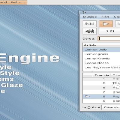
Very nice theme. BTW what is that audio player on your screenshots? I've seen it many times but don't know what's that...
quod libet
Hello cimi86, thank you for your great work. I was looking for a theme like this for a long time. Beside the colors I really like the not rounded buttons an the style of the activated toolbar buttons. Some suggestions to improve this fantastic theme: Menuitems: An activated menu item in Firefox and OpenOffice does not look correct. The icon is outside the box of the hilighted menuitem. In addition to this, the box could be some pixel higher so the icon does better fit into the border of the box. And the box might be more nice as a flat box without a gradient. Scrollbars: Since I'm used to see darker colors as background I always try to click beside the scollbar-button. So I would prefere to change the colors, or even better to implement the scrollbars from "Ubuntulooks Graphite" that is really nice. Buttons: Their look and behavior in toolbars is perfect, whereas on other places, like in Totem they get darker on rollover. I think it would be better if they always get lightened on rollover. The ubuntu application menu has a not so nice bottom border. I miss the application icon in the window title bar. Anyway, this is the best theme for me at the present, so I feel lucky with it. Thank you for your work regards harry-b -
thanks for your feedback... I'll try to fix the menuitems bug, because for the moment I prefer to mantain darker prelight effect on mouseover for buttons. (I haven't understand what do you suggest for improve the scrollnars... make them lighter?)
I'd also suggest to switch the colors of the scrollbars so that the background is dark and the foreground is light. So the bar would have the same color as buttons. In one of your screenshots it looks like there are two scrollbars when the bar is in the middle. ;) Fantastic theme by the way. Keep up your great work!
Where can I get the wallpaper thats in the first screenshot with the windmills?
http://www.deviantart.com/deviation/24425297
I think all of your modifications are wonderful and I'm especially fond of the slate. Only thing is, perhaps you'd want to make the little symbols in the minimize, (un)maximize, and close buttons white when you have the slate, like you did with the text. Anyways, Wonderful work!
It's better with black symbols because slate buttons are not so dark as the title.
I like these Candido themes a lot--very understated. My only comment is: I'm a strong believer that the active title bar should be a different color than the inactive title bars, because otherwise I often end up clicking on the wrong window. Why not make the inactive title bar the same color as the widgets? Anyway, good theme overall. And I like your choice of Quodlibet for a music player.
See Candido-Selected!!! It's for you.
This theme is nice. Thansk for sharing. What settings are you using for xcompmgr. those shadows look nice.
xcompmgr -c -r3.5 -o.45 -l-5 -t-4
cimi86 thanks :-)
Hi, Which musicplayer is it? On the one hand, it looks like rhythmbox, on the other not. Greetings
Quodlibet
Hi there, the theme looks great, but I'm a real newb and I don't know how to install it Can anyone help me??? thanks
Of course! Decompress the directory into /home/YOUR-USER/.themes
Last advice is correct. But, if you need to set by hand this theme, ie: you are using fluxbox like me but love GTK2-Gnome apps for stability and speed. You need to edit the file .gtkrc-2.0 located in your home directory-folder. If that file don't exists at all, make it and write: include "path to theme file /gtkrc" Hope you could understand this.
I just wanted to say that this theme is very nice. It's professional, elegant, and easy on the eyes. I like it a lot. Thanks