Motivation:
I personally find the plastik title bar (window decoration) too thick, and the only way of making it smaller is shrinking the font size, which many may be reluctant to do. I'm also partial to round title corners
Also having bahira as a default theme may be a little tricky because of legal issues. The baghira [style] is nice, but uses up a little too much resources and may be a good "default" on low-end computers.
Description:
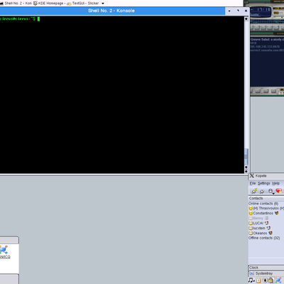
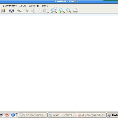
Plastic style + baghira window decoration (red-yellow-green buttons changed to silver as shown). Also, minimum title height is set to 22.
No need to worry about the newbies not know which button is minimize/maximize/restore, etc because
thomas12777 already implemented them as hover-ons.
The color scheme is basically the default plastik with some changes with the active/inactive title text color changes (black=active white=inactive).
low resource footprint, very clean, and colors match between the windeco and style. Colors works well with crystal svg icons, and of course no need to worry about getting into trouble with apple's trademark.
Again, not much tweaks, but I think should be the default in upcoming KDE releases.
1280x1024 Screenshot under download link:
http://themes.kde.org/content/show.php?content=18636


Ratings & Comments
10 Comments
Round corners may be pretty, but: you want buttons to reach the very corner of the screen when maximized. See point 1 in this article for an explanation why: http://benroe.com.nyud.net:8090/files/gui.html With round buttons and corners, you either don't put the buttons on the corner or it does not look like they do. Either way, it is suboptimal from a usability POV.
OSX gets around that by actually having a black bit in the corners of the screen to effectively make the whole screen have rounded corners. I'd be surprised if there wasn't some way to emulate that, but honestly, what's the point? If you want a Mac, get one. :-D Other than that, would it be possible for it to use a different image when maximized so that it has rounded corners normally, but squared ones when maximized?
>>Other than that, would it be possible for it to use a different image when maximized so that it has rounded corners normally, but squared ones when maximized? the knifty theme does that
I'm sorry I dont want to be cinical but you want KDE to look like your desktop out of the box? Why would that benefit us? What kind of improvement is this to KDE? Isnt that why you we have styles, themes, window decorations, etc...so you can change what you dont like? KDE should optimize their code or add new features or tweak already existing ones, maybe make UI changes, but I dont think making it suit one particular users fancy is an "improvement"...
lokheed. you're completely right about people having the right to choose different styles, deco, etc, and i'm not asking that to be taken away, hell no. this may not be correct "solution", but i just think the current keramik win deco takes up way too much screen space by default. how will this benifit kde? since kde is now *the* desktop environment and has matured so much, i think it'll be a good idea to have something look a lot more professional. The styles for the most part are ok, but most dont resemble that "professional" edge. I hope I'm not offending any users or designers here because I appreciate all their hard work. The main thing is that the default theme(s) should be included in the official kde release (maybe some other or most probably not this one because i see that no one here likes it :). Lot of the ones that come with the packages arent useable. I dont think anyone here uses the CDE, system++, or the laptop window decoration here. so something needs to be done in the packaging. The first-time user is not going to know where to download themes. The sys admin may have set limited disk quota making it hard for users to install their own themes. If it's listed in the control center, looks nice, and doesnt hog up memory, then they'll use them. Really don't mean to offend anyone here but it's good see that this is stirring up some comments from all of you.
it is too much MacOS X-inspired. Default KDE theme must be completely different, not a Luna or MacOSX-like one.
Too much inspirated? :) Baghira is clearly a *clone*, so it's clearly obvious it could never and never be set as KDE default, neither enter kdegraphics nor kdelibs. (the same has to be applied to Luna clones or other clones). KDE-look is the only right place where they could stay.
And what about "Redmond", and "CDE" styles? Aren't they "inspired" by win9x and CDE respectively? They are included in kde default packages, so a user running kde for the first time can choose the Look'N'Feel he likes: CDE, Windows, KDE-2x like and MacOS classical. Why not to include something that looks like MacOS X? Just don't include anything as bloat-looking as Luna-clones :) Another proposal: in kde first time config dialog there should be a line saying: "For more styles/themes/icons/wallpapers visit www.kde-look.org" - this site would get more visitors and, probably, submitters!
To remove menu items (file, tools, help, etc): http://www.mozilla.org/support/firefox/tips#app_mainmenu To customize toolbar buttons: view -> toolbars -> customize then drag your navigation buttons, bookmarks toolbar button to where you want.
How did you get firfox's navbar buttons and menu items merged into a single toolbar like that?