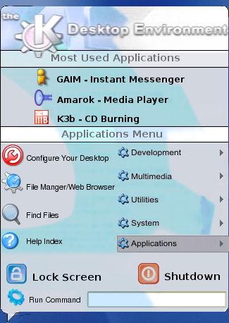
Description: Just a mockup. I believe the current Kmenu needs a facelift. I'm no longer a NEW linux/kde user...but my first impression was that the kmenu was kind of..boring...ugly I'm use to it's look, but still, I think that it needs change. I didn't try to emulate or copy the windows xp start menu...not at all. I simply put my vision onto the screen and into a picture. I know many people may have a problem with a menu such as this...mainly because windows has a menu that may look SIMILAR...but come on people...SOME things windows has is nicer than linux (IMO hiding systray icons). As stated above..this is my vision, only screenshots. I really think that the kmenu needs a new..modern look, and this is what I came up with.
windows? windows? why another windows?!?
sorry - maybe I'm tierd... it late at my timezone, but pls explain to me : why do people love windows theme?!? I remeber times of kde 2.x ... great themes! innovate ones!
and now?! plastik, windows, baghira.... it sucks!
Regards,
Przemek
While Windows may have some admittedly nice interface touches, honestly, I think the systray icon hiding and the huge, bloated start menu are two of the negative additions to XP. They both allow things to get lost easier. KDE definitely has the advantage there.
if you dont like the kmenu, then why do you use it? you can do without!
i just made a menu myself that includes only my 6 (most) used kde-apps(juk, kontact, konqueror, kcontrol, konsole, kpackage) that apperas on leftclicking somewhere on the desktop area and for everything else there is the programstarter applet of kicker, that gives you superfast access to all apps!
Lots of posts here on kde-apps and kde-look try to find ways of improving KDE menu -- among other things :-) but most of the ideas are inspired by Windows. Now admittedly, we've got *used* to the Windows interface but its not perfect and in fact it lacks some very common sense things.
I feel the KDE menu has its own strengths and one should build on that rather than clone XP.
Hey thanks for the comment.
I agree...a windows clone is not the answer..and maybe my menu isn't very good but I'd still like to see some kmenu improvements in the future. I still think it's boring :P. Other than that, kde is great.
What if I WANT several apps docked in my panel..but they take up too much room? What if I don't want to SEE them all at once..but still want them there for easy access? That way I can still have them..but can hide them...and SAVE room. I'm sorry, but it IS useful and it's user friendly.
I get what you're saying..but for me, allot of apps I use have traydocks..and I do want them there, just not always showing. Azureus for example..and klipper. I also use gaim and amsn which have icons that I want...and I use amarok for media playing..which i do allot of..and that has a sys tray icon. I only like about 3 or 4 icons showing..the rest can be hidden and i can simply use them when needed with a single click of the un hide arrow.
I myself find it useful, but it's all personal preference.
I don't see how a menu like this is not functional? On the left..their are just basically quick links to apps...for easy and quick access. You would be able to change them to whatever you want...the right part is the actual menu..which obviously belongs there. Top..most used apps..oh noes we have that already...and an integrated run command for fast access. I can see maybe you don't like the design, but it would definitely be functional.
Personally, I like kde's overall gui way better than windows, but I still say that the windows menu is by far better. It works fine..minus the slowness of windows and how long and sluggish it takes to open *which I doubt that would in happen in kde*. Also..the kde menu is bland..I see nothing wrong with enchanting it with some graphics and making it look nice.. I'm not exactly sure what the problem is with this, unless you people are so scared that something on linux may one day resemble windows. If you keep acting as if windows has copywritten niceness, linux nor kde will ever move forward. It will stand still or go backwards.
What if this menu was one column..then what? Would this be more appealing?
I think I am the only one that likes the KDE Menu the way it is. Actually if the headers (All Applications, Actions, etc.) were able to be hidden, it would be perfect. Adding your own seperators would be really nice too.
I like simple, minimalist, and clean. This "improvement" is horrendous. Its poorly done, poorly executed and the fact that it rips off the Microsoft one almost to a tee is also dissheartening.
I looks like a mess. I hate the MS menu and think they completely fumbled on it and made it anything but usable. To try and copy it (poorly I mgiht add) is just plain wrong.


Ratings & Comments
30 Comments
windows? windows? why another windows?!? sorry - maybe I'm tierd... it late at my timezone, but pls explain to me : why do people love windows theme?!? I remeber times of kde 2.x ... great themes! innovate ones! and now?! plastik, windows, baghira.... it sucks! Regards, Przemek
While Windows may have some admittedly nice interface touches, honestly, I think the systray icon hiding and the huge, bloated start menu are two of the negative additions to XP. They both allow things to get lost easier. KDE definitely has the advantage there.
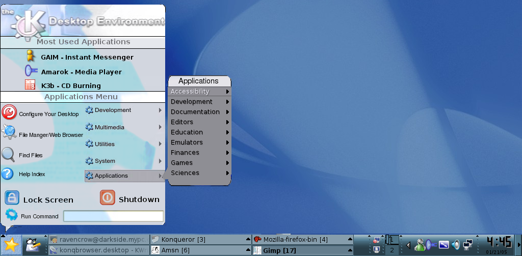
Only difference I see are the text and the little bubble looking things connecting the menu's to the parent.
if you dont like the kmenu, then why do you use it? you can do without! i just made a menu myself that includes only my 6 (most) used kde-apps(juk, kontact, konqueror, kcontrol, konsole, kpackage) that apperas on leftclicking somewhere on the desktop area and for everything else there is the programstarter applet of kicker, that gives you superfast access to all apps!
Like there are different window-themes there also could be some kind of menu-themes. So users have the choice which way they want to look their menus.
elegant. Makes converting Windows users even easier, which is good. As long as you can have an option to switch it back, I think it's great.
Lots of posts here on kde-apps and kde-look try to find ways of improving KDE menu -- among other things :-) but most of the ideas are inspired by Windows. Now admittedly, we've got *used* to the Windows interface but its not perfect and in fact it lacks some very common sense things. I feel the KDE menu has its own strengths and one should build on that rather than clone XP.
Hey thanks for the comment. I agree...a windows clone is not the answer..and maybe my menu isn't very good but I'd still like to see some kmenu improvements in the future. I still think it's boring :P. Other than that, kde is great.
So basically you want the Windows XP start menu for KDE?
uh no..lol. I just want something..nicer is all.
What if I WANT several apps docked in my panel..but they take up too much room? What if I don't want to SEE them all at once..but still want them there for easy access? That way I can still have them..but can hide them...and SAVE room. I'm sorry, but it IS useful and it's user friendly.
I get what you're saying..but for me, allot of apps I use have traydocks..and I do want them there, just not always showing. Azureus for example..and klipper. I also use gaim and amsn which have icons that I want...and I use amarok for media playing..which i do allot of..and that has a sys tray icon. I only like about 3 or 4 icons showing..the rest can be hidden and i can simply use them when needed with a single click of the un hide arrow. I myself find it useful, but it's all personal preference.
This looks just like WinXP - this isn't an improvement. This would be a detriment to KDE.
I don't see how a menu like this is not functional? On the left..their are just basically quick links to apps...for easy and quick access. You would be able to change them to whatever you want...the right part is the actual menu..which obviously belongs there. Top..most used apps..oh noes we have that already...and an integrated run command for fast access. I can see maybe you don't like the design, but it would definitely be functional. Personally, I like kde's overall gui way better than windows, but I still say that the windows menu is by far better. It works fine..minus the slowness of windows and how long and sluggish it takes to open *which I doubt that would in happen in kde*. Also..the kde menu is bland..I see nothing wrong with enchanting it with some graphics and making it look nice.. I'm not exactly sure what the problem is with this, unless you people are so scared that something on linux may one day resemble windows. If you keep acting as if windows has copywritten niceness, linux nor kde will ever move forward. It will stand still or go backwards. What if this menu was one column..then what? Would this be more appealing?
I think I am the only one that likes the KDE Menu the way it is. Actually if the headers (All Applications, Actions, etc.) were able to be hidden, it would be perfect. Adding your own seperators would be really nice too. I like simple, minimalist, and clean. This "improvement" is horrendous. Its poorly done, poorly executed and the fact that it rips off the Microsoft one almost to a tee is also dissheartening. I looks like a mess. I hate the MS menu and think they completely fumbled on it and made it anything but usable. To try and copy it (poorly I mgiht add) is just plain wrong.
I agree. Did you notice the amount of winblows-inspired "improvements" to kde proposed here? This is scary...
You should take a look at the menu of slicker: http://www.slicker.org/setup/modules/gallery/fop/images/menu.jpg THAT's the way how KDE4 should be designed. www.slicker.org
Sorry for double-posting - maybe someone can delete this post or tell me how to do it myself :(.
Is that the actual menu or a mockup? Looks nice though
Yes but given what I've seen one is about as likely to produce code as the other. ...
You should take a look at the menu of slicker: http://www.slicker.org/setup/modules/gallery/fop/images/menu.jpg THAT's the way how KDE4 should be designed. www.slicker.org
That looks great! I would welcome such a k-menu, since i liked it years ago under windows xp as well!
the run command is cool, and I would like the menu to be bigger, but please no 2 columns...