Description: This is an idea for the Control Centre, which to some people is very difficult to navigate. This is mildly inspired by the Mac OS X control centre, which to many people seems to be easier to navigate than so many others. I unfortunately don't have neither the talent nor (currently) the time to do something like this, but I suspect it could be done by re-doing the settings kio slave to output something like this (i.e. change it so it outputs xhtml), and then replace the standard greetings screen in kcontrol with a khtml part pointing to settings ?
Comments? (And code if anyone would )Last changelog:
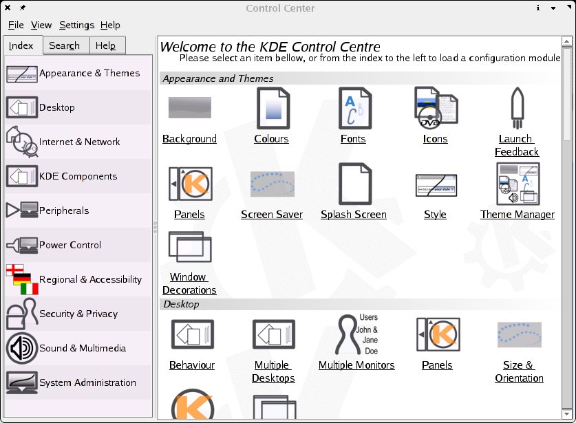
Added a mockup with Crystal Icons (and new screenshots from the KDE 3.2 settings<img class="decoda-emoticon" src="/emoticons/hm.png" alt=""> kio). Also, removed the second / in the settings<img class="decoda-emoticon" src="/emoticons/hm.png" alt=""> addresses above. Woops <img class="decoda-emoticon" src="/emoticons/tongue.png" alt="">
As much as I like tree views (from the current implementation), I find that many people get scared away by them. I like this idea but I would also suggest hiding the more advanced features/settings for non power users. Something to the likes of hiding folders in C:\Program Files until the user clicks on "show files" or whatever. It would help make it easier to search for stuff.
Under System Administration I have "Boot Manager", "Linux Kernel", "Login Manager", "Sony Vaio Laptop...", etc. These are things that aren't used that often (if ever) by some people.
I don't know. reminds me on Microsofts control panel.
I newer liked it, becaus I allways searched for things too long.
Here the things get even worse, because there are many more icons, and people will fast get lost.
Actually no, the MS control centre is what Mission Control tries to do. The closest we've currently got to the MSCC is what I'm suggesting a redesign of (type settings:/ into your Konqueror address bar). Also, the whole "ms design sucks" argument doesn't work. Try telling us exactly why it sucks, then we might take it seriously.
first thought (after looking at the first "screenshot":
"Whaaa.. looks ugly, why is ie "panels" there twice, HEEELP!!!" ;-)"
second thought was, okay, controlcenter could use a bit of makeup.. sure, but it is quite usable, when you first understand what is placed where and why.
So if we change it at all, we should keep a focus on usability!
I didn't know about the settings:/ yet, but I think that one is a good start.
Let's not just change somethink, because it's so [place whatever positive adjective you want here] to change something. ;-)
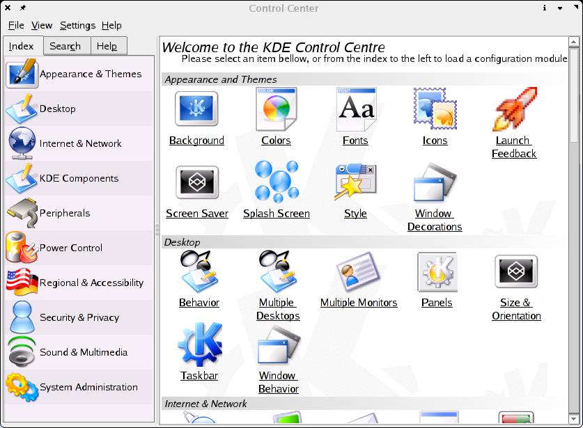
Hmm... You're right with it being there twice. It might be possible in stead to have control centre check wether the settings:/ output is shown, and then hide the sidebar, and only show it when a kcc module is shown inside the kcc shell...
As for the "when you know where stuff is" argument, that's what's ruined many thing for a long time in usability. The problem is, yes it does make some kind of sense, but there is just too much stuff for it to possibly be intuitive, which is really needs to be. This way it's all there, and you only have to scroll up and down a bit, and not click a load of times to find what you're looking for.
And yes you're right as well at the end, where you say don't change anything drastic yet. One possibility would be to change the settings:/ kio slave (maybe do a /all subfolder to it, which then gives the output raw, and a /allcc subfolder giving the output for the control centre (with the appropriate header...)). I may just have to hack my way to this later today, let's see what happens ;)
This is just my opinion but im really sick of ppl comparing or trying to make KDE or Gnome look like a mac. If u want to run mac then go by one. Be original come up with something new. The idea is nice though. I wouldnt use something like that myself but for new ppl maybe it would make their life easier. Good Luck with your project
I do not try to make it look like a mac, it's just the closest I could liken it to in the real world currently. My boyfriend has one, yes, and it is pleasant to use, however I do not wish to just plaster something from it onto KDE, because os x is a complete experience, you can't just take bits, it doesn't work. I just thought that Reinhardt would give my personal opinion on wannabemac kdes away. However, thank you for the encouragement at the end :)
I think your idea is pretty good, perhaps it could be improved but still its a good idea to begin with. Its not bad to look after things that look as cool as Mac Os X does, seriously that system is really outstanding when it comes to GUI. (I wonder if apple was the firs one releasing a real graphics interface). We should look at it, learn from it and do it better if possible. Anyway It never was about copying it, it was about being able to create something that cool too.
KDE is doing a great job, thanks to all.
While I find this http://www.apple.com/macosx/features/systempreferences/
rather easy to use. It's not much different than windows control panel, or KDE Mission Control I posted earlier. And actually looks kind of bland.
While I find this http://www.apple.com/macosx/features/systempreferences/
rather easy to use. It's not much different than windows control panel, or KDE Mission Control I posted earlier. And actually looks kind of bland.
I know Mission Control, and it's not quite what I am thinking of. Mission Control is a complete replacement of the KDE Control Centre, which is not what I am trying to do. I stead, I am trying to suggest a way to just make the existing control centre a little bit more usable (it's ok, but not quite perfect...). And I should note that I'm not being degrading towards anything here, as KDE is really nicely done by now, I am just suggesting a few things to make it even better :)
Now, I know the look of this could be better, but it's just an idea, the final look would probably be rather more like the KDE Help template, but with the lightbulb replaced with a screwdriver or somesuch (like what the header is like in the control centre now...)
Also, Konqueror will complain that the settings:// protocol doesn't exist ;) Sorry, error on my part, it's just called settings:/ (only one slash).
*laughs* You're right, Reinhardt is rather a special style ;) However, the idea still goes, people should be able to figure that one out ;) I don't really like to insult people's intelligence, though of course sometimes it becomes nessecary on the net ;) That said, I will do something, and hopefully have it done sometime really soon :)


 kio slave to output something like this (i.e. change it so it outputs xhtml), and then replace the standard greetings screen in kcontrol with a khtml part pointing to settings
 )
)


Ratings & Comments
16 Comments
As much as I like tree views (from the current implementation), I find that many people get scared away by them. I like this idea but I would also suggest hiding the more advanced features/settings for non power users. Something to the likes of hiding folders in C:\Program Files until the user clicks on "show files" or whatever. It would help make it easier to search for stuff. Under System Administration I have "Boot Manager", "Linux Kernel", "Login Manager", "Sony Vaio Laptop...", etc. These are things that aren't used that often (if ever) by some people.
I don't know. reminds me on Microsofts control panel. I newer liked it, becaus I allways searched for things too long. Here the things get even worse, because there are many more icons, and people will fast get lost.
Actually no, the MS control centre is what Mission Control tries to do. The closest we've currently got to the MSCC is what I'm suggesting a redesign of (type settings:/ into your Konqueror address bar). Also, the whole "ms design sucks" argument doesn't work. Try telling us exactly why it sucks, then we might take it seriously.
first thought (after looking at the first "screenshot": "Whaaa.. looks ugly, why is ie "panels" there twice, HEEELP!!!" ;-)" second thought was, okay, controlcenter could use a bit of makeup.. sure, but it is quite usable, when you first understand what is placed where and why. So if we change it at all, we should keep a focus on usability! I didn't know about the settings:/ yet, but I think that one is a good start. Let's not just change somethink, because it's so [place whatever positive adjective you want here] to change something. ;-)
Hmm... You're right with it being there twice. It might be possible in stead to have control centre check wether the settings:/ output is shown, and then hide the sidebar, and only show it when a kcc module is shown inside the kcc shell... As for the "when you know where stuff is" argument, that's what's ruined many thing for a long time in usability. The problem is, yes it does make some kind of sense, but there is just too much stuff for it to possibly be intuitive, which is really needs to be. This way it's all there, and you only have to scroll up and down a bit, and not click a load of times to find what you're looking for. And yes you're right as well at the end, where you say don't change anything drastic yet. One possibility would be to change the settings:/ kio slave (maybe do a /all subfolder to it, which then gives the output raw, and a /allcc subfolder giving the output for the control centre (with the appropriate header...)). I may just have to hack my way to this later today, let's see what happens ;)
This is just my opinion but im really sick of ppl comparing or trying to make KDE or Gnome look like a mac. If u want to run mac then go by one. Be original come up with something new. The idea is nice though. I wouldnt use something like that myself but for new ppl maybe it would make their life easier. Good Luck with your project
I do not try to make it look like a mac, it's just the closest I could liken it to in the real world currently. My boyfriend has one, yes, and it is pleasant to use, however I do not wish to just plaster something from it onto KDE, because os x is a complete experience, you can't just take bits, it doesn't work. I just thought that Reinhardt would give my personal opinion on wannabemac kdes away. However, thank you for the encouragement at the end :)
I think your idea is pretty good, perhaps it could be improved but still its a good idea to begin with. Its not bad to look after things that look as cool as Mac Os X does, seriously that system is really outstanding when it comes to GUI. (I wonder if apple was the firs one releasing a real graphics interface). We should look at it, learn from it and do it better if possible. Anyway It never was about copying it, it was about being able to create something that cool too. KDE is doing a great job, thanks to all.
While I find this http://www.apple.com/macosx/features/systempreferences/ rather easy to use. It's not much different than windows control panel, or KDE Mission Control I posted earlier. And actually looks kind of bland.
While I find this http://www.apple.com/macosx/features/systempreferences/ rather easy to use. It's not much different than windows control panel, or KDE Mission Control I posted earlier. And actually looks kind of bland.
Yes, you are right it looks a bit bland. However, that would be all up to us. We can make the headers look any way we wish :)
You meen something like this: http://www.pclinuxonline.com/pclos/html/screenshots_10.html It's not exactly the same, but it can be easily modified to look like what your asking for.
I know Mission Control, and it's not quite what I am thinking of. Mission Control is a complete replacement of the KDE Control Centre, which is not what I am trying to do. I stead, I am trying to suggest a way to just make the existing control centre a little bit more usable (it's ok, but not quite perfect...). And I should note that I'm not being degrading towards anything here, as KDE is really nicely done by now, I am just suggesting a few things to make it even better :)
Now, I know the look of this could be better, but it's just an idea, the final look would probably be rather more like the KDE Help template, but with the lightbulb replaced with a screwdriver or somesuch (like what the header is like in the control centre now...) Also, Konqueror will complain that the settings:// protocol doesn't exist ;) Sorry, error on my part, it's just called settings:/ (only one slash).
post an idea with plastik and good fonts and crystal.. reinhard rox, but it's a love/hate theme: you like it or dont :)
*laughs* You're right, Reinhardt is rather a special style ;) However, the idea still goes, people should be able to figure that one out ;) I don't really like to insult people's intelligence, though of course sometimes it becomes nessecary on the net ;) That said, I will do something, and hopefully have it done sometime really soon :)