


SimpleKDE
nunogomez


Source (link to git-repo or to original if based on someone elses unmodified work):


More Various KDE 1.-4. Improvements from nunogomez:
Score 5.0
Other Various KDE 1.-4. Improvements:

Score 5.0


Score 5.0

Score 5.0


Score 5.0

Score 5.0


Score 5.0
Ratings & Comments
11 Comments
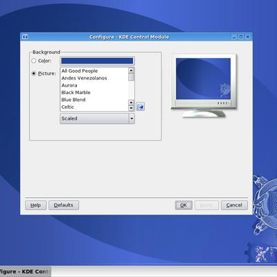
what background are you using and where can I get it?
stupid system, ignore this.
what background are you using?
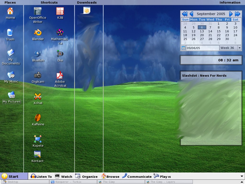
Folks most of you say that bars should be placed at the top and the bottom (as Gnome does). I'll try to explain why I think this is a better approach:
- Personally, these boundaries make me strongly feel that my desktop is limited and I'm not as free as I am with one-bar desktop. I believe I'm not alone in this.
- Almost all of the Windows migrators are used to one-bar desktop. We must not play with general attitudes.
- With this approach, we can consume less desktop place. Because if we make task bar tinier with 2 bars desktop, task bar will get negligible attention; but with this approach, you can make it as tiny as you can, and still get attention at one point.
- This fits very well wih Raleigh Expose approach.
- I think having one single center of focus is better
Additionally, (2) implies also the fact that the desktop starts with 0 verbs (as in Windows), and verbs start appearing with user's interventions.Rather than pushing it up to occupy 85% of the desktop, how about pushing it up a comfortable height, say 1/10th of the screen and showing thumbnails of running apps with a slider or left/right arrows at each edge to see thumbnails that are not visible in the screen. IMO, a similar concept can be used to switch desktops as well. A slider at that drops down from the top of the screen and then one can choose the desktop required (using its thumbnail) or slide left/right to show other desktops. Maybe i'll try and post gui mockups for the ideas above ... Cheers.
Basic idea is good, but it looks terribly. Those white lines over a wallpaper - if they would be more slim and more transparent, it would be okay. Also, those two panels on bottom are terrible, it is just chocholate-box art, junk. So keep working and find yourself a someone who can do nice and cute graphics :) Have u think about having those lines over a wallpaper a bit crooked?
I'm sorry but this looks Awful... If the separation lines will be Drawn over desktop is an awful design... may you can think of a Well designed desktop Sections.. everyone with is own Background an posible an image or something like it. And about the bars.. you can't put two bars below.. and to put one above, and one below is just a Mac Imitation... GNOME (arggggg) bars are enough for Linux... why don't you look at innovative concepts as the Simphony Desktop or something like... Just my 0.01 cents... Bye!
Wow great idea, have the start button not in the corner and, listen to, watch etc buttons not on the edge! Fitts law sucks anyway.. If you are going to have 2 bars (one with the buttons and one with the currently running apps (taskbar), consider having one on top and one on the bottom.
That's great to. But that would also take as much space as the other one too. Why not mkae so that the bars swaps visibility?? You'll never need both at the same time anyway... Just a thought... //Logge
Diving the desktop is a nice feature, I like it. But I think, when developing new concepts we should always make it as compatible to conventional technologies as possible. Because under UNIX, everything is file-based, I would suggest this generic approach: Each directory created under ~/Desktop gets an own section on the Desktop, this would also make them avaible within other window-managers. If you don't like that, you can specify a different Desktop directory in KDE. Think father...
I like how you integrated exposè and the taskbar. It is a really interesting concept. I'm not sure about the "places" thing, but I'd like to try it anyways.