


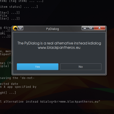
PyDialog [PyQt5] is a new dialog instead kdialog or zenity
VectoR


Source (link to git-repo or to original if based on someone elses unmodified work):
Changelog:
0.3
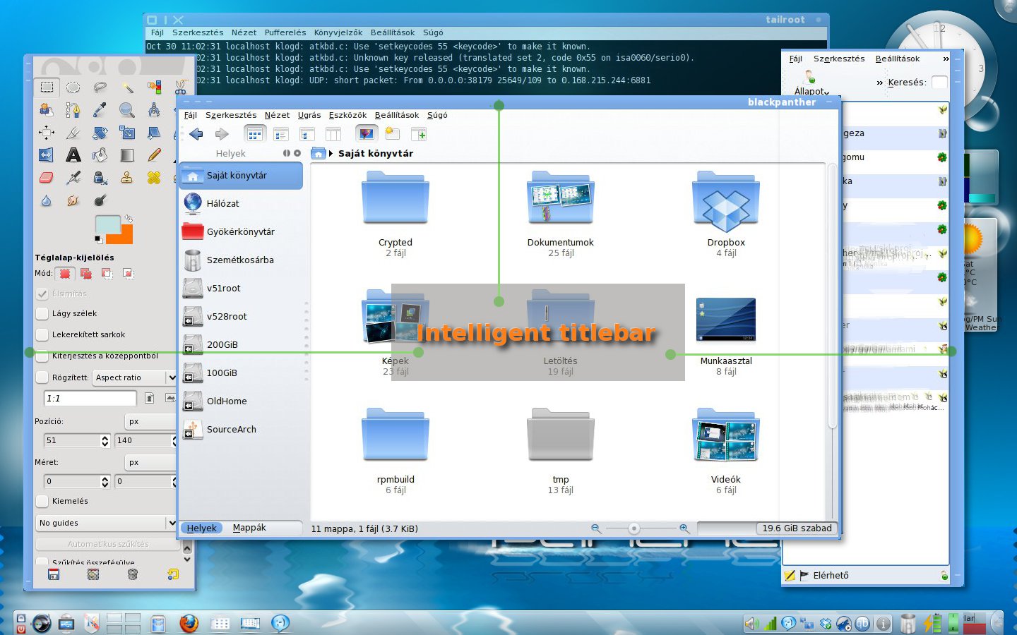
IntelliBar function (inspired by comfort problems test and using Bespin theme)
0.2
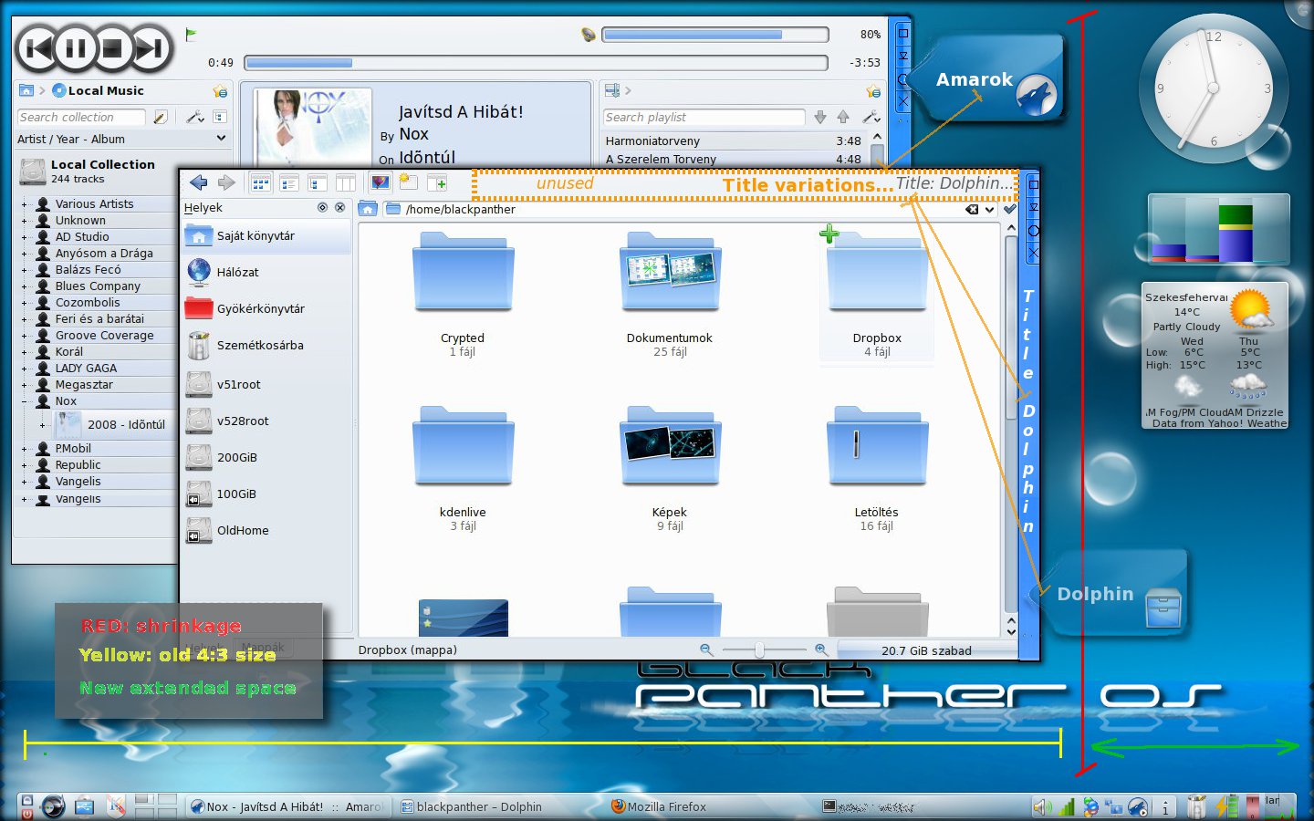
added title text variations
remove menubar (use any simple menu button)
0.1
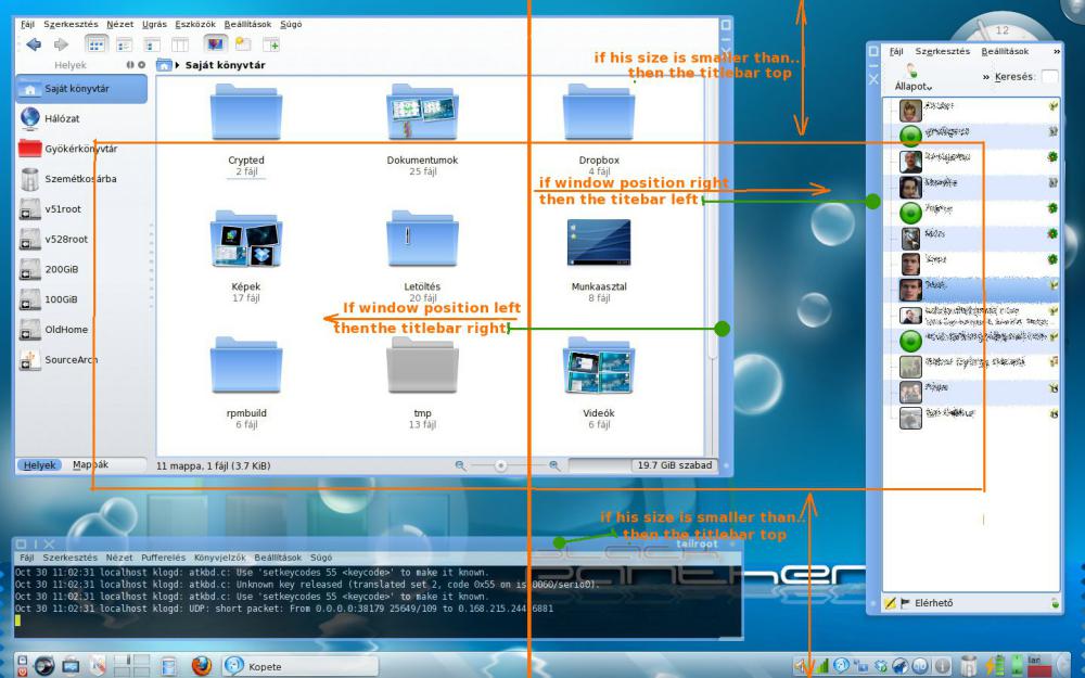
sidebar idea
(original idea: When movig the title bar from the top of the window to the side it takes less space from the content part. It can be useful especially with wide screen monitors, because the title bar doesn't shrinks the height available for the content.)


More Various KDE Stuff from VectoR:
Other Various KDE Stuff:

Ratings & Comments
16 Comments
Hi, I just wanna know what's the name of your weather app? I saw it in your 2nd picture.
Hi This one :http://kde-apps.org/content/show.php/simple+weather+forecast?content=92149 HND
Thanks a lot!
Maybe you could make it a little more like plasma widgets. For example, hovering any of the window edges with the mouse pointer would bring minimize-restore-close-over_all-etc thing up. You can even create a shortcut to lock the "window bar" from appearing (like the "lock widgets").
Already realized (part at least): http://solshark.i-seo.biz/wp-content/uploads/2009/10/title_left.png
I like the idea: windows should contain only the contents. screen space is very expensive real estate.
as i suggested this before elsewhere, i really hope this is going to be a user option sooner or later. as for those who need/want to be able to read the windows' titles, they can continue keeping their title bars horizontally at the top. thumbs up for me.
oo ^ =D :-( -> =D It's a riddle and only the wheel knows the answer ;-)
i'm not sure how this would coexist with tabbed oxygen in kde 4.4 this is how oxygen is supposed to look like http://www.kde-look.org/content/show.php/Kde+for+wxga?content=96561 *source: nitrogen http://www.kde-look.org/content/show.php?content=99551&forumpage=13 oxygen style in 4.4
sry first link is wrong :p so this is how oxygen should look like http://www.flickr.com/photos/42123798@N03/4012025945/sizes/o/
Good idea, but where is the title? I've already put menus in the top panel, now I think I can put the title in the top panel too. I like the idea: windows should contain only the contents. screen space is very expensive real estate and application developers should try to minimize screen space overuse.
Bespin can do this (since yesterday, lefthand as scrollbars tend to be on the right) Flaws: - kwin has a static assumption on the shade layout (when the window is rolled into the titlebar) - it shades to the top border, whether it cotains the titlebar or not (i'll see whether i can cheat on this) - the title label. i put it into the tooltip of the "multibutton" but in fact there's no good way to display it (whether rotated or not visible is equally bad) However, i'm using it since a few days and except for the rare condition i open /multiple/ kwrite insances instead using kate, i could life pretty much ok without the title in sight.
Btw, this has been suggested before. http://www.kde-look.org/content/show.php/Kde+for+wxga?content=96561
LOL. Must be a good idea then. :-)
I like the idea, but I see one problem: usually, as the name says, the title bar contains a title. Writing the title vertically makes it hard to read. You easily avoided this problem by not having a title in the title bar... In general, it would be nice if one could reduce the number of horizontal window and desktop elements and to put them vertically (for example the menu bar or the bottom panel). Just think of the standard KDE desktop with firefox: There there is KDEs's window title bar at the top and the panel containing the task manager and the start menu at the bottom. Firefox has the the menu bar, the navigation bar, the bookmark bar, and the tab bar at the top. At the bottom, you'll find the status bar. If you use certain add-ons, they will add another horizontal bar. If you use a wide screen, this will result in a region of about 1600x200 pixels where the actual web page is rendered. Not to forget that quite a number of web pages (including this one) feature horizontal navigation menus and a horizontal logo line. At least you can usually scroll these. Unfortunately, the problem is always the same: text can not easily be rendered vertically. Frankly, I always wonder whether it wouldn't be better to have high screen rather than a wide screen.
I saw this approach sometime in the 90's, probably a theme with some DOS/Windows App. I always thought it was a better approach to displaying windows. I think the title bars should be customizable to ANY side of the window. I mean, why not? Surely there is someone that wants theirs across the bottom! :-)