Description: This is a compilation of what I think should happen with kicker and kde.
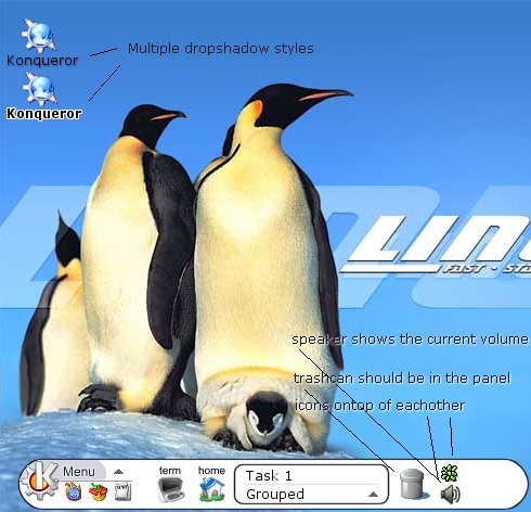
The trashcan idea is from apple. I think it should be always visible and people should be able to drag tasks from the taskbat into it. Maybe aswell from the window decoration.
this is a little off topic, but it is also about ergonormic issue.
I don't know if someone has posted this suggestion before. I think that the close button of a window in Microsoft's windows is at the most convenient position. if a window is maximized, the close button is clickable at the upmost and rightmost pixel of the screen. One does not need to look at the screen in order to find the exact location of the button. if you do this in kde (especially keramic), you would either select the window underneath or the desktop.
It does mostly look like Slicker, but I like where you placed the trash can. I think that's the ideal place, and makes it quick and easy to access. I think something like that could be incorporated into Slicker as well.
Well, in regards to Slicker, it seems you have just ripped off alot of the art work and mock ups on the homepage. So, those who desire what he compiled should wait for the Slicker team to release.
Well, epoch is right you know... These mockups are simply copy/pasted versions of the Slicker mockups done by Fop (see http://slicker.sf.net/screen-mockups.php ). Now, all we ask is for you to ask permission next time you decide to use other people's material. It is a very widely applied idea that when you use other people's material (even as blatantly obvious as it is here), you give credit where it is due. On that note, the icons used is the Noia set as featured elsewhere on this site (in case you missed it).
Please notice that.... The title says COMPILATION.
I gues we have to rip off XP instead of brining new ideas and IMPROVEMENTS to the light.
Consider this. Then some uses someone elses idea then that should be a honour for him or her. People actualy think the ideas are good.
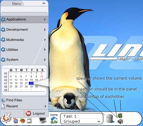
I think the best idea brought out in the screen shots is the enlarged "K". Not only is it aesthetically pleasing, but makes it more intuitive. I often see new users get slightly confused when presented with the interface, as the "K" just looks like every other icon. Just thought this idea should be emphasized, as it's the best.
I think that such modifications are roles of projects like slicker.
I would like too, that a lot more projects inspired from MacOS X interface could appear.
Everyone is always making comparison with WinXP, but the most ergonomic remains MacOS.
Moreover, the role of linux is not to copy them, but to improve good ideas and developp new ones.
So the more slicker's like projects will appear, the more we could personnalize our interface design.
This look really good! It's definitely an improvement, especially if one could choose between both, this one and the classical look.
Hope there is somebody able to do it. I am certainly not :( . Not yet, at least.


Ratings & Comments
10 Comments
this is a little off topic, but it is also about ergonormic issue. I don't know if someone has posted this suggestion before. I think that the close button of a window in Microsoft's windows is at the most convenient position. if a window is maximized, the close button is clickable at the upmost and rightmost pixel of the screen. One does not need to look at the screen in order to find the exact location of the button. if you do this in kde (especially keramic), you would either select the window underneath or the desktop.
It does mostly look like Slicker, but I like where you placed the trash can. I think that's the ideal place, and makes it quick and easy to access. I think something like that could be incorporated into Slicker as well.
Well, in regards to Slicker, it seems you have just ripped off alot of the art work and mock ups on the homepage. So, those who desire what he compiled should wait for the Slicker team to release.
Well, epoch is right you know... These mockups are simply copy/pasted versions of the Slicker mockups done by Fop (see http://slicker.sf.net/screen-mockups.php ). Now, all we ask is for you to ask permission next time you decide to use other people's material. It is a very widely applied idea that when you use other people's material (even as blatantly obvious as it is here), you give credit where it is due. On that note, the icons used is the Noia set as featured elsewhere on this site (in case you missed it).
Please notice that.... The title says COMPILATION. I gues we have to rip off XP instead of brining new ideas and IMPROVEMENTS to the light. Consider this. Then some uses someone elses idea then that should be a honour for him or her. People actualy think the ideas are good.
I have already mailed these images to the slicker team. BTW what's your point? I should rip off ideas and improve them to my likings?
I think the best idea brought out in the screen shots is the enlarged "K". Not only is it aesthetically pleasing, but makes it more intuitive. I often see new users get slightly confused when presented with the interface, as the "K" just looks like every other icon. Just thought this idea should be emphasized, as it's the best.
I have to say, great ideas, you got my vote on it ! KDE developers, take a look !
I think that such modifications are roles of projects like slicker. I would like too, that a lot more projects inspired from MacOS X interface could appear. Everyone is always making comparison with WinXP, but the most ergonomic remains MacOS. Moreover, the role of linux is not to copy them, but to improve good ideas and developp new ones. So the more slicker's like projects will appear, the more we could personnalize our interface design.
This look really good! It's definitely an improvement, especially if one could choose between both, this one and the classical look. Hope there is somebody able to do it. I am certainly not :( . Not yet, at least.