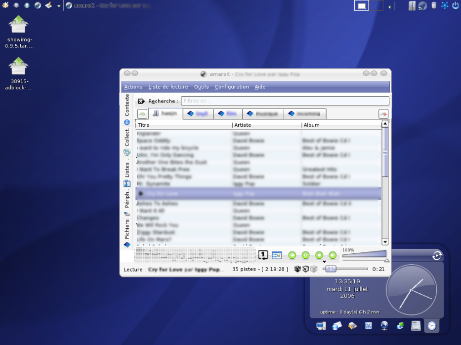
that suppose have a tree view on the left bar (for explore and drag and drop file) and in each tabs can add songs, playlist file (pls,..) and stream
The session (tabs, files,..) could be save with a session manager (as in konqueror).
This is just a proposition.
Screenshot powered by the Gimp


Ratings & Comments
9 Comments
verry good idea many times i search in my database and want make another search with not losing the first one
amarok already have all the necessary tabs... do not try to complicate what is, in fact, quite simple. amarok is the most powerfull and user friendly music player available this days. btw, u'r mockup screenshot is absolutely unuseful...
Recently the SVN version changed the layout somewhat. Here's a screenshot of a recent checkout: http://img234.imageshack.us/my.php?image=amaroktabs4ge.png Hop on IRC and talk to the devs in #amarok on irc.freenode.net or open a wishlist/bug on it from http://bugs.kde.org if you'd like to add input.
ewww, any way to change it back?
I'm using this post to tell a really anoying thing that amarok doesn't do, save the position of the middle bar when the program exits. I've often have to put this bar in to the right position. I know this is small thing but for me is really anoying. By the way i think the idea of the post is great.
100% Agree. This frustrates the hell out of me. This is the main bone I have to pick with Amarok.
Just a url for you there - http://bugs.kde.org/ :) This could be classed as either a wishlist item or a bug, whichever works for you i guess. Reporting problems in the correct place is always a good thing to do - kde-look is NOT the right place ;)
but could tabs have checkboxes or some other way to pick from wich tabs amarok should pick songs?? for example you put one album on one tab and you marking few of them amarok should play only them ps. sorry for my english
Why are you blurring everything out? This is a mockup, you are simply providing random song names and such, noone will sue you for that (not even the RIAA or whomever). Please reconsider reuploading your work without the blur, because as it is now, you are greatly limiting the use of the mockup by blurring out vital information. That said, do try and join the #amarok channel on freenode to discuss the idea. And please note - we have had people suggest this for a VERY long time, without being able to do it Just Right(TM), which is something we really want (to do it right, that is).