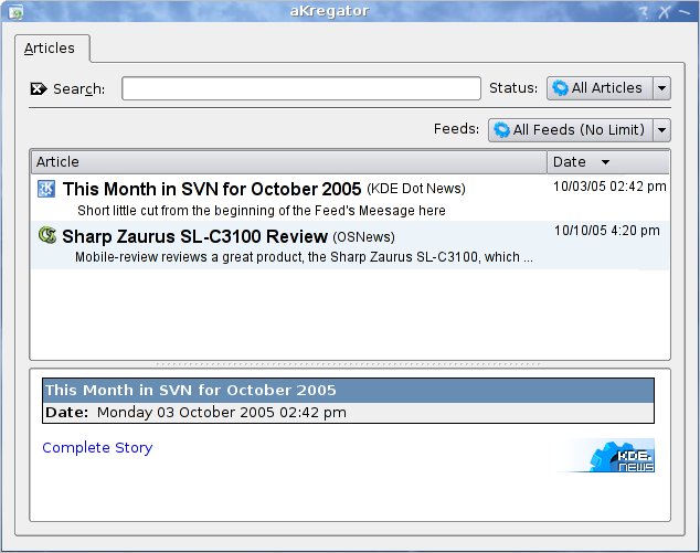
Description: Here is a mock-up of my thought on "what if" for changes to aKregator.
I'm not quite sure on the feed's combo box. But then I don't really like the side bar either any ideas?
One thing you'll probably notice besides the viewer is "what's with this 'All Feed (No Limit)' ??" Probably poorly worded but it's a wishlist for something that I'll report as a wishlist if someone hasn't already beat me to it today. The idea behind that is your all feeds is limited to lets say 10 articles per feed. I understand you can set it up to limit the size to x many articles. however they are lost. I want them there.. but I don't always want to see them. The combo box idea was made to perhaps make that happen. a checkbox however probably would be more appropriate so that it could be applied to every feed individually.
Ok now for the meat of the idea. We have the feed icon in front so we can distingush at a quick glance what feed this is comming from. The title is bold so again at a quick glance it's very readable. in parenthesis we have the feed name preceding the title so if you have 2 feeds with the same icon you still can distinguish them appart. A short description because normally it's short anyway and who wants to click on all of them if they could just do a quick scan?
I really do love the articles display, with the bold title, the little description etc etc . But I don't understand why use combo box to select the feeds...if you start to have lots of feed this will lead to a quite unusable situation...why don't you stick the the left tree as in current akregator?
that's actually the reason that I said that I wasn't too sure about the combo box idea.
you make a very good point about that. for me I only have 5-6 feeds and as the first post says lots of my screen is wasted.
Also how often do you switch from all feeds to a certain one?
overall tho that idea isn't too important. I might just remove it. would appear that aKregator doesn't support removing that from the view menu styles anyway.
since i have 34 feeds in there, and never actually use all feeds view, but it would be fine to have an oportunity to set it like that, akregator could use some shiny visage, and its definitely usable as summary view, which is missing right now
But I dont quite get the organization yet -- you say its the main viwer part but it really looks like a feedlist. In my Akregator v1.01 with only 12 feedss, the lower portion of the left-side bar is wasted. It should be split horizontally to list titles of the selected feed. Then ALL of the right-side could be devoted to content for reading. See Firefox/Sage extension for an example of this layout/design.
1) If you vote no. at least have the decency to tell *why*
2) this mock-up really is only for the main viewer part not the combo box and sidebar. As I said in the beginning it's my "what if" thinking out loud so to speak.


Ratings & Comments
6 Comments
I really do love the articles display, with the bold title, the little description etc etc . But I don't understand why use combo box to select the feeds...if you start to have lots of feed this will lead to a quite unusable situation...why don't you stick the the left tree as in current akregator?
I think *exactly* the same. I like the article view, but the tree view for the feeds is much better. Therefore I neither voted Yes nor No.
that's actually the reason that I said that I wasn't too sure about the combo box idea. you make a very good point about that. for me I only have 5-6 feeds and as the first post says lots of my screen is wasted. Also how often do you switch from all feeds to a certain one? overall tho that idea isn't too important. I might just remove it. would appear that aKregator doesn't support removing that from the view menu styles anyway.
since i have 34 feeds in there, and never actually use all feeds view, but it would be fine to have an oportunity to set it like that, akregator could use some shiny visage, and its definitely usable as summary view, which is missing right now
But I dont quite get the organization yet -- you say its the main viwer part but it really looks like a feedlist. In my Akregator v1.01 with only 12 feedss, the lower portion of the left-side bar is wasted. It should be split horizontally to list titles of the selected feed. Then ALL of the right-side could be devoted to content for reading. See Firefox/Sage extension for an example of this layout/design.
1) If you vote no. at least have the decency to tell *why* 2) this mock-up really is only for the main viewer part not the combo box and sidebar. As I said in the beginning it's my "what if" thinking out loud so to speak.