


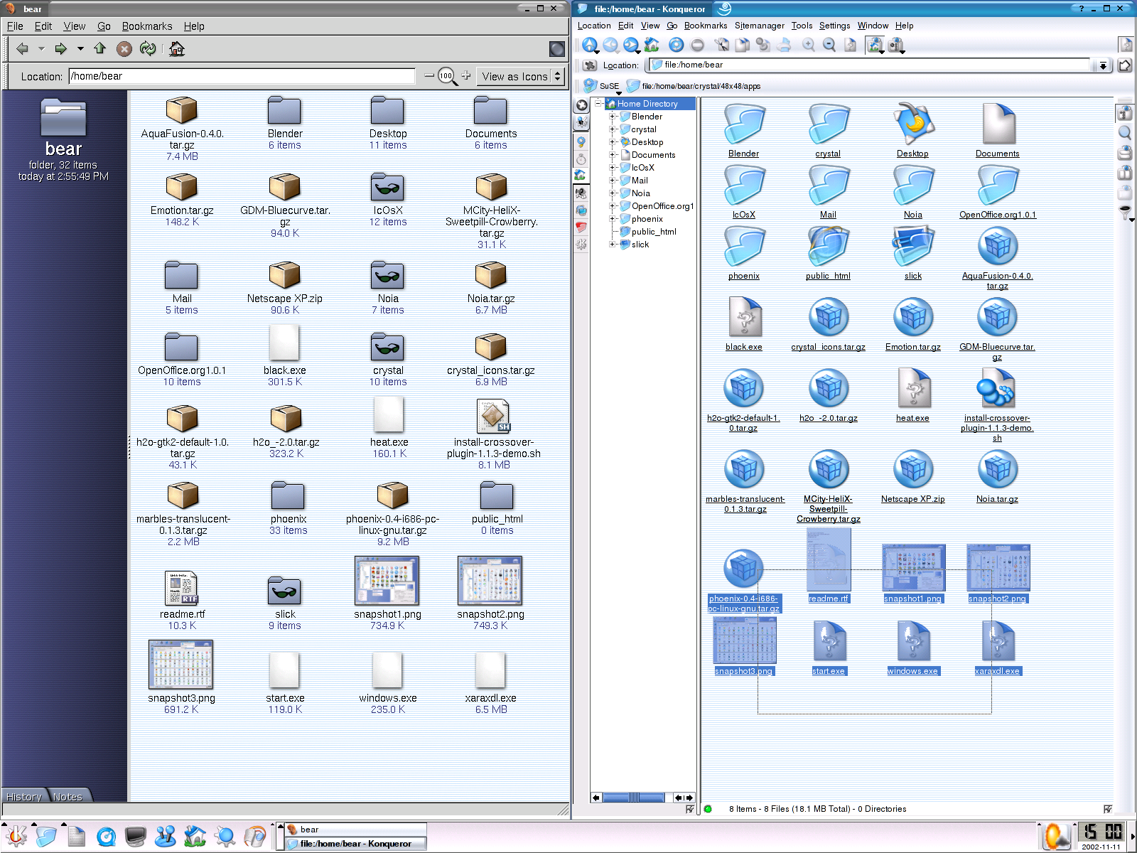
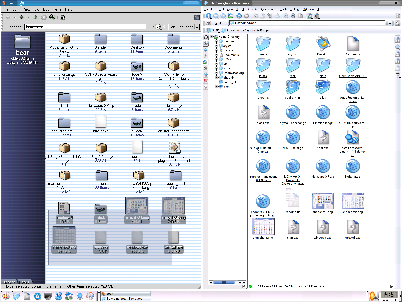
Nautilus highlights icons perfectly and the oval transparent background also looks quite good as well as the nice shadowed fonts and uniform highlighting of all the parts of an icon. It looks like it is casting a shadow over the files you have selected, which is a plus in usability. It's the same way on the desktop; the text under the icons looks great, nicely shadowed like in XP to make it easy to see on any wallpaper. (This is also very attractive for preview icons like images, shadows look great on them. Compare sceenshot previews in konqueror without shadows to their GNOME counterparts.) In KDE, for some busy wallpapers with a complementing mix of autumn colors I need to put a background color for the text to see it. This would not be so bad if it were handled like in GNOME, with a slightly translucent rectangle with rounded edges and a barely noticeable drop-shadow. However, in KDE it is a big, plain and ugly opaque rectangle.
In Konqueror it looks like your putting up fences to select your icons, very unattractive. Highlighting is often poor, the darkened images suddenly have unappealing bright white spots and the background color under the icons is an ugly, plain rectangle and the text is hard to see and plain. Same goes for the desktop, even worse; when an icon is clicked a small discontinued rectangular line surrounds the icon text. Ugly! If KDE had emblems maybe a small special one could be placed by the icon to indicate that it was just launched instead of having an ugly discontinued, rectangular line select the text.
The GNOME project is often lagging behind in features, but it sometimes executes the features it has a lot better. Please learn from Nautilus, it's very fast and full of nice features like emblems, which I would love to see in KDE.
Explorer handles the highlighting like GNOME in the file manager and like KDE on the desktop. I never noticed before, but Explorer is actually very smart, for example the side navigation and information panel disappears by itself if you make the window small enough and the side panel is dynamic and changes appropriately according to the contents of a folder or a type of item. In a folder full of pictures of a large size it also automatically adjusts and puts the text under the icons instead of right by them. However, when the icons are links to folders or items the text is right by them, therefore saving space if information about the item is to be placed and it looks better. These are only a few minor things, but they can greatly improve somebody's eXPerience. We should stop bashing Microsoft so much and start implementing what they do well in OSS.
Both Nautilus and Konqueror could learn a lot from Explorer and Explorer could learn a lot from Konqueror and Nautilus

Due to space constraints I can not post a picture of my GNOME or KDE desktop, however here is one that shows the shadowed text under the icons and KDE�s way.
GNOME:
http://art.gnome.org/show_screenshot.php?screenshotID=13
KDE:
http://kde-look.org/content/preview.php?file=1794-1.png (not a good example because the background is not very distracting and therefore it is still easy to read the text)
Please tell me what you think on this issue, if you agree vote good, if you disagree vote bad. =) If you don't feel strongly either way, either try to makeup your mind and vote or comment and do not vote. Personally, I think if these issues are a lot more important for usability than fancy translucent menus.
More suggestions would also be great,, K developers need to know what needs to be improved and this place is where most people go when they think something needs to be improved from an aesthetic and usability perspective.
I might seem a little harsh on KDE, but keep in mind I am only trying to help improve it. I also think many of the things I mentioned are probably not extremely ahrd to do. But, I am not experienced enough to state this for a fact.
(By the way, clicking download will show you how Microsoft Explorer handles the problems mentioned above.)


Ratings & Comments
35 Comments
I think WinterWolf is right. KDE is more advanced in features, but GNOME do is in usability, like these aestethic things. Personally I use KDE because of the advanced io_slaves, like GUI access to files in my servers using SSH (SFTP) protocol. But... GNOME based applications can't normally be used directly. And, GNOME based applications use the GNOME configurations like fonts... I will like these apps will take my own configuration being KDE or not. I think KDE must address the performance too.
used nautilus 2.2 that came with mdk 9.1 recently and it is MUCH faster than it used to be. i stand corrected. doesn't crash as much either (didn't crash on me once actually but i didn't use it that long).
Although the Gnome (and WinXP) selection rectangle is much more visually-appealing than the one employed by Konqueror (and older Windows versions), I am seriously bothered by its lagginess on both systems. On WinXP, it's not all that laggy and most people don't notice a problem with it (although the lag is there); on Gnome it is absolutely horrible. On XP the first thing I did was disable the new GUI (perhaps an attempt by Gates to catch up to the more visually-appealing Mac and Linux GUIs?) But the problem isn't bad enough for most users to want to disable it; I'm just a speed whore. I wouldn't mind seeing this feature implemented in Konqueror if it were implemented as well as XP does it. But following the Gnome example, it's horrible. And just to stick my nose off-topic like everyone else here, Konqueror runs much faster for me. The only reason you think Nautilus runs faster in Gnome is that Gnome made the same mistake Windows did. Your file browser and your graphical shell are one and the same, meaning it is ALWAYS running, and when Nautilus crashes, so does Gnome.
No lagging here, and I'm on a 500MHz Pentium III with an old ATI Rage 128. Have you tied any of the Nautilus 2.2 series? The latest is 2.2.1 (though currently my version is 2.2, and I've not seen any speed problems since the early 1.x and 2.x releases).
I have no idea which version of Nautilus I'm using (because I never use Gnome). However, I assume that my 1.4GHz AthlonXP with 512Mb of DDR-RAM should handle anything Nautilus throws at me. But Nautilus' selection rectangle is laggy, as my screenshot will show. This show me shrinking a large selection area, with the selection "rectangle" obviously not looking like a rectangle due to lagging, mainly because it had to select a large number of icons. http://www.wccgc.com/nautilus.png
1) You're using an older version of Nautilus (newer version don't have that blue sidebar with the tabs anymore). Also, the icon view in the newer versions of Nautilus was rewritten and a bit faster. If you would like it to be even faster than that you could try recompiling Nautilus by disabling support for those 'anti-aliased' labels under each file name (see source code). 2) The reason why it feels so fast for you on Windows XP is because Windows has better graphics acceleration (and currently a better graphical architecture) and often better display drivers for your graphics card. When you're using an NVIDIA card I'd really recommend to install the official Linux drivers from NVIDIA because it makes the rectangle just as fast as it is on XP. 3) Gnome doesn't crash when Nautilus crashes. If it happens, Nautilus will just restart automatically and run happily like it's never crashed before, but it won't crash Gnome itself. (unless your system/hardware is seriously fscked) (note: I'm using a P3 933 - GeForce3 Ti 200) hth
The point of this discussion is not arguing about which FileBrowser is better. I think that both Nautilus and Konqueror have their good stuff. It will be really nice to have this cool looking features in KDE's Konqueror. I really hate how ugly selected Icons look in Konqueror, and I just love the "rounded look" that selected Icons have in Nautilus. This would be a very good addition to the look n feel of konqueror. I actually prefer using konqueror over nautilus because Konqueror is much more customizable than Nautilus, I like having the ability to have a Konsole embedded in the browser. An improvement that I will really appreciate is having the ease of sharing folders with samba with just giving a few clicks (instead of having to edit a text file) , just as you can do it in Explorer. This will be a really significant improvement to kde.
I wish many of the aethstetic features I mentione din my origianl post would make it into Konqueror. Maybe som that are not so aethstetic only also, such as emblems (mmmm.. good) and special folder views such as audio, video, graphics etc. The way Nautilus integrates with Gstreamer is fantastic, if Konqueror could do that that would indeed be very nice. Also those views should maybe enable themeselves by default if the folder only contains those kidns of files. I too like konqueror more for it's feature set, customizability, and KDe integration, but i ahve to admit Explorer and nautilus are very good also and many of their features would b very nice in konqueror.
networking with xandros works jsut like you want. Right clicka folder, drive, floppy etc. select window sharing from teh context menu, give it a share name , comment if you like, set permissions, and voila it si on teh Windows network. I should also mention that it will ahve a nice emblem for whateer your sahring to show you it is being shared. Xandros really is very nice, even thoguh it uses KDE 2.2 as it's base. Do not be fooled though, they've tweaked KDe so much it is better than 3.1 and they don't even use Konqueror.
I would love to use linux as a desktop, but both KDE and gnome are imo extremely unusable (worse than windows 3.1) right now. Nautilus is slow and way icons are dragged sucks. Konqueror has more features, but icon selection is bad and much more difficult to use than win98 or XP. KDE's default theme is ugly too, I prefer the simplicity of the win95/2000 look. This is maybe OT but another problem I have is that when you double-click a program in KDE/gnome, it takes a long time for anything to happen (yeah I know the taskbar shows some "working" thing in KDE). On windows, even when you start a big application, there are immediate results (window opens, or hard drive grinds for a few seconds and then a window opens). This makes the linux desktop difficult to use. (Of course the command line is very fast and usable compated to windows). Right now I use icewm because KDE and gnome are ugly and unusable. I would like a good file manager, but the choices for linux are limited. Explorer.exe doesn't run very well under wine. Comments please.
I'm sorry, but if you dislike KDE, etc so much why the heck are you here, and especially bothering to post? Nonetheless, you should be sure you're using the latest versions of KDE/Gnome because neither of them are nearly as bad as you so inaccurately described, and Explorer tends to be much worse. Consider yourself lucky in the Windows usage department.
Well I am still using it on some machines. After changing the theme and some other looknfeel things, I've got to a point where I don't vomit when using it. I always keep up to date to see if they improve things, and they have fixed some problems of older versions. Explorer actually isn't that much worse, though it is bloatware (kde is worse). Explorer's interface in win2000 is very solid and not as "hacked" looking as kde. Of course KDE will fix these problems in the next couple years as m$ did with win95.
Konqueror has always been faster for me. That and I hate the way Nautilus tries to handle file-type extenstions. Other than that I like Nautilus but I still would take Konqueror over it.
Nautilus 2.2 loads up just as fast as Konqueror and in fact it has been more stable than Konqueror on my computer, and this si true for most of the people. Explore rdoes NOT rstart itself except after a crasha nd it asks you if you want to restart it or not, this is a good thing. Yes this does have to do with usability, for example in KDE I can not evenr ead the text on font 16 with one of my backgrounds, using the same background I can read the text fine in GNOME 2.2
I may load fast for you, but for the rest of the universe it's slow and buggy as hell. Konqueror is definitely better than it in all aspects except maybe looks (unless you have the right theme, like me) :D
No, for alot of people Nautilus 2.2 IS very fast. Are you everyone else in the universe? No. Then what makes you think you can speak for everyone else in the universe? Try the latest Nautilus first before bashing it.
... anyone gets the impression this has anything to do with usability: it doesn't. =) the points about Konqueror's highlighting not being the most artistic in the world are accurate. but this isn't about usability it's about how things look.
It does have to do with usability. Shadows or outlines around text on the desktop makes it more readable against all sorts of backgrounds, and is definitely a usability issue. As for the file-selection box, that may be mostly a nice-looking cosmetic thing, but also makes the whole thing more visible. I'm sure it's a usability for the visually impaired if nothing else...
You must be joking, Nautilus is slow compared with Konqueror. It's also unstable IMHO and restarts itself just like explorer does. Konqueror has always been a bit ugly, doesn't make it unusable IMHO. Give me speed and reliability over eyecandy any day.
This is NOT a GNOME VS KDE submission and furthermore there are a lot of great apps for GNOME just as there are for KDE. Besides KDE apps work in GNOME and vice versa. ANYWAY, please stay on topic and don't try to stir up others into a GNOME vs KDE flame fest. Please tell me your opinion about the subject.
But, I want constructive feedback and hopefully if many people want the same features I do implemented into KDE the developers will listen and put it on their todo list.
I've used both, and I *love* the look and feel of Nautilus as a file manager -- but I still stick with KDE3 for the following reasons: - It's not GTK+. I can not express my displeasure over GTK+ and their themes. I like KDE styles, because you can get the look *and* set your own colors. The RH8.0 BlueCurve is the best GTK+ theme I have yet to see, personally. (Which is why I use it, so it matches my KDE style.) - More KDE apps. A lot of KDE apps simply work well together, and work well. I still use quite a few Gnome apps (Pan, Gimp, etc...) but for the majority of my work, I like the KDE counterparts. And if there was a KDE/QT port of Gimp...hubba! - Configuration options. Want all your titlebar buttons on the left and do not want to hack a SawFish/MetaCity/Etc theme file? No problem. Want to configure all your system sounds in one place? No problem! That all said, I do like Gnome2. The More-like-a-Mac Menu panel rocks, and wish KDE had one more like it. Complete with curved corners! ;) But Gnome2 still has a very "unfinished" feel to me.
We've got better Mac-style menus coming in 3.2. See http://c133.org/kiwi/new-label.png for an example... although the alignment is off in that screenshot and the menus are actually coming along a lot nicer recently. Also, GNOME doesn't really have Mac-style menus. They have a menu widget in their top panel, yes, but it doesn't change to the current application's menus when you change applications; in KDE, it does. (And in 3.2, the Mac-style menubar will be a Kicker applet, so you'll be able to have your K button and system tray and clock all on the top panel at the same time.) 3.2 is going to be even more fun than 3.1 :)
yes!!! i recall in KDE 1 (way long ago) there were menus like this for any app for kde. i remember it distinctly trying to my my linux partition look like a mac. i found that cool kde "menubar on top" thing and was really impressed. when i fully switched to linux (not just as a toy) i found in kde2 that this feature was somewhat "thrown away" and a menubar on top is erally useless. i'm so excited to see this if it makes the 3.2 feature freeze. you know what it's called so i might be able to watch it in cvs?
bump!