


Eye Candy:
1) Etched Glass: translucent and blurred (fuzzy)
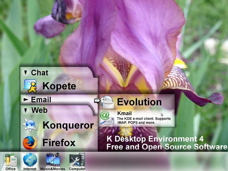
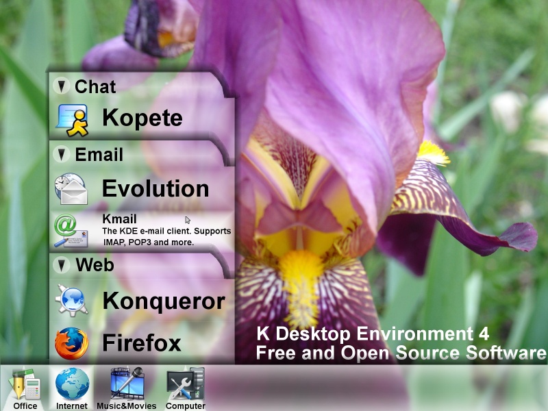
2) Menu Indicator: Translucent pyramids under expandable menus will replace the itsy-bitsy black triangle that currently appears in the upper left corner. This will restore symmetry in the icon and be more visible yet less intrusive since it is in the background. The pointed end of the pyramid will direct the user to where the menu will slide out.
3) Variable Opacity: Area surrounding an item (which consists of icon and text) will smoothly/gradually become more opaque when the user moves the mouse over the icon, comparable to the Plastik theme way of changing the background color of window buttons when the mouse is hovering over them.
4) Upright Icons: For neatness and to resemble reality (where there is gravity), icons that stand up and that are not pointing every which way will be used as much as possible.
Usability:
1) Tabbed Sub-menus: A submenu can either appear as a tab (with its contents listed under the tab) or to the right (as in KDE 3.4). A triangle on the left side of the tab allows the user to switch between modes on a per-tab basis, in order to maximize space and minimize clicks.
2) No K(Start)-menu: K(Start)-menu just adds an extra click. Instead, apps are classified into 4 or 5 major categories that show up directly on Kicker.
3) Labels under Kicker icons
4) Description of Apps: Brief description of menu items will appear when the user moves the mouse over the item. The application name will be resized to make room for the description.
Special thanks to the creators of the icons and images I used:
Crystal Clear (http://www.kde-look.org/content/show.php?content=2566

Lanthys Icon Set (http://www.kde-look.org/content/show.php?content=25846)
Exquisite (http://www.kde-look.org/content/show.php?content=1478
Black + White Icons (http://www.kde-look.org/content/show.php?content=24645)
Cezanne Icon Theme (http://gnome-look.org/content/show.php?content=16479)
Flower Power (http://www.kde-look.org/content/show.php?content=25479)
Jimmac Cursor Theme (http://kde-look.org/content/show.php?content=6550)


Ratings & Comments
11 Comments
I am sorry but that looks very unusable to me. The menus are HUGE and the heavy drop shadows drag your attention away from the actual contents of the menu.
different from earlier comments i now see a real chance to implement sth. like this on the current Xorg arch (with few restrictions) about the panel structure, well i have another opinion on this, but plasma will be variable enough to fit everyone ;) http://baghira.sourceforge.net/blurring.shtml
Wow, that's a really good idea! I doubt people will notice the difference between Gaussian and Shift blurring.
looks nice.
Seems to be very nice - keep on working on this, I'm looking forward to KDE 4! liquidat
I love it. It adds usability and very impressive looks. Just what KDE 4 was looking for!
Frosted glass or wax paper. Etched glass doesn't seem to be the right name.
and i'm sure KDE 4 will make this not just possbile, but easy :D
I hope the kicker in KDE 4 won't look like that. The bar is nice but the text under the icons and the peculiar triangle of "light" (?) and the highlighting is just ugly - IMHO.
The text is meant to make it easier for users to understand what the icon represents. The triangle under menu icon points up to where the menu will slide out when the icon is clicked.
It does restore symmetry to the taskbar. Looking forward to KDE 4. The Borg Queen