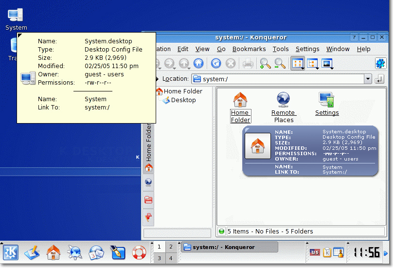
Description: I don't like the description of the files in kde so i wanted to make some idea for KDE 3.4 This is just an idea so if someone can make i to reality if would be great because i think this would make KDE look little bit better.
Please send me you opinion and what do you think about this.
I'd change the way permissions are shown to the user. Many users (especially non-tech) will be clueless about -rw-r--r--, so instead visualize it by means of icons. Three groups, each having 3 icons. Then it would be perfect :)
You should try to contact any kde developer, because I they are really interested in help with these kind of things (usability and prettyness) for their kde 4 release.
Dan
Why not have a toggle option that you can enable the new tooltips that are in kicker for 3.4 for the files descriptions as well?
I kinda like the white rounded tool tips that are ion 3.4, and then we wouldn't have yet another tool tip class.
Plus that's probably the easier way to code it.
Did you know that Black Text is better visible in Yellow Background! That's why those Road Sign, School Buses etc are Yellow and Black.
It's about visibility. Yellow as KDE does is good.
The things I don't like in your suggestions:
1. Uses Dark Blue color (text not readable)
2. Looks more like a BUTTON
3. Too much rounded
i like it very much. i think it's no so difficult to read, it would be nice to could change the color for everyone likes and the size of the font.
but i reeat it's a good job,only a question, qhere's the patch?
I don't really like you blue one, a tooltip should
be clean and easy to read.
I don't use KDE 3.4 (beta/RC), but I've checked some
screenshots. Rounded cornes would be
ok, like the one in panel tooltips. (well, this is what
"BalloonFileTip patch" does, but I think it's too rounded.
A tooltip similar to the ones in panel would be great.
Another thing that could be improved may be the icon:
I don't really like the location (middle left).
For those who like eyecandy, it would be cool with
a "watermark" in the right-down corner.
Yeah, I konw it's impossible. But would it be
possible with SVG icons? (I don't know so much
about that stuff...)
I agree, the tooltip could use a facelift. However, I think it's generally a good idea to stick with an easily recognizable object, like the universal yellow box.
Don't hard code it.
I really love it and I'd wish this or something similar to be a default, but: The shape and the background of these widgets should generally be defined by the current style engine. Hence: Patch these widgets such that they support KStyle and add a default implementation if it's not supported by the style engine.
Regards
kde 3.4 is already finished, not to mention that:
- this would be a new feature
- it doesn't fit to all styles
- it doesn't fit to all color schemes
- patching qtooltip in qt would be the better way instead of reinventing tooltip-classes over and over again
although, it took me a second to figure out which icon the bubble was describing. it would be handy to have the bubble have a pointer to the icon which it's about - like a speech bubble in a cartoon.
I like the idea of the round edges, but I don't like the color. The yellow is so much nicer IMO,
I also like the line, but I see an issue with that idea. When previewing an image, the original shows a rather large image-preview, which is nice IMO. Your idea would require either a larger box or a smaller image. If the image were smaller I'd have to open more files when I'm looking for a specific image.
I too agree tips/popups should be made themable.
Is anyone knowing if Qt4 with its new QStyle engine would allow such things?
In fact I even don't know how to make styles and IF we can add a new "object category" (as buttons get a style, menus get a style... can KDE say "themes can have a 'tip' category and I will use it for passive popups, tooltips and 'icon zooming'").
Because currently we have a lot of tips/messages styles :
- The current tooltip... old flat yellow rectangle
- The KPassivePopup... Just like tooltips but with bigger border
- amaroK great rounded (and transparent) rectangles
- eventwatcher/oldAkregator : a rounded yellow baloon. Was great too but we can imagine lot of enhancements
And what we could imagine:
- MSN Messenger like
- ZoneAlarm like
- New colorful/3D likes
- Simple/clean but a little of 3D "Plastik" like, or even crystal or aqua........
Is there plans to make the *now very spread* tips/popups messages themable?
KDE 4?
As we can configure our widget style, window decoration, icons, color... we SHOULD be able to configure those piece of data because nowaday we see them a lot!
PS. :) Concerning this KDE Apps entry I find it great. Perhapse a little too round (corners could be less rounded).
But I have to admit this look more appealing than the current solution
I agree that inspiration should be taken from the new kicker tooltip popups.
But prehaps a themable ktip would be a better approach to implementing this.
best solution in my opinion would be if those windows could be styled thru kwin-styles. this would give them a consistent look with the rest of the desktop.


Ratings & Comments
36 Comments
Thanks...
I click on the download link, it is opening its image.
I'd change the way permissions are shown to the user. Many users (especially non-tech) will be clueless about -rw-r--r--, so instead visualize it by means of icons. Three groups, each having 3 icons. Then it would be perfect :)
Add xcomposite transparency, and you've got a hit!
This looks great. Contact the KDE developers
I think that's good but it would be better if there were options to set the background picture (or color) and font type for the tooltips.
I like your suggestion so go for it!
wow!!! that's extremelly nice... please, contact kde developers as the other comment say... Would be nice to have this in kde 4 :)
You should try to contact any kde developer, because I they are really interested in help with these kind of things (usability and prettyness) for their kde 4 release. Dan
Why not have a toggle option that you can enable the new tooltips that are in kicker for 3.4 for the files descriptions as well? I kinda like the white rounded tool tips that are ion 3.4, and then we wouldn't have yet another tool tip class. Plus that's probably the easier way to code it.
Did you know that Black Text is better visible in Yellow Background! That's why those Road Sign, School Buses etc are Yellow and Black. It's about visibility. Yellow as KDE does is good. The things I don't like in your suggestions: 1. Uses Dark Blue color (text not readable) 2. Looks more like a BUTTON 3. Too much rounded
Not another tooltip class. I wish there was just ONE usable QToolTip instead of every application and developer reinventing the wheel.
It looks very nice (:
i like it very much. i think it's no so difficult to read, it would be nice to could change the color for everyone likes and the size of the font. but i reeat it's a good job,only a question, qhere's the patch?
I don't really like you blue one, a tooltip should be clean and easy to read. I don't use KDE 3.4 (beta/RC), but I've checked some screenshots. Rounded cornes would be ok, like the one in panel tooltips. (well, this is what "BalloonFileTip patch" does, but I think it's too rounded. A tooltip similar to the ones in panel would be great. Another thing that could be improved may be the icon: I don't really like the location (middle left). For those who like eyecandy, it would be cool with a "watermark" in the right-down corner. Yeah, I konw it's impossible. But would it be possible with SVG icons? (I don't know so much about that stuff...)
I agree, the tooltip could use a facelift. However, I think it's generally a good idea to stick with an easily recognizable object, like the universal yellow box.
Don't hard code it. I really love it and I'd wish this or something similar to be a default, but: The shape and the background of these widgets should generally be defined by the current style engine. Hence: Patch these widgets such that they support KStyle and add a default implementation if it's not supported by the style engine. Regards
kde 3.4 is already finished, not to mention that: - this would be a new feature - it doesn't fit to all styles - it doesn't fit to all color schemes - patching qtooltip in qt would be the better way instead of reinventing tooltip-classes over and over again
although, it took me a second to figure out which icon the bubble was describing. it would be handy to have the bubble have a pointer to the icon which it's about - like a speech bubble in a cartoon.
I've made something simular to this idea, it is NOT the same, but you might like it. http://www.kde-apps.org/content/show.php?content=21480
I like the idea of the round edges, but I don't like the color. The yellow is so much nicer IMO, I also like the line, but I see an issue with that idea. When previewing an image, the original shows a rather large image-preview, which is nice IMO. Your idea would require either a larger box or a smaller image. If the image were smaller I'd have to open more files when I'm looking for a specific image.
I too agree tips/popups should be made themable. Is anyone knowing if Qt4 with its new QStyle engine would allow such things? In fact I even don't know how to make styles and IF we can add a new "object category" (as buttons get a style, menus get a style... can KDE say "themes can have a 'tip' category and I will use it for passive popups, tooltips and 'icon zooming'"). Because currently we have a lot of tips/messages styles : - The current tooltip... old flat yellow rectangle - The KPassivePopup... Just like tooltips but with bigger border - amaroK great rounded (and transparent) rectangles - eventwatcher/oldAkregator : a rounded yellow baloon. Was great too but we can imagine lot of enhancements And what we could imagine: - MSN Messenger like - ZoneAlarm like - New colorful/3D likes - Simple/clean but a little of 3D "Plastik" like, or even crystal or aqua........ Is there plans to make the *now very spread* tips/popups messages themable? KDE 4? As we can configure our widget style, window decoration, icons, color... we SHOULD be able to configure those piece of data because nowaday we see them a lot! PS. :) Concerning this KDE Apps entry I find it great. Perhapse a little too round (corners could be less rounded). But I have to admit this look more appealing than the current solution
I agree that inspiration should be taken from the new kicker tooltip popups. But prehaps a themable ktip would be a better approach to implementing this.
best solution in my opinion would be if those windows could be styled thru kwin-styles. this would give them a consistent look with the rest of the desktop.
I like it too.