


 .
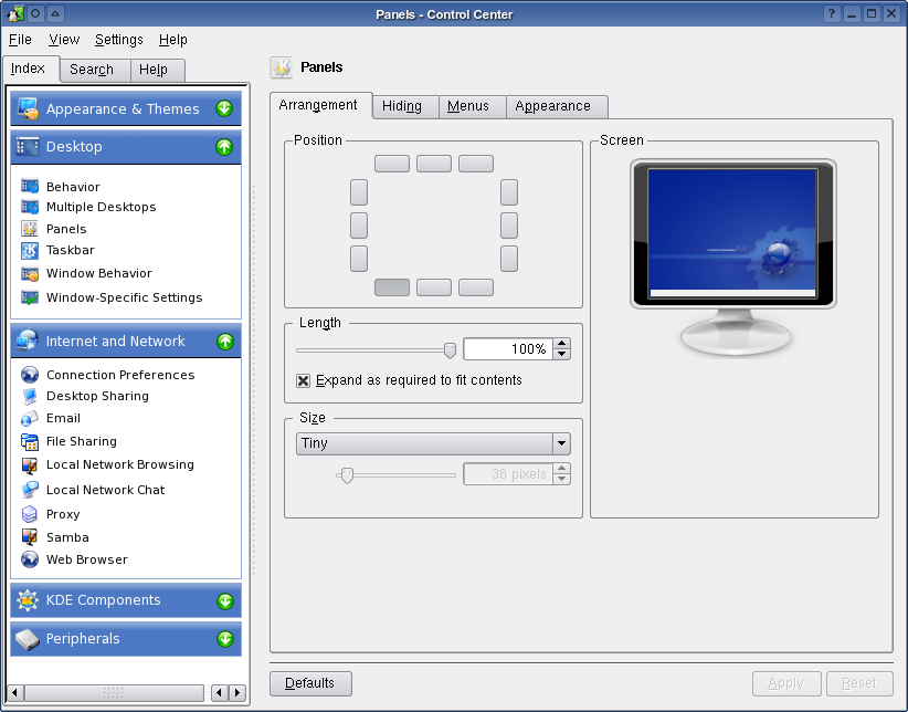
.Its only screenshot that i modified with Gimp. Because the tree icon for choose configuration
in control center look old fashion for me. I hope the next control center tree browser change into new design and can give the beautifull look and feel.
Have Fun with KDE
Teddy Widhi L.
Penguin Power


Ratings & Comments
19 Comments
I wish you successes
those arrows look just like ie's back and forward. use kde's arrows instead.
Looks great!
great idea - just dont' use the green arrows pls - it reminds me "another" system ;)
Altough I don't find "looks old fashioned" to be a valid reason to cahnge soemthing that already works, I think this is a good idea, as I hate tree browsers for usability (the +/- thing, etc) It would be cool if this was implemented in the KDE libraries as something that would easily ported from KTreelist. I think it woul dneed more design decisions as well. What about multiple layers of trees? Maybe just stick to the tree paradigm for that... I'm rambling. Good mock-up. It'd be nice to see implemented, but then again it doesn't come close to that OS X has.
Excelent.
Some post said that it looks like WinXP, well I cant see how it looks like WinXP Controlcenter
trully at first see it look's like blue win
Now THAT'S what I would call real eyecandy. It's by far one of the best proposals I've ever seen here. Really nice!
but this only works for an hierarchy that has a depth of one level. How do you want to display "Internet & Network -> Web Browser -> Browser Identification"?
There are similar patches/suggestions for the Konqueror sidebar and other apps. I think that if something like this is implemented, it should be on the theme/style level, so that by selecting an option in the theme you get the same look and feel in the konq sidebar, ControlCenter, Kontact, or wherever it would make sense.
I think this can almost be done with konqueror, metabar and all the new kio slaves in 3.4. With the shortcut linking that metabar does you could just say assign system:/ as a shortcut and so on the save it all as a profile. Of course there would have to be some modifications done to metabar. But I think it would be doable.
Colors, themes or what something else resembles is not important to me. From what I see so far, functionality alone is a nice idea. Slimmed down, more to the point options. In my opinion, if a design works and serves it's purpose it doesn't matter which platform tidbits are snagged from. I wouldn't mind seeing something like this implemented.
It seems like your main problem with the control center is with the use of a standard tree view for the list of kcmodules. While I agree that your design is nicer in some ways, I'm not generally for skinning applications. KDE currently has a uniform look and feel with dozens of great themes available. Therefore, if you think that there's a need for a new widget (mostly for applications with lots of options), then you should make one, and follow the look of the selected style.
...if the colors were not too teletubbish (read: XP-alike). The idea is nice indeed (I use both amaroK and metabar), but the look (green icons with rounded blue bars) resemble losedows XP (which makes me sick). Just my opinion.
From a usability standpoint I really think this would be an improvement over the tree structure. The colors I agree are XP-like but what the heck, dont knock the guy -- doesn't KDE-Look.org provide a 'Redmond' Theme for exactly this purpose?
I will say that this does resemble winxp however at the same time it has some look to it or w/e that makes it completely different. I don't really care for the look, but I am interested in the functionality. wish I could give an example of a better look but I'm running a blank atm. however good luck! :D
I for one like the look. And I also think that those who make comparisons to windows (which I haven't used for 7 some odd years) are kind of like homophobes, only on an operating system level, and therefore have no brain. It's kind of like saying "I hate corvettes" but one day you see a particular corvette that has really nice rims, but you don't dare get those rims and bash those who do because they're on a car you hate. Makes a lot of sense, doesn't it? Keep up the good work. =)
I think this just takes something that already works perfectly fine and doesn't look bad (it doesn't "look" at all) and makes it more like Windows XP. I'm not one to criticize everything for copying XP, but it seems to me this serves little other purpose than that, and it's not even something that is even particularly great. I don't mean to discourage you from sharing your ideas...that's just my opinion on this one.