Sorry, this is not a new release, but a notice of abandonment. If there is anyone who wants to adopt this window decoration, please let me know. I don't have the time or the skill to extend this as I would like.
BUGS THAT NEED FIXING =====================
1. Compiling. Doesn't compile anymore, and shouldn't require the user to run 'make -f Makefile.cvs' before './configure'.
2. When moving a shaded window, the window sometimes unshades poorly and following error occurs:
kwin: X_ConfigureWindow(0x0): BadValue (integer parameter out of range for operation)
To restore and resize the window, there are two options: either maximize the window and then resize it, or right-click on the window while holding down the Alt button and resize the window that way. I believe that this bug is related to the masking operation, but haven't been able to hunt it down yet.
3. The blank bar to the right of the button area does not accept double-clicks if you want to shade the window. For now, in order to shade a window, you need to double-click in the title area only.
4. There's an extra black pixel in the lower-left corner, on the outer edge. I think the black line is just draw one pixel too long.
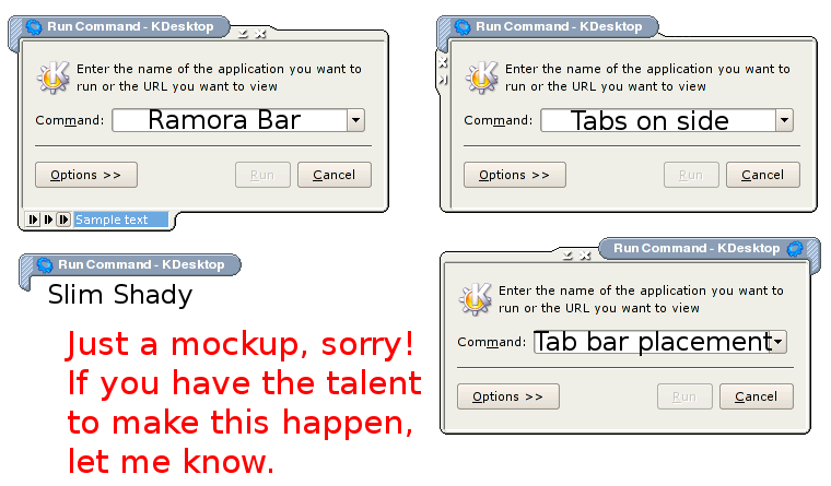
NEAT FEATURES THAT I WOULD LIKE TO SEE ====================================== See the second image for mockups of what I have in mind.
1. Tab Bar Placement The tab bar should alternate sides if you left-click on it while holding down the Alt key. (Or some other reasonable combination--I just chose Alt+left-click because that's what the B2 decoration uses to move tabs.) Things to watch out for: as a result of switching sides, the shadows and light spots change.
2. Buttons on the side When the window is narrow (like the GIMP's main window), draw the buttons on the side. There should also be an option to disable this, if people don't want it. When in this mode, the left side should also accept double-clicks (for shading), in addition to the tab bar.
3. Buttons on the bottom Hey, why not?
4. Slim Shady With this option selected, shaded windows only display the tab bar, not the test of the top bar.
5. Maximum Maximize There should be an option so that when the window is maximized, the only border is a one-pixel black border on all sides, with the buttons hanging down like in the Fitz window decoration. I haven't quite decided if a title should be drawn, but I'm leaning towards "no."
5. (The big one!) Remora Bar A remora is a fish that attaches itself to large fish with the help of a large sucking disk. The remora bar is much like its animal namesake; it hangs off the bottom of the active window and displays a row of buttons that, when pressed, can call other programs, shell scripts, make dcop calls, you name it. It also can display a text field, which is handy for displaying messages, the current song, etc. I don't know if it's possible for a window decoration to have dcop hooks so that other programs can call it, but it would be very cool if it could. That way, you could have a script that would be able to display messages in the remora bar.
The height of the ramora bar should be configurable; minimum is 7 pixels high, in the mockup it is 14 pixels. Also in the mockup, I've drawn three button styles: raised button (the first), flat button (the second), and pixmap button (the third). The first two take a black and white image that is the size of the button (here, 14x14), where black is the foreground color and white is the background color. It is possible to change the values of the foreground and background color, but by default the foreground color is black and the background color is the color of the window border. For the raised button, a frame is drawn around it using the frame color's shadow and light colors. For the pixmap button, the button image is directly imported as is, with no option to change the color.
Between the buttons and the text field is a separator; this is optional and is available as a configuration option.
The text field (the blue area) is configurable for font, font color, and background color. It should be able to scroll text if the text doesn't fit in the field provided. The width of the field is also configurable.
Several examples should be included, such as a way to interface with amarok (using dcop calls), an quickstart icon bar to start frequently used programs, and a text field that displays the CPU's temperature and fan speed.
And now, for the old information...
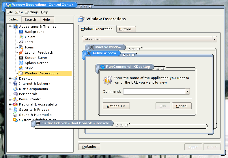
INTRODUCTION ============ First, a word about Fahrenheit. The theme, like its namesake, is not meant to be the final word in practicality or usability. Think about it: why hasn't the US switched to Celsius, a much more practical and usable temperature scale? It makes much more sense to base a temperature scale around water (since so much of life literally revolves around water). Just what is 0�F and 100�F anyways? It makes no sense at all, other than the inertia of tradition. Fahrenheit the theme is much the same way, except that it lacks the temperature scale's inertia, but it also looks (in the author's opinion) more visually interesting than the standard square box. Be it the lickable OSX or the crayola WinXP, the fact remains that even by rounding out the corners, most window decorations are hopelessly mired in squareville. Now, there are good reasons for square. Square is usable. Square is practical. Square is comforting and familiar, like a teddy bear that's gotten the stuffing squeezed out of it. But square is also boring, overdone, and, like week-old leftovers, there's only so much you can do with it before you get sick of turkey sandwiches and turkey quiche and turkey omelets and cream of turkey soup. To relieve my boredom, there's Fahrenheit. That's right, this is about _me_. If you like it, you're more than welcome to use it. If you don't, then forget about it. It's not for you. Go back to squaredom. I don't care. Yes, this violates Fitt's law in obscene and unthinkable ways. The buttons may be too small, but then, I have fine motor control and don't find it a problem in the least. I find it usable; therefore, it is usable for me. It wastes space with all the funky curves and bars. Well, my monitor is 1400x1050, so I've got space to waste.
COMPILING ========= A straight-forward affair; read the INSTALL file for more details, but the following ought to be enough: 1) make -f Makefile.cvs 2) ./configure (Depending on your system, you may need to add '--prefix=/usr' and if it can't find the location of the Qt libs and includes, those as well. './configure --help' will tell you what you need to know.) 3) make 4) (as root) make install
If you have problems compiling, make sure that you have the necessary KDE development files installed. And before complaining that you can't compile, read through the discussions for other KDE 3.2 borders. There is a 99.9% chance that your problem already has a long and glorious precedent set by others.
COLORS ====== There are six color settings that you will want to play with in the Control Panel:Appearances & Themes:Colors dialog. These are: - Active Title Bar - Inactive Title Bar - Active Window Frame - Inactive Window Frame - Active Window Handle - Inactive Window Handle The title bar and window frame colors should be self-evident. Less obviously, however, are the window handle settings. This changes the color of the grip lines in the upper-right hand corner of the frame.
THANKS ====== Inspiration: Fahrenheit was inspired by the mock-up screenshots of a hypothetical future BeOS window border, GonX. See the screenshots at http://cotito.free.fr/projects/. David Johnson on the kwin mailing list was of great help to me while writing this decoration. His Example decoration (http://www.kde-look.org/content/show.php?content=6332) is also a great framework for creating new decorations as well.
That's too bad. On the mockups I can actually see what I was waiting for for years.
I sure hope some enthusiast takes on this amazing windeco and develops it further.
Ive got the exact same message when trying to compile it.
>sudo make -f Makefile.cvs
*** YOU'RE USING automake (GNU automake) 1.9.1.
*** KDE requires automake 1.6.1 or newer
make[1]: *** [cvs] Fejl 1
make: *** [all] Fejl 2
I am using suse 9.2 and have all devel-lib's installed.
I tried to downgrade automake but the oldest verion shipped with my system is 1.9.1-4
I haven't downloaded this, but I'll just say that as a rule, you shouldn't force your users to run make -f Makefile.cvs.
Its Makefile.cvs for a reason, your supposed to run it before making the tar.
When I compiled this I got the following:
rnd:/home/rnd/fahrenheit-0.1 # make -f Makefile.cvs
*** YOU'RE USING automake (GNU automake) 1.9.5.
*** KDE requires automake 1.6.1 or newer
make[1]: *** [cvs] Error 1
make: *** [all] Error 2
Hi!
A feature request: How about changing the window border sligthly for maximized windows, as Keramik does? Maximized windows should IMHO lack the lower right and the upper left handles so they make better use of the screen size without annoying manual adjustments?
Greetings,
Interneci
the kwin deco is really nice - compliments to the chef :]
...i'd only propose a small improvement:
could you make it so, that instead of having all buttons on the right of the title, you could have some that would hang down from the edge (like that white-stripped tab now does).
that way you could place buttons left and right from the title also here (like you can with other kwin decos)
...pretty please ^^
What features do you have in mind? If you want moveable tabs like in the B2 decoration, you'll need to send a patch. Like I told another guy, I started by modifying the B2 theme so that the tabs were moveable, but the results just did not look good. For the next release, I am planning on making the tab alternate between the left and right sides of the window; alt-click (or something like that) on the tab will make it switch sides.
Fahrenheit is awesome - I am using it from now!
The only thing I am missing is that the window title could have a behavior like B2's which would make it a little more comfortable.
Keep up the good work!
nice try but if you want to be 'different' how about insert some IQ into wm ? look at B2 - same thing, squareish, but smart in in preventing overlaping (yes - i like B2 :-)
I actually started by modifying B2, but the result was not visually pleasing. If you can come up with a way that makes it look nice, please send a patch.
Heey man ... you've done a great job, i tell this cuz this is the first time that i could see a different windeco ...
Continue with your work...
... A suggestion ... maybe you might consider change your close, minimize, maximize ... etc , buttons and your background, that will make look more interesting your deco.
See Yah ...
I've tried it. It looks very good ...but there's just one tiny thing that I miss.
I like having my "x" (and menu) button separated from the others, and in your kwin deco this cannot be done :( ...that's the only reason why I don't use it.
My suggestion: you could make an extension of the button section pointing to the bottom (like an tupped over "L") ...so you would have the (already existant) horizontal bit acting as the "right" bit of the bar in the buttons' settings, and the vertical one, acting as the "left" bit.
I hope you can understand what I'm trying to say ...I know it's written down a bit confuzing :]
The Fahrenheit temperature scale was based on conditions that could be readily reproduced in any laboratory, thus allowing consistency between calibrated measuring devices.
Zero degrees was the coldest temperature you could reliably repeat.
It is achieved by mixing equal parts of ice, water, and salt and waiting for them to achieve equilibrium.
32 degrees was set as the freezing point of water to allow 180 divisions (degrees) of temperature between the freezing and boiling points of water.
This resulted in a boiling point of 212 degrees for water.
Those window buttons are horribly unuseable - you may have fine motor control but for us epileptics in the crowd (raise the roof), you're being biased. I mean, "butsnso are teoaa smaller for meaaa"...... hehe - just kidding...
Exceptional, unconventional, and generally nice all-round. It also does unkind things to my poor, struggling CPU as it tries to draw drop shadows around all those curves. :P
It'd be nice if the Title Button colour settings could be followed.
In response to a comment made above, I like having the window title tab thing locked to one side. It makes good screenshots easier to set up, or something. That said, I would like an option to lock it to the right side instead of the left.
Sorry it won't even bother starting compiling:
$ make -f Makefile.cvs
*** YOU'RE USING Autoconf version 2.13.
*** KDE requires autoconf 2.53 or newer
make[1]: *** [cvs] Error 1
make: *** [all] Error 2
$ emerge -s autoconf
* sys-devel/autoconf
Latest version available: 2.58-r1
Latest version installed: 2.58-r1
Size of downloaded files: 1,336 kB
Homepage: http://www.gnu.org/software/autoconf/autoconf.html
Description: Used to create autoconfiguration files
License: GPL-2
The version I have installed is 2.58.


Ratings & Comments
50 Comments
That's too bad. On the mockups I can actually see what I was waiting for for years. I sure hope some enthusiast takes on this amazing windeco and develops it further.
I LIKE the attitude! Now, can and will you try to make a set with the bar at the bottom? That would make my day!
Ive got the exact same message when trying to compile it. >sudo make -f Makefile.cvs *** YOU'RE USING automake (GNU automake) 1.9.1. *** KDE requires automake 1.6.1 or newer make[1]: *** [cvs] Fejl 1 make: *** [all] Fejl 2 I am using suse 9.2 and have all devel-lib's installed. I tried to downgrade automake but the oldest verion shipped with my system is 1.9.1-4
I haven't downloaded this, but I'll just say that as a rule, you shouldn't force your users to run make -f Makefile.cvs. Its Makefile.cvs for a reason, your supposed to run it before making the tar.
When I compiled this I got the following: rnd:/home/rnd/fahrenheit-0.1 # make -f Makefile.cvs *** YOU'RE USING automake (GNU automake) 1.9.5. *** KDE requires automake 1.6.1 or newer make[1]: *** [cvs] Error 1 make: *** [all] Error 2
Hi! A feature request: How about changing the window border sligthly for maximized windows, as Keramik does? Maximized windows should IMHO lack the lower right and the upper left handles so they make better use of the screen size without annoying manual adjustments? Greetings, Interneci
the kwin deco is really nice - compliments to the chef :] ...i'd only propose a small improvement: could you make it so, that instead of having all buttons on the right of the title, you could have some that would hang down from the edge (like that white-stripped tab now does). that way you could place buttons left and right from the title also here (like you can with other kwin decos) ...pretty please ^^
oops, just saw that i asked you this already (sorry) ...but i'd still like to see it :]
hm, i would it find nice if ..(sorry for my english) ..if the titlebar in rolled up state only shows the title. nicolas
will it be an update with more beos like functions ?
What features do you have in mind? If you want moveable tabs like in the B2 decoration, you'll need to send a patch. Like I told another guy, I started by modifying the B2 theme so that the tabs were moveable, but the results just did not look good. For the next release, I am planning on making the tab alternate between the left and right sides of the window; alt-click (or something like that) on the tab will make it switch sides.
Fahrenheit is awesome - I am using it from now! The only thing I am missing is that the window title could have a behavior like B2's which would make it a little more comfortable. Keep up the good work!
nice try but if you want to be 'different' how about insert some IQ into wm ? look at B2 - same thing, squareish, but smart in in preventing overlaping (yes - i like B2 :-)
I actually started by modifying B2, but the result was not visually pleasing. If you can come up with a way that makes it look nice, please send a patch.
That is our win deco number one now ! All servers and Workstations become this. thx nico
Heey man ... you've done a great job, i tell this cuz this is the first time that i could see a different windeco ... Continue with your work... ... A suggestion ... maybe you might consider change your close, minimize, maximize ... etc , buttons and your background, that will make look more interesting your deco. See Yah ...
I've tried it. It looks very good ...but there's just one tiny thing that I miss. I like having my "x" (and menu) button separated from the others, and in your kwin deco this cannot be done :( ...that's the only reason why I don't use it. My suggestion: you could make an extension of the button section pointing to the bottom (like an tupped over "L") ...so you would have the (already existant) horizontal bit acting as the "right" bit of the bar in the buttons' settings, and the vertical one, acting as the "left" bit. I hope you can understand what I'm trying to say ...I know it's written down a bit confuzing :]
Actually the Farenheit system is based on water--salt water, that is. The temperature of saline ocean water.
Ah, but what happens at 100F? And then where does 212 come in?
The Fahrenheit temperature scale was based on conditions that could be readily reproduced in any laboratory, thus allowing consistency between calibrated measuring devices. Zero degrees was the coldest temperature you could reliably repeat. It is achieved by mixing equal parts of ice, water, and salt and waiting for them to achieve equilibrium. 32 degrees was set as the freezing point of water to allow 180 divisions (degrees) of temperature between the freezing and boiling points of water. This resulted in a boiling point of 212 degrees for water.
Those window buttons are horribly unuseable - you may have fine motor control but for us epileptics in the crowd (raise the roof), you're being biased. I mean, "butsnso are teoaa smaller for meaaa"...... hehe - just kidding...
This Deco looks really great and I can't wait to see how it all turns out... Good Job! and please keep up the great work...
Exceptional, unconventional, and generally nice all-round. It also does unkind things to my poor, struggling CPU as it tries to draw drop shadows around all those curves. :P It'd be nice if the Title Button colour settings could be followed. In response to a comment made above, I like having the window title tab thing locked to one side. It makes good screenshots easier to set up, or something. That said, I would like an option to lock it to the right side instead of the left.
gj
Sorry it won't even bother starting compiling: $ make -f Makefile.cvs *** YOU'RE USING Autoconf version 2.13. *** KDE requires autoconf 2.53 or newer make[1]: *** [cvs] Error 1 make: *** [all] Error 2 $ emerge -s autoconf * sys-devel/autoconf Latest version available: 2.58-r1 Latest version installed: 2.58-r1 Size of downloaded files: 1,336 kB Homepage: http://www.gnu.org/software/autoconf/autoconf.html Description: Used to create autoconfiguration files License: GPL-2 The version I have installed is 2.58.