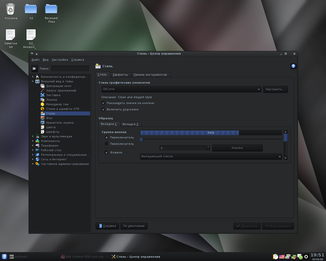
This theme requires latest QtCurve and Crystal Window Decoration. I'm using Crystal 1.06 and QtCurve 0.59.2. It contains a color scheme, qtcurve config, crystal background and kicker background.
Config of crystal decoration: Outline - #070808 Inline - #1A1C1D
...and I like it! The only difference is that I chose the Vista buttons. I don't particularly like anything to do with M$, but I do like the buttons.
Alright, enough about that. Anyhow, I do like your theme. I tend to use 'dark' themes myself. The first thing I did was opened up Konqueror to check for adverse color scheme problems. Things were alright there...
Then I opened Kate... Other than the text color in Kate being too dark to really see well, this theme of yours is alright. I just set the text color to match the other. Some people just see it as being too much trouble if they have to change the font color is all.
I've now got another cool dark theme. Thanx!
I guess the address bar's font is too dark in Konqueror also... Just thought I'd say something, as I'm certain someone else will also.
It's still a nice theme though!
I'm still trying to find soft contrast in the dark colors. In next versions i will upload a more balanced theme.
Also i want to create KWrite text-theme in this style.
I want to improve this theme, so inform me about all defects you find.
Thanks.


Ratings & Comments
8 Comments
sorry to be such a noob... i'm using mandriva and dont have experience in kde themes. What should I do to use this. Thanks
Bautiful job, i have linked your style in the page of DarkGlass iconset and now i use it for default.
I like the blue text
I link dark themes, but I cannot use such tiny fonts. Even if it is one sans-serif, it's hard to read it.
My theme don't contains font config, so you can choose any font which you like. This small font is readable for me. ;)
...and I like it! The only difference is that I chose the Vista buttons. I don't particularly like anything to do with M$, but I do like the buttons. Alright, enough about that. Anyhow, I do like your theme. I tend to use 'dark' themes myself. The first thing I did was opened up Konqueror to check for adverse color scheme problems. Things were alright there... Then I opened Kate... Other than the text color in Kate being too dark to really see well, this theme of yours is alright. I just set the text color to match the other. Some people just see it as being too much trouble if they have to change the font color is all. I've now got another cool dark theme. Thanx!
I guess the address bar's font is too dark in Konqueror also... Just thought I'd say something, as I'm certain someone else will also. It's still a nice theme though!
I'm still trying to find soft contrast in the dark colors. In next versions i will upload a more balanced theme. Also i want to create KWrite text-theme in this style. I want to improve this theme, so inform me about all defects you find. Thanks.