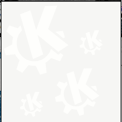
Description: This is an alternate logo for Kubuntu because I dislike the default logo and I doodle too much in French class. It's based more on a single gear. The colors are from the dapper logo and I don't know how to make glossy fancy stuff in inkscape. Feel free to make changes!!
*Update: New versions with the spacing in between straightened and a version with rounded corners, both using the Oxygen Palette.
*Update: OK, going by what people have said in the Kubuntu and Ubuntu forums and in the poll, I think I'll go ahead with creating an alternate theme, allternate slash screens, wallpapers, figure out how to replace the K menu logo, etc.. Thanks for your input! And if anyone still wants to help me, feel free to ask! I need it!
I added new versions with the spacing in between straightened and a version with rounded corners, both using the Oxygen Palette. It sucks that there's no round corner tool in inkscape so I had to use a glitch that occurs in dynamic offsetting and then do a ton of scaling.
It looks great (much better than current logo)
I think it would read better if it could be made more in the style of the KDE logo (tapered, rounded corners, longer teeth, etc) and check out the Oxygen color palette.
keep it up :)
I do like it much better as well. I think you should seriously consider submitting it to Ubuntu for the next version on Kubuntu. I Really like its simplicity.


Ratings & Comments
10 Comments
The light coloured one looks pretty similar to the Xubuntu logo.
This is much better than the official one. I hope we can change it to this one. It's a whole lot cleaner and more simple.
good idea.
I added new versions with the spacing in between straightened and a version with rounded corners, both using the Oxygen Palette. It sucks that there's no round corner tool in inkscape so I had to use a glitch that occurs in dynamic offsetting and then do a ton of scaling.
It looks great (much better than current logo) I think it would read better if it could be made more in the style of the KDE logo (tapered, rounded corners, longer teeth, etc) and check out the Oxygen color palette. keep it up :)
It really looks good, however a rounded corner shapes instead of squared corner would look better, what do you think?
I do like it much better as well. I think you should seriously consider submitting it to Ubuntu for the next version on Kubuntu. I Really like its simplicity.
Looks so much better than the official one!
I'd love to see this as the next logo revision. It looks really good.
Good work.