


Blank Layout
mpop


Source (link to git-repo or to original if based on someone elses unmodified work):
Changes for 1.0.2:
- by default, the "favorites by artist" and "suggested songs" boxes are now shown. If you want to hide them (like I do for my amaroK), you'll have to uncomment the corresponding "display: none;" in the stylesheet.css file.
- suppressed newdanna-full, so that the theme won't go in too many different directions.
- stopped trying to float elements in the "recently added songs" box, because sometimes the table effect wouldn't go ok (and i cant figure out why). So it's basic one-row-per-item layout now.
A few changes for 1.0.1:
- changed name from newdanna-blue to newdanna. I like short names, and the screenshots make it obvious that it IS blue.
- dropped the old danna-blue style for box headers. Sorry for those who liked it better.
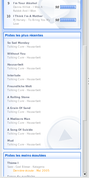
- improved the newest songs display. Now it should look like a two-column table, and stay that way whatever the size of the context browser or of the content.
- corrected (as much as possible) the bug with the "metadata history" box header. But I couldn't style it further since that part of the html code is pretty bad (virtually no specific markers...).


Other Amarok Themes:


Ratings & Comments
20 Comments
oculd you check the "favorite tracks by [artist]" stuff? the ratings overlap at the right corner of the rectangle... I could not fix it...
I've got this problem too. Both ratings in Sugested and Favourit songs are too much right aligned. Amarok 1.4.7. Great theme BTW.
Add the following lines to the stylesheet file. .statsBox { padding-right: 6px; }
Hi, i cant install the theme. can somebody help me please? thanks in advance
Just download the tar.bz2 file to, say, your home directory. In Amarok, click Settings. In the Appearance tab, look for the button that says [Install New Style]. Pick the file and click OK. You can now select the new style in the drop down menu.
Followed your advice and I could not find the tab "Appearance" Amarok v 2.1.1 Sorry for my english
Followed your advice and I could not find the tab "Appearance" Amarok v 2.1.1 Sorry for my english
Followed your advice and I could not find the tab "Appearance" Amarok v 2.1.1 Sorry for my english
This is best AmaroK thame for me! :) But some time's inactiv TAB buttons and button "Clear" (in filter form) is grey! Is this a bug????
Hi! How do I use this theme in amarok? Thank you!
From Amarok 1.2.2 on, you can just go into the amarok configuration, select appearance or something like that (it's the second tab) and then "install new style" (bottom right). Select the file you've downloaded, and it should be ok.
First of all, you did a great job; there´s just one little thing i would like to get changed: the font size of the album tracks are too small for my eyes, i´d really appreciate it, if you could add a new version of the newdanna-lite style with larger fonts ...
Yes it's true that it's small... Does someone know whether i can use standard system font sizes ? Or i should try to make a version for big screens (above 1024*768)
i made a blue version of the splash screen. you can download it here: http://ww2.moocowfish.com:5357/~nathan/blue_danna_splash.png if you upload it as part of your theme i won't have to mirror it from such an ugly location anymore. ;)
When listening to radio streams, the "Metadata History" box has the wrong font color in the heading. The same bug is in the original danna theme.
this should be corrected by now
Looks great, especially the lyrics tab! Loving it :)
Much better than my half-arsed attempt ^_^ There seems to be a problem with short titles in the new tracks section. They are appearing 2 to a line and badly aligned (it looks a bit messy) Still, much better than mine (I like what you did with the avatar - much less clashy)
I tested floated divs on the new tracks section, and when I did it looked good, but that might be because all my recently added tracks were from the same album, so all the divs have the same widths... I can switch it back to the old "one track = one line" layout or put a "widht: 46%" for the divs so that there will always be two tracks for each line, whatever the content of each div is (long or short title)... Vote? Anyway i'll try to correct that (and the thing with the Metadata history section, which I didn't style at all since I don't usually use it) in a few days.
Yes, finally it does look messy. So I switched back to normal mode.