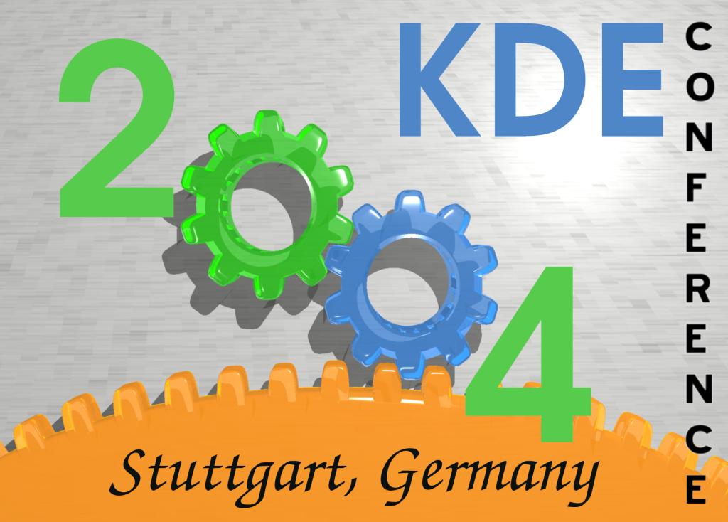
Description: Please help me decide on which one to submit. I don't want to post two because they would steal votes from each other. Just add a comment with CLEAR or SKETCH in the subject plus any suggestions in the body. I'll "let one go" in about 2 days. Thanks.
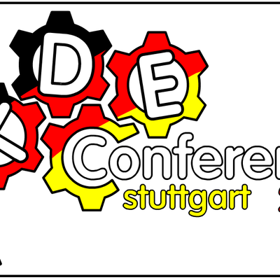
Well I don't know why, but every time I see this logo it reminds me of the perfect picture that should be seen on a KDE Conference 2004 stamp. But don't ask me why ... but it definately looks good!
Tackat
Logos should be as simple as possible. I'd even simplify the 1st one further (at least the background). Also not sure about the bottom gear color.
Good Luck!
J.A.


Ratings & Comments
5 Comments
Well, it is having a little MORE in it, but it looks good for me.
ok! I am late :) but I liked it.
Well I don't know why, but every time I see this logo it reminds me of the perfect picture that should be seen on a KDE Conference 2004 stamp. But don't ask me why ... but it definately looks good! Tackat
Definitively. The other looks like someone fiddled with a filter.
Logos should be as simple as possible. I'd even simplify the 1st one further (at least the background). Also not sure about the bottom gear color. Good Luck! J.A.