


Tell me what you think

Any suggestions (positive!) for improvement?


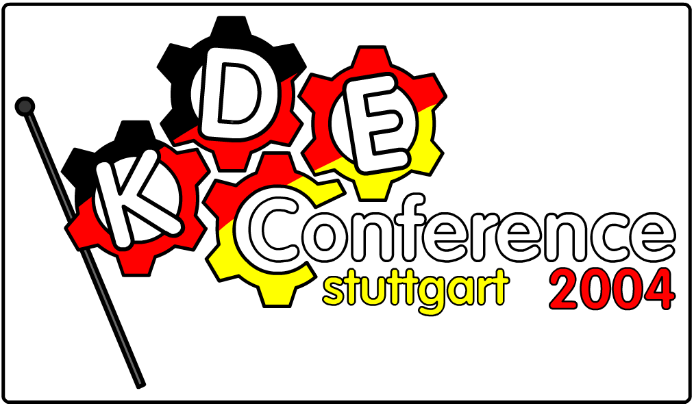
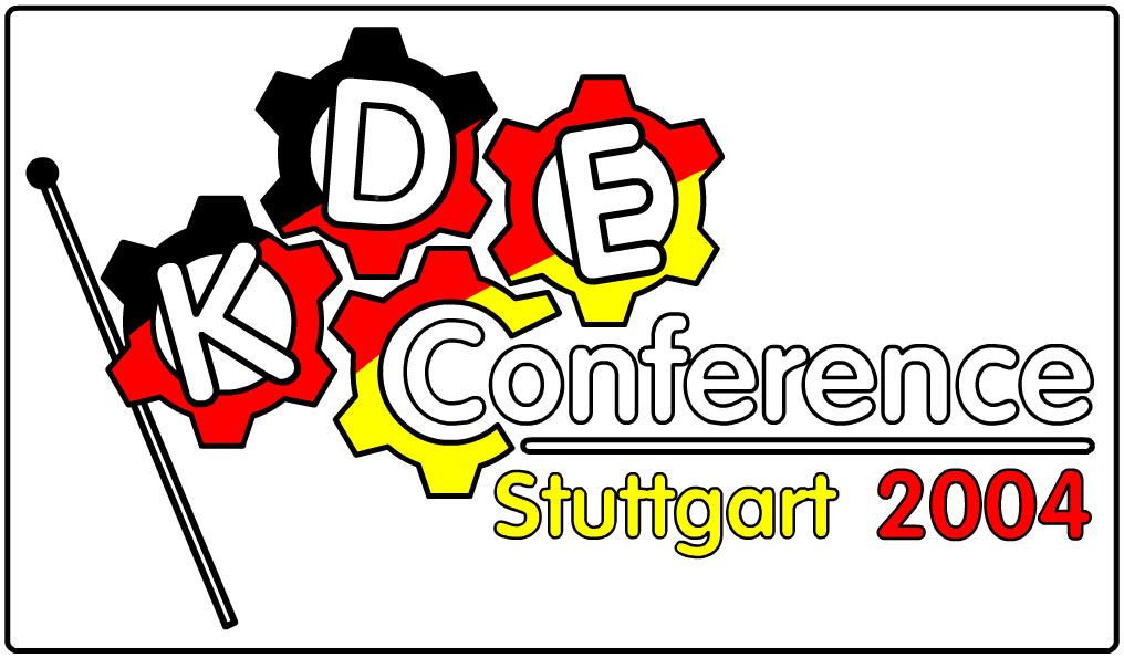
Source (link to git-repo or to original if based on someone elses unmodified work):
0.2 - improved "stuttgart 2004" area, made flag pole obey colour scheme (see second preview).


Other Various Artwork:


Ratings & Comments
3 Comments
... but it's kinda hard to read!
Keep working on it!
I think it's not bad, the original concept and the little number of colors make this work, in my opinion, a good logo. But it needs work,.. i think. Your art is very original ! Keep it up !
Thanks for the feedback. I agree that my logo needs work, especially around the "stuttgart 2004" area. Any suggestions?