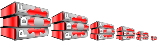
i think also, that it is underrates, because ist is not as simple and similar to other KDE icons like content 16614 and an good icon have be remarkable.
This icon is great, and I'll tell you why. It's easy to associate it with PDF. The icon is quite original, and browsing through a lot of (random) icons it would be easy to pick this one out if you were looking for it. That's why I dig it.
This icon is very underrated.
If this doesnt get to be the kpdf default icon (which I dont think it will based on most peoples unfavorable reaction),it is certainly going to be my mime-type icon for PDFs. I think this is great :)
My immediate reaction was
to vote it down.
This is because in the small
view this looked rather simple
and bulky and FDP is a German
political party. This is a
strange connotation and for
a brief moment I thought someone
would do some advertising here.
After reading the
comments I zoomed the icon
and it looks much better with
higher resolution, I agree.
The pages of each book should
be discernible though IMHO.
I still think that the book should
be sorted in PDF order. I certainly
wouldn't want to have an FDP
icon on my desktop ;-)
While this is definitely not my favorite possibility, it certainly deserves a score greater than 50%, so I voted it up. Nice work and concept. Personally I'm not a fan of all these icons that make liberal use of "books." To me it makes the icons look bulky and unclear.


Ratings & Comments
10 Comments
i think also, that it is underrates, because ist is not as simple and similar to other KDE icons like content 16614 and an good icon have be remarkable.
This icon is great, and I'll tell you why. It's easy to associate it with PDF. The icon is quite original, and browsing through a lot of (random) icons it would be easy to pick this one out if you were looking for it. That's why I dig it. This icon is very underrated.
Thank you. The fact that it pleases you mean alot to me :oD
If this doesnt get to be the kpdf default icon (which I dont think it will based on most peoples unfavorable reaction),it is certainly going to be my mime-type icon for PDFs. I think this is great :)
Yeah i also noticed that issue about the text order. FPD in portuguese it's the same as SOB in english. LOL croky
I think you should put the P on the bottom book and the F oder the top book. At first it reads FDP, which is the name of a German political party.
My immediate reaction was to vote it down. This is because in the small view this looked rather simple and bulky and FDP is a German political party. This is a strange connotation and for a brief moment I thought someone would do some advertising here. After reading the comments I zoomed the icon and it looks much better with higher resolution, I agree. The pages of each book should be discernible though IMHO. I still think that the book should be sorted in PDF order. I certainly wouldn't want to have an FDP icon on my desktop ;-)
OOps.. Sorry about that :-) When I was addind the text it seemed fine at the moment.
While this is definitely not my favorite possibility, it certainly deserves a score greater than 50%, so I voted it up. Nice work and concept. Personally I'm not a fan of all these icons that make liberal use of "books." To me it makes the icons look bulky and unclear.
Who voted this down into the 30's this is great, highly original without compromising the adobe tm'd logo. I love it!