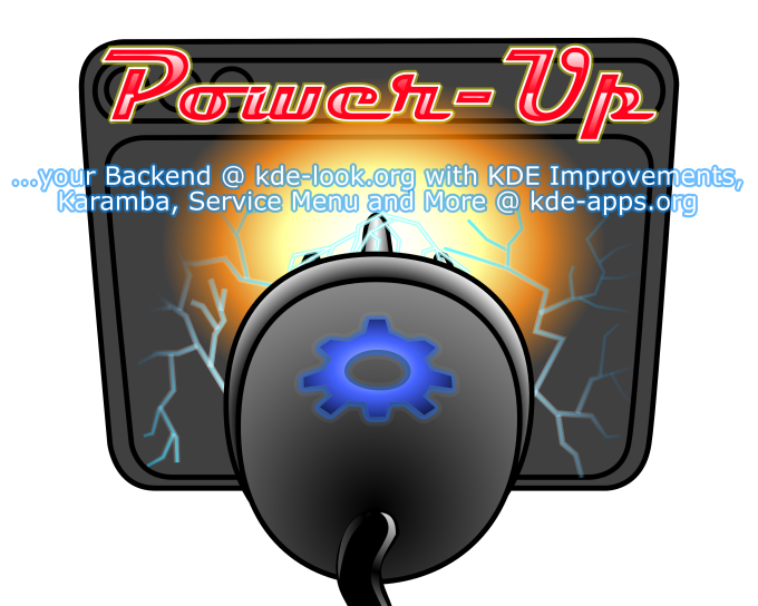
the text reads a bit awkward. Maybe something like. MORE THAN MEETS THE EYE! lol hehe
Seriously maybe just www.kde-look.org in large electric font under Power up on the plug image.
When it comes to text on t-shirts IMHO less is more.
First I would like to thank everyone for commenting. I'm going to make the suggested changes and submit other entries. Before everyone bombards me, Yes I know I misspelled "Improvements" on the back image. I'll fix it in the coming hours. :-D
Your image is great! The only bad thing is that the kde-look.org is hard to read (due to the font). IMO, "www.kde-look.org" should be the first word tth viewer notices.


Ratings & Comments
7 Comments
the text reads a bit awkward. Maybe something like. MORE THAN MEETS THE EYE! lol hehe Seriously maybe just www.kde-look.org in large electric font under Power up on the plug image. When it comes to text on t-shirts IMHO less is more.
First I would like to thank everyone for commenting. I'm going to make the suggested changes and submit other entries. Before everyone bombards me, Yes I know I misspelled "Improvements" on the back image. I'll fix it in the coming hours. :-D
I dunno why, but it reminds me of Transformers for some reason. =D I like Transformers. Very cool idea for the shirt
Me too man!!! MORE THAN MEETS THE EYE!
Your image is great! The only bad thing is that the kde-look.org is hard to read (due to the font). IMO, "www.kde-look.org" should be the first word tth viewer notices.
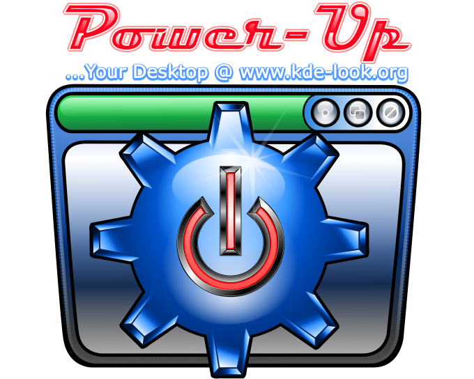
the window and the power gear in the first image are realy cool!!! but the font looks somehow bad... maybe you should use a "cooler" font.
All I can say is you just set the new standard in this contest.