

Note: I'm always looking for ways to improve it. So if you give a good vote or a bad vote, take a second and tell what you like and what you think I could improve on, it would be very cool and helpful. Thanks
 .
.

Source (link to git-repo or to original if based on someone elses unmodified work):
.What's New?
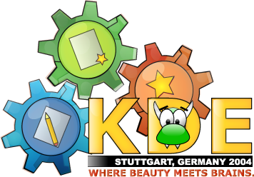
-penguin has been replaced by my konqui(first pic.. suggestions?)
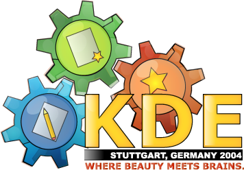
-reguar no mascot picture is in the second pic.
-I thought of changing "Where Beauty Meets Brains" to "Customize. Create. Innovate".. which is what the three icons stand for. What do you think?
What's Old?
4.0
-a lot of shading work on the wheels.
-now featuring 2 different looks:
-the new look is in screenshot1.
-the traditional look is in screenshot2.
which one do you like better?
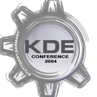
-added conference text.
3.0:
-the first screenshot
-a lot of work on the KDE sign to polish the look.
-removal of traces of small trasparent patches in the file.
-the polishing of the text below kde.
-and of course needed to add a more linux feeling so added a penguin peeking in through the letter 'd'.
2.0:
-The second screenshot.
-The file now includes a big trasparent png version.
-The file also includes svg(source).
-Gears have been rotated so they can move and aren't stuck .
1.0:
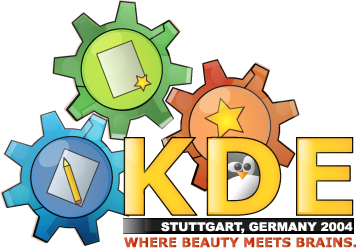
-the original, third screenshot.


Other Various Artwork:


Ratings & Comments
25 Comments
Well, I never liked the Crystal Penguin. While it looks funny on a desktop it looks somehow irritated or even mad. I don't think that this is good for an conference. Maybe you should try the original tux here? And then KDE does not only run on Linux. A lot of people use it on *BSD or even Solaris.
yeah konqi can work here too
Yeah! Konqi would be great! He could look out of the O and cover some parts of it with his head.
Konqi looks great. You got my vote.
Hey, you're really improving. Nice!
you're really improving it. the first time I looked at the shots, I didnt really like them. but now I do ;-) the first screenshot is very good, imho. And I like the colorful nature of the pics. the second one is 'too empty'.
I must say its VERY nice... But how many times do you plan on upgrading this? it's getting a little old. I dont mean to be a jerk ... im just telling you that people may feel the same way and vote it down.
This will probably be one of my last upgrades(might be one more.) I basically update it every time there is something that people request that I think warrants an update(such as the conference connection, putting up source.) I soon won't have any time to work on it and i like feedback, which is why i've updated it so often recently.
although it looks nice, I do not get the link to the conference.
Hehehe this connection can be made. I'll make another release.
I like this submission a lot. I must admit though, that while the penguin is amusing, i think i prefer the version without the penguin in it.
I think the font of the text is much more smooth in the one with the penguin. I like the 3rd edition most :). Looking forward to see more artworks of you, artur. I'm wondering why this picture "only" got 78% yet.
I actually like the penguin a lot, i think it matches but I could see where you can say that it looks good without it too(it might draw away attention from the left). But it is really a matter of personal taste. I could post both versions in the file w/ penguin and w/o. We could have a little vote hehehe. :)
The pinguin looking through the "D" is funny :))
http://www.lenzheilmann.de/pics/desktop.jpg >> My current desktop :)
looks great :)
Thank you for adding the picture and source. Now, that's my new background picture... :)
Nice work! :) I would like it if you would post a png version with an transparent background, so that I can set my own favorite background color. Please remember: If you release your wallpaper under the GPL, you have to post your source (e.g. the gimp file), too. Thanks. :)
yes please post the xcf file. This can be used in several places. Fab
Well noted, i'll update the package to include a trasparent version and svg source.
Hey, the gears are jammed! :-) D.
Hi there... Nice logo I like it (No vote yet... I am waiting for more entries...), but one question: Do you plan to release the vector sources (what format are they in?)? Otherwise the PNG is too small for anything (Wallpaper, T-Shirt etc.) and the license (GPL) doesn't really make sense without the source... Patrick
I think this would make a great shirt! I wouldn't mind wearing one. :) In fact, this would make a nice wallpaper too.
I think this would look great on a shirt. The colors and shading is great and the layout is good too :) One suggestion though, the pencil and paper looks a little busy compared with the other gear centers... maybe it could use a little simplification?
Yeah I think that is a great suggestion, i'll remove the writing on the paper and the pencil. Thanks!