


Splashes | KDE-Look t-shirt
flow


Source (link to git-repo or to original if based on someone elses unmodified work):
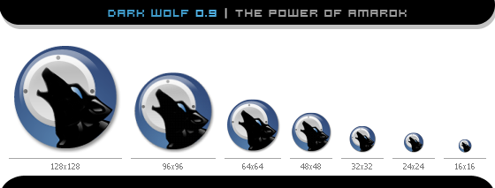
// 0.9
- Changed Highlight
- Changed Speaker color
- Removed Black Border
- Tweaked it here and there
// 0.6
- Changed the moon to a speaker
- Changed Eye color to a light blue
- Added a Border for better visibility


More Various Artwork from flow:
Other Various Artwork:


Ratings & Comments
30 Comments
..if you also added the one without the border. I use transparency on my menu so, so the square shape of the border around the circle shaped icon makes it look out of place. Thanks for a great icon!
i just removed the border so it should look better now. If you see the old screens press strg+F5 to update them. flo
Hi Da-Flow, Why are you using a thin black line around this icon? Will it stay? Good work on you Sparkling !
im not sure if it will stay: playing arround with diffrent styles i think i will remove it in the next version, (i got it ready but will wait to upload it till tommorow, to tired and exausted :[ ) thx for the comment on sparkling
removed ;)
I hope you don't mind me giving a suggestion? I was thinking the wolf outline shouldn't be under the crystal look.. you know that white gradient you have in a circle to give it that shiny look? I was thinking that you should make the wolf part of it's own crystal.. I dunno if I got that across properly... ie. right now it looks like the wolf is inside a glass marble and it doesn't really "pop" out to me .. =) Other than that, it's a nice icon. =)
* SVG or SVGZ is the required format ?(bitmap based icons not accepted)
Coming along very nicely! I like alot!!
The icon is well designed and very sharp. But it doesn't make the connection to a sound app. Besides, i think i've seen already something very similar not too long ago ... croky
I think it _does_ associate with sounds apps, due to the "howling" of the wolf. This is a subtle analogy for sending media waves. IMHO much better than headphones or speakers.
Well it is a question of taste regarding using or not using a speaker BUT if you put two icons in a desktop, one showing a speaker and other without speaker, i bet most people will hit the sound speaker icon if they want to launch a sound app ... just a thought .
interesting point of view.
here comes my point of view on icon/logo-design: 1.) It doesnt matter how often users click on an icon or if they would at first sight associate a speaker with a sound app. Its the psychological view that counts: For example: -Music-match icon: Any Speaker in there : No Its 2 "Shapes that match each other" -Winamp icon: Any Speaker in there : No A Sine wave -Sonique Icon: Speaker: .... No Lets continue where i begann naming examples: Fact is Original and Icons connected to the name/philosophy of an app stay better in mind then a simple or even perfectly designed speaker. A Speaker has no Philosophy, Character or specific feature. Its a Speaker.
but this are commercial apps. I feel amaroK is the KDE sound player application.
This is true, i would never claim my view as the only right, so i have to admit: your view is very right too. Still its an Stand-alone app. :) I think a combination is the right way to go so the update has the wanted speaker blended in too. :) P.S.:Its nice discussing with you and i very much like your icon im quite sure i couldnt make a speaker look that beautifull ;)
seems I didn't mentioned those icons you have posted are just great :)
I understand your POV and i agree with most of what you've said but anyway, everyone has its own. Hmmm, i like the new version best ;) croky
Btw, the "howling" of the wolf has a relation with just one sound app, amaroK. While this is good because it is unique and people used to amaroK will understand the idea, you have to see things through the other perpective: people not knowing about amaroK will be lost when they see just a wolf icon . Besides, what you reffer as "a subtle analogy for sending media waves" has already been (extremely well) done by euxneks and his icon "wolf howl" for this contest. To flow: please don't get me wrong, i do like your icon, i'm just discussing details. croky
What you may remember seeing is http://www.elfquest.com/ which is the homepage of WARP Graphics, acclaimed author of the fantasy series ElfQuest, which first appeared in print in 1979. They have a big problem (at least have had in the past) with people who use the WARP Graphics logo as their own. While they have a very liberal policy regarding copyright, their logo is holy ground, in that it's what they are identified by. In short, this and the WARP Graphics logo http://www.elfquest.com/images/About.gif do seem very similar. But, as mentioned before, the two products (amaroK and ElfQuest) are so different that it has little or no meaning ;) Also: Very nice work! If this one is chosen over my personal favourite (amaroK: Wolf Howl) then I shall be only very little disappointed ;)
here i come to defend myself: The artwork which inspired and served as my original to sketch, vectorise and create the icon is this: http://da-flow.schaekel.org/da-flow/daten/wolf.jpg and in my mind there is no copyright violation in designing an icon based on a old drawing. I did not even know the site you mentioned above, but what you say is true this could lead to compications. Sounds like this icon will maybe be useless.
Just to clarify: I wasn't accusing you of plagiarism, just pointing out that there is a similarity there ;) Still think it's very good work :)
when i saw the icon on the above website a shiver ran "down" my back.. I hate coinsidences like this. I worked on the logo and updated it, now it should fit the diffrent views and needs of people better. Take a glance :)
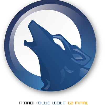
Cool icon, one of my favorites. This version also scales down well, better than the blue version. Guess it's due to the higher contrast.
I totally agree :)
thx very much to both of you