


roKy the amaroK wolf
theobroma


Source (link to git-repo or to original if based on someone elses unmodified work):
* I added a version without the Adobe "A" shadow and fixed some other shadows.
* I added a version w/o the loop in the K (just in case).


More Various Artwork from theobroma:
Other Various Artwork:


Ratings & Comments
10 Comments
You need to endeavour, your design too corresponds to the present fashion, but a fashion changes. Think of something permanent, which it is impossible to repeat, but that to all pleased. Successes! P.S. You have large creative capabilities. You work beautifully, but it is needed always to study new.
looks very good, especially the ones with the loop!
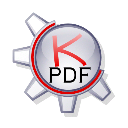
This icon is the best I've seen here! It does not depend on the Adobe logo, but is inspired from it. VERY GOOD!
i think this icon is great. but i cant see it in any icon set, and especially crystal. i think this one is much better than many others, but just doesnt fit as one icon in a whole icon set.
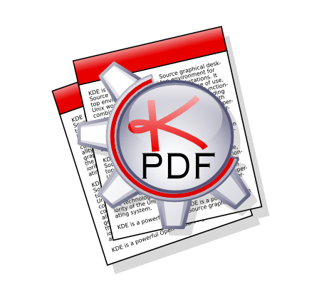
thinking about it, this icon doesnt even show the function of kpdf. it is just a the normal kde gear with KPDF on it. if icons were created this way, almost every icon on your desktop was a gear with the words "konqueror" or "kmail" on it. and who can read the K-PDF when the icon is 32*32? and what this icon will look like? a gear with some word that i need to get my head close to screen to read it?
There we go, this is the one. It's the ONLY icon I've seen that doesn't use the Acrobat logo and that I actually LIKED as opposed to thinking "that was a good effort." If this one isn't chosen, I will be very disappointed. EXCELLENT work.
The background docs add a nice touch, but I think you can improve them. For one, they should be rectangles, not parallelograms. I would also change the red bar along the top of the docs, they aren't consistent with the rest of the design. Other than this, these are some wonderful icons! My fav so far ;) Good work.
indeed
Hey this is really a nice and refreshing icon ... You got my vote Fab
My hat is off to you. I knew the last minute entries would be of one I had to worry about. ;-) Good Luck bro, but I doubt you'd need it. :-D