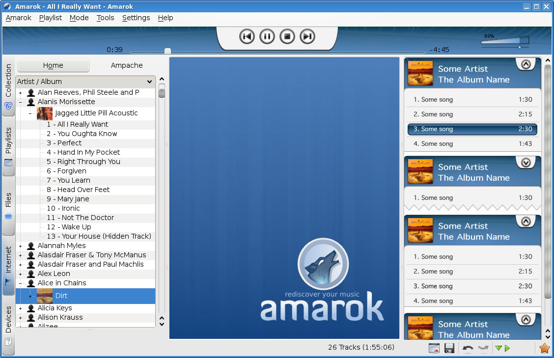
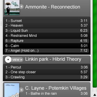
Description: Here is my new version of playlist for Amarok2. that is only an idea made because the actual blue playlist in test seems like alien part of Amarok to me, so i post my own more clear and closer to amarok style.
what do you think?
I'll post the svg file soon but not today because the work ;p
http://www.kde-look.org/content/show.php/Amarok2+playlist+with+max%2Bmin+button?content=67061
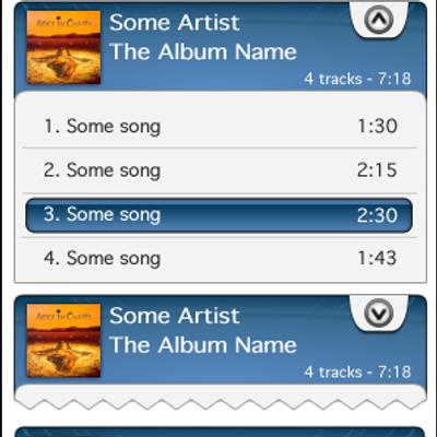
that is one of my last mockup, some thing like that im thinking to do if i have only a track, without album but always have artist name and title and that is all that you need to put... or remember there is always an unknown album to put some tracks...
for the second question... you have reason, no track should show...
i fix those in my next mock promise
I was asking because Hydrogen and I were debating on the merits of having more then one piece of information (eg Title .. Album) on one line.
He thinks this is too crowded, and wants all playlist items to have just the one datum per line like you show for the Albums header here. Then tracks by themselves would have a third line where it would have the title and track length.
I'm worried this solution might use up too much vertical space. Especially in a situation with a shuffled playlist (eg a dynamic playlist) ever track would have three lines.
But I see the issue Hydrogen brought up as well.
Just something to chew on! :)


Ratings & Comments
6 Comments
Do you know if these side tabs gradients are final? They look strange, the gradient is too steep.
None of the Amarok2 artwork has been finally decided on. We really need more artists to help us develop a consistent theme for the entire application.
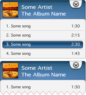
Great looking mockup. Just got a couple of questions.I'm wondering what your opinions are for what tracks should look like when they are not part of an album. Why do collapsed albums still show one track?
http://www.kde-look.org/content/show.php/Amarok2+playlist+with+max%2Bmin+button?content=67061 that is one of my last mockup, some thing like that im thinking to do if i have only a track, without album but always have artist name and title and that is all that you need to put... or remember there is always an unknown album to put some tracks... for the second question... you have reason, no track should show... i fix those in my next mock promise
Currently we do have that space in the collapsed album. We use it to show number of tracks and total playing time of album
I was asking because Hydrogen and I were debating on the merits of having more then one piece of information (eg Title .. Album) on one line. He thinks this is too crowded, and wants all playlist items to have just the one datum per line like you show for the Albums header here. Then tracks by themselves would have a third line where it would have the title and track length. I'm worried this solution might use up too much vertical space. Especially in a situation with a shuffled playlist (eg a dynamic playlist) ever track would have three lines. But I see the issue Hydrogen brought up as well. Just something to chew on! :)