


Splashes | KDE-Look t-shirt
flow


Source (link to git-repo or to original if based on someone elses unmodified work):
1.2|--------------------------
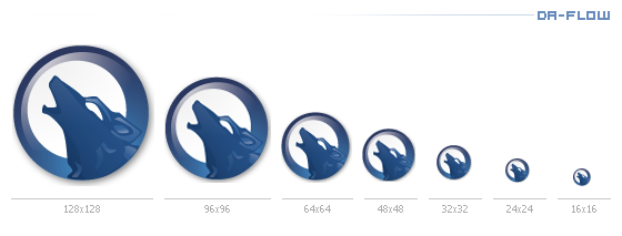
- fixed SVG file
- better scaling
- moon centered
- color improvements
- more of the original touch of 0.9
- final version!
1.1|--------------------------
- size change from 24x24 to 22x22
1.0|--------------------------
- Changes to Color Alpha and Shadow
- Done totaly in Svg (included)
- Shadows in SVG


More Various Artwork from flow:
Other Various Artwork:


Ratings & Comments
39 Comments
Hi really like the logo, would we be able to use this for our charity at all ??? Thansk
Forbidden You don't have permission to access /da-flow v.2/data/amaroK - Blue Wolf 1.2.tar.gz on this server.
Link is not broken: it's forbidden due to permissions.
Link is broke.
I just learned from the Amarok 1.2.1 changelog that this icon has been replaced due to legal issues. Can someone please enlighten me? What is the problem?
I just stumbled across the same thing, but after doing some searching, I think the icon looks too similar to a logo from Warp Graphics, Inc. as found on the top of http://www.elfquest.com/ .
The howling wolf thing like that is pretty common.
BAH! The don't look that much alike to cry over....that red thing is ugly as sin i.m.h.o. anyway.
I like it so much that I made it my wallpaper (http://omni.isr.ist.utl.pt/~hcostelha/Images/Wolf_Amarok_Wallpaper.png).
Is it ok if I put publish this wallpaper here in kde-look in the wallpapers section? Do you think I should do it?
i saw you posted it and thats o.k. permission granted greets, flo
Well done!
...dear god! it's awesome!!!
I'm glad it's a howling wolf at least ;) Congratulations on your win!
Congrats. Nice work
Thanks, i appreciate it !
please fix the svg...i see it (with ksvg) with a white background that is not present in the pngs. Great work and congratulations :)
fixed svg .. take a look
really better now! Thanks! :) Though the svg is ok now, the icon rendering of kde has still got some problems, at least on my computer, with the internal blue gradient...i see it gray, unless I open it with the ksvg plugin. Check it out! And thank you again for your great work! :)
Congratulations. What i don't get is why did you change the icon the same day you won the contest. I do think the old icon was much better than this new one. Anyway, which icon won, the old or the new ?
I would agree, the original icon made much more sence. http://kde-look.org/content/show.php?content=18848 I think he tweaked the original in Gimp\PhotoChop and cant replicate that look in SVG for final. Hence, the cheaper look.
ahm the icon you are talking of has nothing to do with this version. This is Blue Wolf the link points to Dark Wolf. These are 2 diffrent submissions. But its true that i updated the 0.9 version of "Blue Wolf" to an in my eyes more suitable version.Many factors influenced the changes like the centered moon and the amarok team gave me most of the suggestions for the changes in this new version. Now things should be clearer.
They are different submitions but they are very similar. They even have the same elements and the positioning of the moon is the one you previously used in this icon. IMHO he has a point.
I was looking at http://www.adler-solutions.de/amarok_icon_contest/ I again remembered how I did like the original icon more. I don't see the point of the centering the moon.
"I think he tweaked the original in Gimp\PhotoChop and cant replicate that look in SVG for final. Hence, the cheaper look." I completely agree with you. I didn't even know the whole thing wasn't an svg at first. IMHO there are some problems with the nose of the wolf and the way the moon is now. There are some guys here at work which were also following the contest and they reffer the same thing.