


ClipIt Mono Icons - Ubuntu Ambience
flomar


Source (link to git-repo or to original if based on someone elses unmodified work):
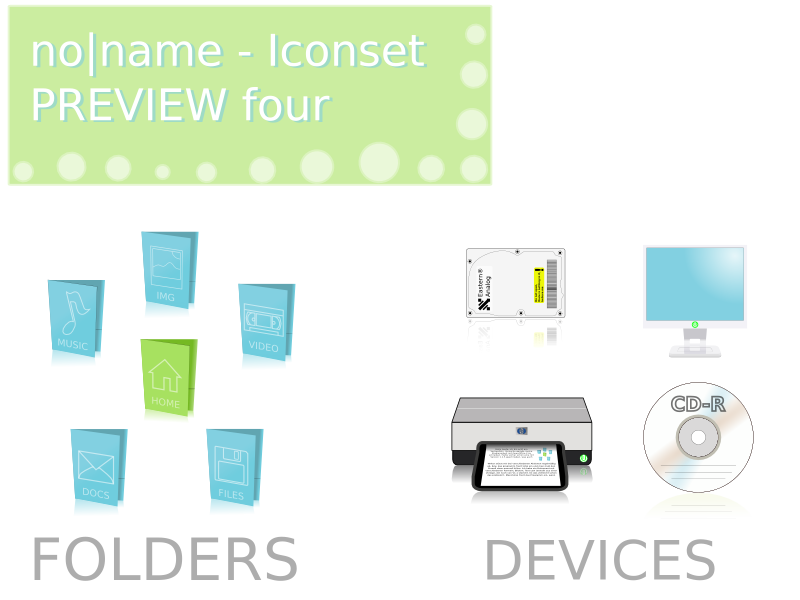
preview 2: added some folder icons
preview 3: added some device icons
preview 4: changed the computer and cd-r icons
p.s.: thanks for your comments!


More Icon Sub-Sets from flomar:
Other Icon Sub-Sets:


Ratings & Comments
15 Comments
looks great, the blue is too bright i think, something softer, smoother. great work!
This looks really great, especially the folders. I hope to see a release soon!
I really like what you're doing, simple and it's great (I like simple things ;) ). But maybe the Computer (screen) icon is a bit too "white". I guess that's just the background that is making that effet :).
yes i think so too. the computer icon needs more contrast. but a really nice theme :)
I think they look nice, but too simple, and they look as though you couldn't decide whether you wanted to make regular gooey icons or photo-realistic icons. I might also mention that there's currently no use for those folders in gnome, except for the home folders, as all folders/directories look the same except for the emblems.
you are right at one point; i wanted to make pretty simple icons, without any reflections or the popular "glassy" look. however some people didnt like the simple computer icon i made for preview 3, so i abandoned the idea at the devices. the folders: you can adjust the folder icons(e.g. on your desktop) on your own, so they are not completely useless. i have to think over it again a bit, when i have more time. thx, flo
wow i hope you make more icons, they look so good
Eastern Analog HAHAHAHAHAAHAHAAHAHHAAHHAHA what a funny joke hahahahahahahahahahaha
i think the computer icon is too simple. I think it would be better with some shadow or reflect or something
Yup, the computer and CD icons are a bit boring since they're too simple, definitely need more work, or perhaps could be completely overhauled? Printer and harddrive are very good... In general, pretty good job...
thank you for your overall positive comments. go on please, and tell me what you think about my update with the device icons..!? flo
Good color choice, very easy for eyes. Keep it up
VERY NICE! GOOD JOB! :)
looks simple but nice :)
looks simple and elegant, altough I think it will be quite a challenge to do a complete icon set with the same feel. I hope you succeed, good work so far.