


Dropline NOU!
ertz


Source (link to git-repo or to original if based on someone elses unmodified work):
0.4
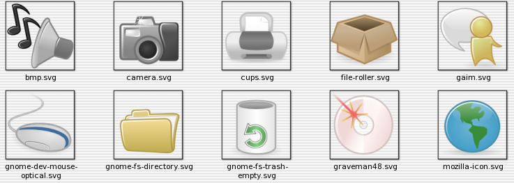
* This release includes some PNG icons for evolution
stock icons. It seems that evolution isn't loading
ANY of the SVG stock icons, so you can find the
PNGs in 24x24/stock/evolution those same icons are
available in scalable/stock for you to modify sorry
for choosing this way, but is the only one i've found
so far.
* stock icons for GNOME Baker in Xtra directory
* icons for iRiver devices IHP-120, IPF-880 and H10 to
replace 'gnome-dev-ipod'.
0.3
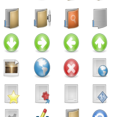
* 34 new icons, more emblems...
* reworked many icons in every category (apps,
emblems, devices, filesystems, mimetypes, stock).
0.2
* many many new icons (by many i mean 133).
* like bvc suggested, i've used vacuum defs, so filesize
has decreased a lot.
0.1
* initial release.


More Icon Sub-Sets from ertz:
Other Icon Sub-Sets:


Ratings & Comments
29 Comments
i wish this set would be updated. i really like it.
Download link for icon set is broken.
PLease, don't stop your work!
I love the simplicity of this icon set... it accurately shows what you are looking at, and covers a wide variety of program and file types. this is exactly what i needed!
You was created a nice iconset. You helped me a lot about the looking of my system ;) A suggestion is: try to create the gtk stock icons using a bold contourn (line around the icon borders). Because an stock icon can be small (32x32) so with a bold border line this will be visible in smaller sizes, if not it will appears some translucent (that is happening now). Same about mimetype icons: In some mimetype icons you have a little text saying the mime type ("HTML" for example), that text is too small, can you do it more bigger?? So can be readable in small sizes. If you want too, you can make your folder icons in different colors (green, blue, red, white, black :P). Thank you! :) Bye!
Great update, the icons look a lot sharper now. You should include the doom3 icon from dropline-neu because it matches this theme really well. Also can you make icons for EasyTag, enemy territory, and gweled? Very very complete theme now and like I said before it'd make a good gnome-2.14 default theme ;).
It looks so nice!
This was already my default theme, but with the new improvements and stock icons it will continue to be my icon theme for a loooong time. Thanks for sharing..
Just wanted to show my appreciation for your hard work. I just love this icon theme! There's nothing worse than a fabulous icon theme that is incomplete though, so I really hope you don't stop making new icons. I would love to see some icons for these applications: Evince GQview xCHM gnoCHM OpenOffice.org * I'm sure there are other applications that need icons as well. One of the most complete themes out there is Lila, so you might want to compare your theme with it.
Evince has an icon :) ... i'll check Lila, thanks.
Where is the Evince icon? Does it use the postscript-viewer.svg icon or what?
It would be great if you could make icons for these programs as well: F-Spot AbiWord aMule VLC Thanks! Love the icons.
i believe Abiword is already there :) i'll make icons for those, thanks for your request
As much as I love this icon theme, I have a small request. Could you please make an icon for Liferea in the next release? Thanks! :)
hmm, i just posted an update and just missed your request, i'm sorry. i'll do it for 0.4, i promise :) i just have to build it and see what's about :P
Thanks much for your reply, and once again, also for these icons. I normally don't make requests, but this icon theme has been on my desktop since the day you released it, and Liferea is one of the icons in my panel and just looks out of place with the others that have already been themed. You do some great work....
Great job on the .2 release. The only issue I'm having is the gnome-multimedia icon isn't being loaded/read. I managed to open it in inkscape and copy it over to a new project and resave it, and it started working. Not sure if anyone else had this issue. Also don't forget about emblems :). This would be an awsome default theme for the Gnome-2.14 :D.
thanks :), but i don't think gnome devs will ever change jimmac's work. about the gnome-multimedia... are you running GNOME 2.12? or at least librsvg 2.12.0?, becouse latest librsvg release seems to have some problems rendering SVGs...
Yea I'm running librsvg-2.12 :/. That was the only icon that I had problems with luckily.
Thank you, thank you, thank you!
you'r weolcome, you'r weolcome, you'r welcime, heh :P
Looks great. Highly useable and you've chosen a good color for the folder icons :D.
ha!... don't worry, i'm doing some updates to Dropline NEU, it will include more colors for the folder icon ;)
Good work, as usual. You're doing a fine job with your icon themes.
thanks a lot :)