


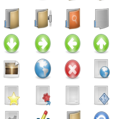
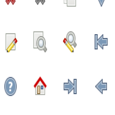
I’ll start by saying that the icons have been resized to 48×48 and in this resize process every icon got modified
 . This release is compliant with FreeDesktop.org’s Icon Naming Specification (just like Giøn). It also includes 22×22, 24×24, 48×48 and 128×128 PNGs (for those of you who prefer use PNGs instead of SVG for performance) 16×16 is coming in the final release.
Also, this time it doesn’t has all the apps icons it used to have, I’ve only implemented the basic ones, the rest will get in there, they just need some time. It uses symlinks instead of duplicating files (and filesize of course)… previous version had about 470 icons, this new version has over 3000!! (and imagine how many they’ll be once I finish every app icon).
Mimetypes are in development too, there are no small versions like 22×22 nor 24×24, so you’ll get resized SVGs for those.
______________________________________
For those who vote negative... Help me improve the icon set by giving an opinion about why the icon set deserves your negative vote. Thanks!


Ratings & Comments
49 Comments
Hey. Please tell me that can I use Your set of icon in my company www page. What is required? what can I do and what I cant do with them.
Congratulations, your icon set is really nice ! I just miss a specific icon for lyx documents, would it be possible to add it ? Thanks, regards
Very nice icons. Can't wait until you manage to complete it all :-)
I've not voted you (cause the vote is not positive :( sorry ). Your theme is great (3000 icons! wow!) but I didn't like the color scheme. I like more saturated colors.
i love these icons, thanks
using fedora 8 here and the firefox 2.0.0.12 links aren't updated and getting the rather dull default look. When i enable the same icon theme in ubuntu it shows the new icon. Any ideas?
Really lovely bunch of icons- I particularly like the folder icon. Is there a way of changing the Gnome icon that appears on the 'Applications' menu in the top panel to the original Ubuntu one? Thanks! Charlie
I have seen this icon-theme used in some youtubes and always wanted it myself. And now i found it :) Thanks, very nice icon-theme.
OMG!!! Best icons EVER! "Games" icon is soo sweeaat. (: But especialy for Ubuntu, blue tones of some icons should be changed to orange, like others.
Hey, I just wanted to say that this is the best icon theme I have ever used. I even made an account on here just to tell you that. GREAT JOB!! KEEP UP THE GOOD WORK!!! I'm using it. ;)
Excelent work!! ...great!!
Very good icons. The best one i have tried :)
You've done a hell of good work making these icons. They're jusy extreamaly handy and fit my screen in an axcellent manner. Thank you
Excellent icons ! Keep up the good work.
for that great Icon Theme!
these are the first thing i install - aka default for me :)
I want a new version of these icons, I love them. Great job!
Great work!
Excellent icons! Is there a firefox 1.5+ theme available that'll utilise the same icons?
Hey, I'd like to say this is the best Icon theme I've ever seen. It has a nice soft look without being tacky or garish (which is pretty un-common :P ) I recommended your icons for use with my themes, I hope you don't mind.
I quite like this theme but there is a problem for me and that is spacing on the Pan icon bar. I have set up Pan to be a certain size on the screen but whenever I select this icon theme Pan stretches over to the right making it wider and it looks odd to me :-) Yours are not the only culprit, there are others too :-) To test this, select for example, HumanAzul2 and size the Pan window so the 'X' (Cancel last task) icon is right at the edge then change the icon set to Neu and notice the difference. Anyway, keep up the good work.
Ertz!! you freak :P
Fantastic, lots of work went into this. I like the dimensional look to the folders. How about some fancy openoffice type icons to add to the 3000 or so you've done so far!!!
The buttons on Banshee are blank icons with red x's
Hi, This is some really good work. I would like to see networwk icons have "SSH" or "SMB" or "FTP" written on them but thats about the only suggestion I can make. Have you thought about applying to have these included with a ditribution? I know Fedora is looking at replacing their tired old Bluecurve set, myabe they would be interested.