


Ubuntu studio 256px icons
wedderburn


Source (link to git-repo or to original if based on someone elses unmodified work):
Update 15/08
This is a fix up for the broken/missing cd icons i would like to thank muchtomydelight for taking time to fix it for everyone 
Update 30/05
fix some symbolic links many thanks to muchtomydelight for pointing that out
fixed some details here and there
----------
UPDATE #4 ...14/05
added some more icons now if you're on ubuntu dapper and you log out the shut down restart and hibernate buttons are themed
settled on using the black+blue navigation buttons they look better on a dark background
UPDATE #3..07/05
ok heres a new version alot more icons fixed up that flag and some other icons added quite a few more as well
--------------------
UPDATE #2... 04/5
ok heres version .03
changes include:
the stop button(made it darker)
preferences-desktop-locale(changed the flages now its chinese and french)
drive-harddisk(used the oribinal tango one fir this just darkened it a bit and made it more simple)
media-cdrom(added more red it just looked better)
im still working on this if you have any suggestions please do let me know
------------------------
UPDATE 29/4
i've just packaged version 0.02 its has more icons and now the set can be used
hope you injoy
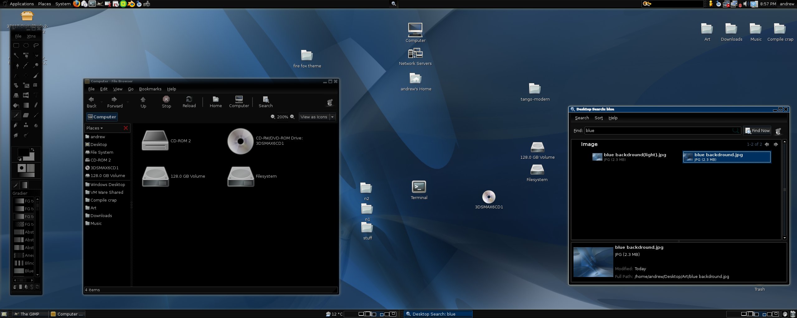
heres a screen shot as well
http://www.ubuntuforums.org/gallery/showimage.php?i=2555&c=13
ps im still working on the navigation arrows and more
------------------
hey im moding/making a darker blue version of the tango-orange theme.
the reason is that i really like the orange version of many of the icons but because its orange it only really fitted in with ubuntu, so started to make this
here a list of things i did differently
*shortened the white top half of the folder ( a few people didn't like having such a high one)
* added more black to the server box( i really liked the extra black on the box that orange tango introduced)
*added a recycling logo to the trash can ( some users thought it looked like a battery)
*removed some extra details from the computer screens(just to make it look more simple and uniform)
*added a shadow to network-offline 's X logo just like the network-error icon
hope some of you like it, if you don't please tell us what bugs you. i only started today so i open to suggestions comments or anyone that wants to add to it
ps im thinking of changing the folder does anyone have a idea what should be done with that


More Icon Sub-Sets from wedderburn:
Other Icon Sub-Sets:


Ratings & Comments
23 Comments
Version Française : Félicitation, ton thème a été retenu pour Ubuntu Studio ! English Version : Congratulation, your topic was retained for Ubuntu Studio!
My only change would be a Ubuntu logo (in either Orange, or Noir) instead of the Gnome Logo... otherwise, it's great!
I know that the other guys from Ubuntu Studio contacted you about this awesome theme. Can you be sure to add an icon for ardour? They have a new logo now at ardour.org, and the "A" in the logo looks great as an icon. It'd be good to have this in your theme as well as Ubuntu Studio. :D
thanks!!!
What GTK-Style is that used on the Screenshots?
I like the look. Do you have a Firefox tango noir theme?
hmmm i never tried.. do you know how to make one? because it would be a nice touch
In forums Mozilla zine Ed Hume it explains: http://forums.mozillazine.org/viewtopic.php?t=345753 This is a little complicated.
found these but forgot to put them in the list for you. drive-cdrom.svg -> /home/andrew/Desktop/tango-modern/scalable/devices/media-cdrom.svg gnome-dev-cdrom.svg -> /home/andrew/Desktop/tango-modern/scalable/devices/media-cdrom.svg http://www.atprocks.com/tango-noir0-7.2.tar.gz unofficial icon set with fixed CD-ROM use at your own risk. but i promise all i done was fix the broken links.
hey there's no icon for Creat a CD/DVD in Resouces Menu of Gnome! Let's correct it!
is that a missing icon or is it a icon you would like see added eg a cd with a + on/next to it
ls -l ~/.icons/tango-noir-0.6/scalable/actions | grep andrew gives me these broken links. i fixed mine. but some users are not so lucky. they are beautiful icons. gtk-apply.svg -> /home/andrew/Desktop/tango-modern/scalable/actions/dialog-apply.svg gtk-close.svg -> /home/andrew/Desktop/tango-modern/scalable/actions/dialog-close.svg gtk-no.svg -> /home/andrew/Desktop/tango-modern/scalable/actions/dialog-cancel.svg gtk-ok.svg -> /home/andrew/Desktop/tango-modern/scalable/actions/dialog-apply.svg gtk-quit.svg -> /home/andrew/Desktop/tango-modern/scalable/actions/dialog-close.svg gtk-yes.svg -> /home/andrew/Desktop/tango-modern/scalable/actions/dialog-apply.svg
thanks i'll fix them now :D :D cheers mate
Where'd you get the icon set for gimp??? I've been looking for some for ages now and failing misserably
i don't use the gimp so i wouldn't know i use inkscape for the icons
Hoy, great update :). I was wondering, I think that the colours are too dark (yeah it's call Tango-noir I know :p) and that's not really making it looks that good. Why not change the dark colour to a less dark one ? (see the folders ? Well arrows, etc... would be better with those colours I think) :). Anyway, I love that icon theme, great work ;).
thanks for your comment ... once i have finished this one i'll make a lighter version that way everyone can have what they like :D
Yeaaah thx buddy :).
Hey, thanks for this really good icon theme! :)
why thank you :)
Yeahhh ! I love the tangerine icon set but it was Orange as you said. Now I'm happy :D !!! Thank you for your hard work :).
:D that good to hear :D
i love it!!! the only thing which is imho sub-optimal is the lock-screen picture which doesn't fit within the shutdown dialog, because everything elseis a blue/black symbol, but this is a screen + a yellow lock ... ugly .. :-)