


ALLBLACK
Mandarancid


Source (link to git-repo or to original if based on someone elses unmodified work):
VERY VERY SECOND UNFINISHED RELEASE:
-I DON'T REMEMBER .. I MADE THIS RELEASE IN A LOT OF TIME.. 
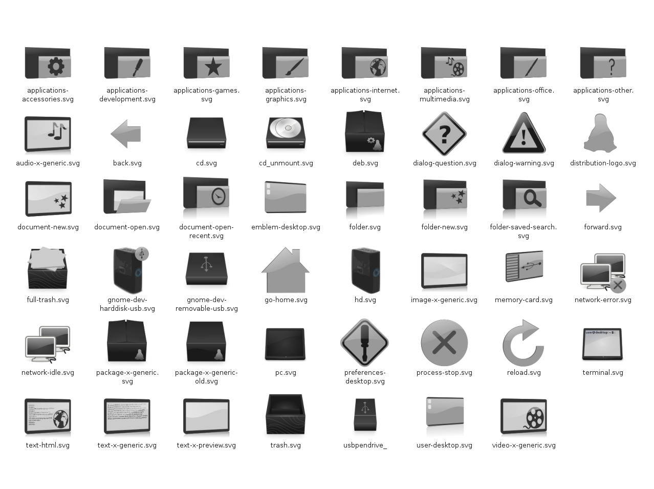
-NEW COMPUTER ICONS NEW STATUS ICONS NEW MIMETYPES (I BELIVE)
-FIX BUGS..
VERY VERY FIRST RELEASE :
-added some icons*
-full resolution (PNG: 18x18, 22x22, 24x24, 32x32, 48x48, 64x64 SVG: scalable)*
-some fix*
Preview 6:
-new place and status icon (network search and other*
-new mimetypes (or modified)*
-all categories
-other icons *
*some not in the scrennshot and/or in the file
Preview 5:
-new package mimetypes (+deb & rpm)
-some categories icons (but i'm sure only about the internet icons and the preferences)
-terminal icon
Preview 4:
-pendrive
-hd usb
-reload, stop actions
-text mimetypes
-img mimetypes
-removable usb device (?)
-cd unmuont
Preview 3:
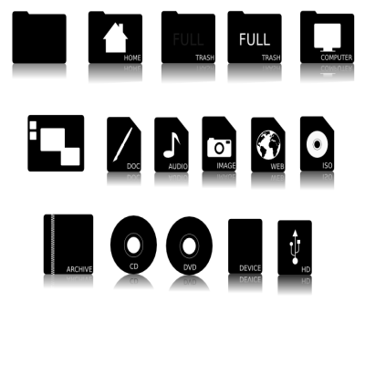
-Memorycard
-CD
-Arrows
-Home
-Logo
-new-folder (action)
Preview 2:
-Trash (full-empity)
-Desktop (icon + emblem)
Preview 1:
-Folder icon + home
-HD icon
-Computer icon


More Icon Sub-Sets from Mandarancid:
Other Icon Sub-Sets:


Ratings & Comments
44 Comments
looks like you got a ways to go for a complete icon set, but since practically the only icons i see are the folders and tar's i think it couldn't be better! keep up the good work :D
Some nice themes dude, but, could you add an exaile, pidgin, thunderbird, gimp, and synaptic, and volume icons too? Awesome start dude, wish I was this talented =P -J
And, a network/ server icon.. =D Thanks again.
Thanks for the suggestion!!! I'll must to do many work to complit it!! I know!! :(
THANKS TO ALL!! FOR THE HELP FOR THE REATHER (GOOD OR BAD THAT IT WAS) AND FOR THE THANKS AND ALSO TO UNDERSTAND MY BAD ENGLISH!!!
good!! :)
Just wanted to say that i absolutely love your icons! -keep up the good work, can't wait for the next release!
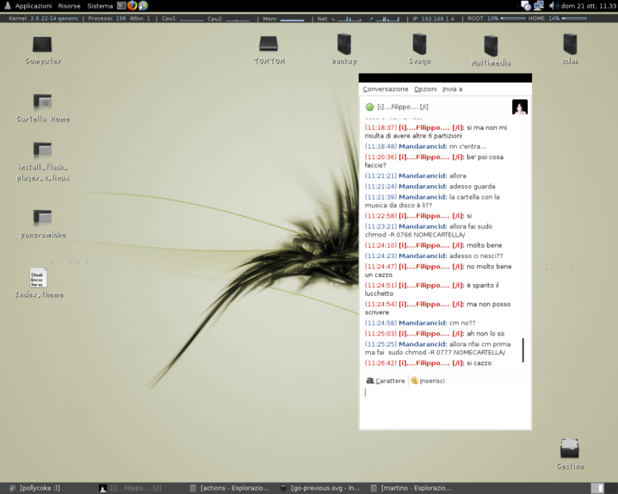
Nice, clean and eye friendly theme :) I don't like too colorful themes much.. there are definitely too few darker and restrained themes out there. Keep on, good work :) Maybe sounding dumb, but what info bar is that below your gnome-panel? Where could I get it from?
How do you install this icon pack? When I follow the drag 'n' drop method I get an unsupported format error.
IS STRANGE!! ON MY BOX WORK CORRECTLY!! IF NOT YOU CAN TRY TO EXCTRACT THE FILE AND COPY IN /home/USER/.icons/ OR IN /usr/share/icons/ .. ELSE YOU CAN TRY TO DOWNLOAD AGAIN!!
THANKS!!!!
damn! nice stuff, dude.
THANKS SO MUCH!!!!
Thank you for your work, I am now using your amazing theme and my desktop feels much better. Looks very good with the arsen-bw theme too ;). Thanks again and keep up the good work, you have talent man. :)
AGAIN THANKS!!! I WOULD HAVE TALENT...
Very nice! The main guideline of the theme is great, its now a matter of completness only. Feedback: I spoted some jagged lines on icons at 32x32 and smaller, so maybe antialiasing is need when scaling the icons. Anyway, maybe you already know it. If I come up with a solution for applying antialiasing on the conversion script I will notify you. Keep up the good work!
Thanks... I have a question... How to use the antilising??? THANKS!!!!
Hi, good work! I really like your theme :) just a thing which I noticed: look the "folder-news.svg", why no stars in the bottom reflection?
Thanks... Beacouse in my idea I see the emblems like a hole in the folder...
@ gertdesmet and nightangel: Thanks.. And voila.. the very first release is here!!!! @ ThrowRocksAtMe1: First thanks .. I would apply some change to trash icons.. but the main themes is this... @ freakcode: Thanks.. For the stock icons I know, I'll do its..
About mimetypes: make just generic icons for audio files, text files, graphic files, and so on... no need to put a different icon for *every* mimetype. Put more effort on stock icons, those are the most important ones on GNOME as its used on every button and menu. Also, the stock icons should look crisp at 16x16 and 24x24 if you wanna make a great GNOME theme. Good luck!
The trash icon should be different. more like a trash can. and not a box with papers on top. personal preference though. and.. while i'm at it, are the borders on the text-x-preview.svg icon too large? how well does the text show up?
not that i hate it. it's really good
can't wait for the release
I like the categorie icons a lot and all the new ones too. The text-html.svg, text-x-generic and video-x-generic and the terminal are awesome ! Im getting impatient ^ ^