


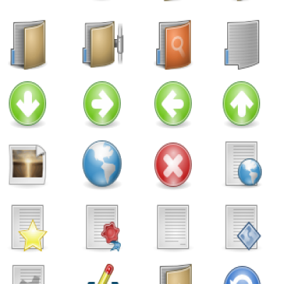
This is the last icon set from the “new” trilogy, that means Dropline NEU, Dropline NUOVO and the brand new and shiny Dropline NOU. Yes yes, stupid naming I know.
Please, leave your negative feedback
 I see some of you are voting these as bad, let me know why so I can improve them. thanks!!
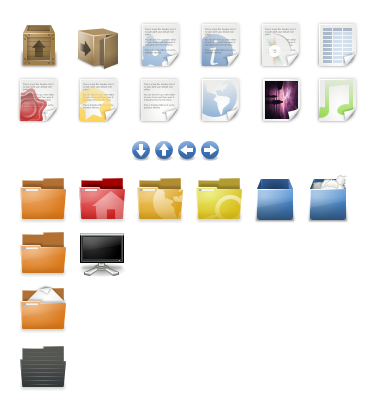
// Special folders "Howto" //
pick a folder, right-click it and select properties. in the properties window you will see the current icon, you should drag the new icon and drop it over the icon in the properties window.
the special folders are in Nou/128×128/places/Special Folders
hope that helps


Ratings & Comments
32 Comments
Added too ;) Alex
It's been a year since you last updated. The one negative comment I have is that this iconset isn't very complete. Please continue work on it!
I very like Your icon set. In my opinion its best set on gnome-look. But i think that old (black) hdd icons and computer icon was much better. Keep a good work :-)
Nonsense. It's nice, but for be the best it's far far away ... I see here many good good works from some newbes. So don't say stupids ;)
erm... he/she said it was his/her opinion. I don't see why you should say it's nonesense :)
Thanks :)
He deserve at least a "Thx Very Much, its very beatiful :D" I say its a great work, keep doing that, this is one of the best I had seen here :)
I agree, I like it a lot. My favorite part is probably the folders, and I love the special folders, like the home folder. I also agree that I liked the previous device icons better. Additionally, I don't like the trash icon very much, it seems very 'fat' and boxy, I prefer the shape of the one in the Ubuntu Human theme, for example. Overall, a very nice start. P.S. I love the wax-seal
I like the icons as they are now. Isn't there enough black in Linux themes already? It's getting really tiring that every theme has to have black in it.
Thank you for your nice icon set :)
keep up the great theme - please change the log off button back to it's original "arrow and door"it makes the set cleaner - but other wise it's on all my desktops - Thanks
very nice work pal!!!!! it one of the best work i never see before in icons for linux, really beauty work, please continue making things like that!!! congratulations and thanks gracias amigo!
Great. It deserves to be ranked 'one'.
Looks awesome! Your iconsets rock!
NOU means new in Romanian language
It's the very best icon I've seen before. But I'm sorry that I don't know how to use the special icons ?
don't be. it's really easy, you should pick a folder, right-click it and select properties. in the properties window you will see the current icon, you should drag the new icon and drop it over the icon in the properties window.
Oh,right,it's just very easy! I ignored the icon in the property window. Thanks!
I've been waiting for these for long, since you showed them the first time. Impressive work.
Look extremely different from anything we had before.
PLEEEEEEEEAAAAAAAAAAAASEEEEEEEEEE!!!!!!!!! PLEASSSSSSSSSSSSSSSSSSSSSSEEEEEEEEE!!!!!!!! PLEEEEEEEEEEEEEEEEEEAAAAAAAAAAASSSSSEEEE!!!! PLEEEEEEEEEEEEEEEEEEEEEEEEEAAAAAAAAAAAAAAASSSSSSSSSSSEEEEEEEEEEEEEEEEEEEEEEEEEEE FINISHHHHHHHHHHHH IT!!!!!!!!!!! or else we will hate you!:)
IT really looks like you're putting a LOT of time into each and every icon here. Very very nice job!
I am looking forward for the release, that will defenetivly us it!
I like you'r icon theme very much and you really done work for this! I just wanna say you done good job and i will use this!
yeah dude, really great iconset! this is just what i `m waitin´ for, not macish not windowish just a simply "NOU" style, fittin´ perfectly to a modern linux based os. this set will be my default, if it`s released. i `m really impressed!