


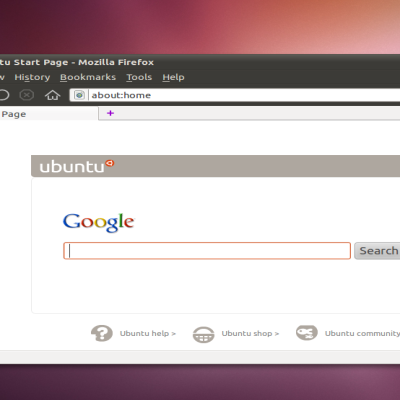
Please forgive the web designers if the screenshot does not update!


Source (link to git-repo or to original if based on someone elses unmodified work):
added the 'Tropic' GDM theme, and it now features my new Firey <b>1.0</b> metacity theme! Checkout the specific post (<a href="http://www.gnome-look.org/content/show.php/Firey?content=64584">http://www.gnome-look.org/content/show.php/Firey?content=64584</a>) for detailed change list!


More Various Gnome Stuff from themer:
Other Various Gnome Stuff:


Ratings & Comments
20 Comments
What fonts did you use on this screenshot? Reminds me "Jacky Brown" movie. :D
I'm just saying the fonts in the picture are not the default Sans, so if you were expecting to find them in the theme, don't be disappointed that they're not there, and if you think they're ugly, well, your in luck! They're not included! :)
oh, What fonts :) oops: app font: Sans doc font: Sans Desktop Font: Candice Window title font: Candice fixed-width: Monospace you can find the "Candice" font here: http://www.mediafire.com/?9530oksw4xm
I've been dreaming of this day for some time! the pre-release of my Firey 0.7 theme! You know how the buttons are all combined, right? Well, now, when you push one down, well, I don't know how to explain it, but it's smoother! :) check it out! http://www.mediafire.com/?e0rbmqw2wjz
0.7 is quite old now (1 day :)) look for the always up-to-date version in the link in the description of this theme! If the fonts in the screenshot aren't to your linking, fine! they are not included actually, I just think they're nice :) (but if you want them included, just ask!)
You can find an updated version of my Firey metacity theme here: http://www.mediafire.com/?aqamt9nvxi2 It features a slimmer window frame and slightly different shadow under the active text (the colour value change is unnoticeable, but it looks better because it removes some of the 'over-anti-aliasing' resulting in grainy text" The reason I'm keeping this theme "secret" by not "officially" posting it is because I want to keep getting suggestions and small improvements until the final release of 1.0!
Luks gud mate! Wonder y ppl vote negative without giving the reason!
maybe some people hate ubuntu because it's so much easier to some things with it vs other distros kinda like some people hate mac users because mac is so easy to use and some people brag about that :)
Great job on it all. Also, the Fiery Metacity theme is great.
How To Contribute /!\ Feisty artwork will be designed by kwwii -- of Kubuntu Edgy and KDE Oxygen Icon fame. He will be working closely with sabdfl in the design. Do not expect community involvement in defining this portion.
you can get your hands on a work-in-progress version of my theme here: http://www.mediafire.com/?7njbm9zvbwy any ideas?
that combined buttons idea is coming along quite nicely! The actuall look of the buttons wil be dark, but glossy like the titlebar, and the "logos" will apear on rollover, like mac OS X!
I guess it's just hard to do something in gimp vs. the same thing in, say, photoshop! I'll try to rush that theme with the utmost quality :)
Did you make these panels? The colors are perfect! I know a lot of people want the Ubuntu color scheme to have a dark brown (like that wood-ey panel) and light brown (like the other panel) color scheme. I personally love the orange in Ubuntu, so that third glossy orange panel is rocking my world right now. If you made these, submit them to the Ubuntu art team, you could really spice up the OS with these!
Yup, all myself! Everything in the "Human" folder under panels however is just a screenshot of the titlebar in the ubuntu default theme :) with different colour variations.
Wow, that's amazing! You've got some mad skills Did you use Gimp? I'm still trying to get the hang of it... You seriously have to get in touch with the Ubuntu art team! You could be the one to finally get rid of the boring, ugly, plain gray panels
Yeah, just the gimp! the default grey panels arn't a picture that comes with ubuntu, but the look for the human theme; other themes's panels look different when set to "system default" and not "image". I guess I should make an attempt to get these packages with the release... but for now, just let everyone come here and get this stuff! :)
That's what I mean, you should try to get this included with the Human theme for Gutsy. Plus, there's been talk of using a darker, wood-colored brown rather than the vomit-ey one that's used currently. I don't know what others might think, but if you could make good-looking window borders (like the ones used in the Feisty New Human theme) look as good as these panels, Ubuntu would be totally set. Again, great job! P.S. - Did you use tutorials for the Gimp? I've been trying to learn from scratch, and it's honestly not going too well...
No tutorials! I have to admit, for intuitive-ness, it's the opposite of a mac, but I've working with it since I was like 9 on an old pentium 200Mhz with redhat (well, now my computer's better :)) but you get the point! =D P.S., what a coincidence you would say that! I'm just working on a metacity theme using that panel! :)
It's not so much a lack of intuitiveness, just a lack of...logic. It's incredibly powerful, but that's not much use if you can't figure out how to use it. Still, that's half the fun! That's cool, you should include it with an update of this theme when you're done. Just a suggestion (okay, more personal preference), but I think that if you combined the nice look of the combined buttons (http://www.gnome-look.org/content/show.php?content=55659) with as good of a titlebar as your panels, you'd definitely have a winner =)