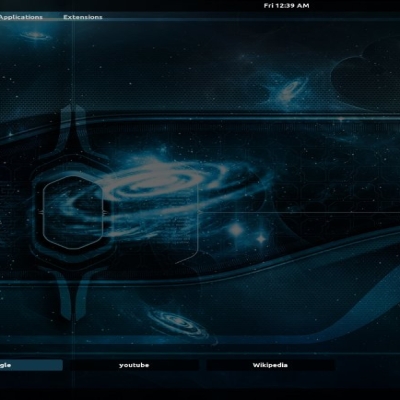
nice mockup, but maybe it is your linux dream and not your gnome dream... gnome isn't the one who detects all those things but linux... aniway it is a great idea, maybe in 1 or 2 years we'll have something like this :D
Yet again things incorporated from KDE4... ^^
It's nice but those stuff has aldready been in kde4 consepts.
And some of the stuff you have here is probably hard to change to gnome. It's called nautilus rewrote.
However somethings can be already done today. Like that differences in icons sizes at desktop and opastic panel.
Can I comment that I think that plases and desktop menu should be dropped down or then think some new approach to them. :)
And I am not KDE user, so don't call me that. I don't like neither of big desktops. I am just interest about eye candy and usability.
Some kind of KnoDE desktop would be awesome...
I partially agree.
I'm not liking the direction that's taking the big DE's.
KDE is big and bulky, and gnome is a bit windoze-like. I like the simplicity of gnome 2.14, but the traces of Windoze (menubar below the titlebar like Windoze, panels that can't be shrinked to a corner) makes me mad with rage.
My dream gnome would be gnome 2.14 with a fully functional Mac menubar (not the POS menubar applet, a real menubar holding the "File Edit View..."
menus in the panel and keeping them out of that stop below the app's window titlebar), a built-in compositing manager, built-in archiving in nautilus (not via file-roller, but built-in like the nautilus cd burner), a Mac-like main menu (without the arrow in the button launcher and without the "system" entries), and the ability to hide the bottom panel in a corner and have it save it's state (collapsed or expanded) when gnome is closed (using the session manager ofcourse).
P.d: I partially like gnome, but hate the way of thinking of it's current developpers, those guys want gnome to be like Windoze, and I hate Windoze. Also I like gnome to look like OS9 b/c I came from there and want to replace OS9 (which was discontinuated by Apple) with OSS to avoid further discontinuation-related problems.
This is really nice work. Not only does it look good and seems possible to do. But unlike so many other concept desktops out there, this one actually seems usable rather than just blatant eye-candy.
The cool thing about this mockup, is that it's not that far off from being possible, unlike a lot of them which requre Gnome being reprogrammed pretty much from the half-way point.
Some of that can be achieved already, but it would be cool to have some of those options on the top title bar. and some of the things in the main area. One thing that would be nice would be if the notification area could handle multiple rows rather than just one as is the case now.
Yeah, I would like to see some of that in Gnome 3.
And one thing: If the Gnome guys decide to add some eye candy, please, guys, give people the option to have a less pretty one that runs will less resources being used. The people with the 400 mghz machienes will love you for that, because Gnome as it is runs very nicely on a slow machiene.
Gnome 3 is supposed to be a clean break from Gnome 2, and it's the developers' chance to implement new paradigms. If you're interested in some of their ideas, go to http://live.gnome.org/ThreePointZero.


Ratings & Comments
9 Comments
The notifications are pretty nice. I think that libnotify is working to create something like this.
nice mockup, but maybe it is your linux dream and not your gnome dream... gnome isn't the one who detects all those things but linux... aniway it is a great idea, maybe in 1 or 2 years we'll have something like this :D
Yet again things incorporated from KDE4... ^^ It's nice but those stuff has aldready been in kde4 consepts. And some of the stuff you have here is probably hard to change to gnome. It's called nautilus rewrote. However somethings can be already done today. Like that differences in icons sizes at desktop and opastic panel. Can I comment that I think that plases and desktop menu should be dropped down or then think some new approach to them. :) And I am not KDE user, so don't call me that. I don't like neither of big desktops. I am just interest about eye candy and usability. Some kind of KnoDE desktop would be awesome...
I partially agree. I'm not liking the direction that's taking the big DE's. KDE is big and bulky, and gnome is a bit windoze-like. I like the simplicity of gnome 2.14, but the traces of Windoze (menubar below the titlebar like Windoze, panels that can't be shrinked to a corner) makes me mad with rage. My dream gnome would be gnome 2.14 with a fully functional Mac menubar (not the POS menubar applet, a real menubar holding the "File Edit View..." menus in the panel and keeping them out of that stop below the app's window titlebar), a built-in compositing manager, built-in archiving in nautilus (not via file-roller, but built-in like the nautilus cd burner), a Mac-like main menu (without the arrow in the button launcher and without the "system" entries), and the ability to hide the bottom panel in a corner and have it save it's state (collapsed or expanded) when gnome is closed (using the session manager ofcourse). P.d: I partially like gnome, but hate the way of thinking of it's current developpers, those guys want gnome to be like Windoze, and I hate Windoze. Also I like gnome to look like OS9 b/c I came from there and want to replace OS9 (which was discontinuated by Apple) with OSS to avoid further discontinuation-related problems.
This is really nice work. Not only does it look good and seems possible to do. But unlike so many other concept desktops out there, this one actually seems usable rather than just blatant eye-candy.
The cool thing about this mockup, is that it's not that far off from being possible, unlike a lot of them which requre Gnome being reprogrammed pretty much from the half-way point. Some of that can be achieved already, but it would be cool to have some of those options on the top title bar. and some of the things in the main area. One thing that would be nice would be if the notification area could handle multiple rows rather than just one as is the case now. Yeah, I would like to see some of that in Gnome 3. And one thing: If the Gnome guys decide to add some eye candy, please, guys, give people the option to have a less pretty one that runs will less resources being used. The people with the 400 mghz machienes will love you for that, because Gnome as it is runs very nicely on a slow machiene.
Gnome 3 is supposed to be a clean break from Gnome 2, and it's the developers' chance to implement new paradigms. If you're interested in some of their ideas, go to http://live.gnome.org/ThreePointZero.
Hi! I like your concept of Gnome! And, may i know the font you used in the desktop, please? Thanks, Bye!
Crazy pen font :) - Rage Italic (It was included to MS Office 2003 or shared on P2P :P I don't remember) Wallpaper font - andover - http://antraxja-fonts.iweb.pl/index.php?show=a&litera=b&od=3