


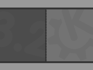
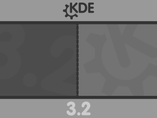
I have made 2: one with kde 3.2 at the top and bottom, and one without...
Comments welcome, as always...
Sorry if I have uploaded a lot of crap lately


Source (link to git-repo or to original if based on someone elses unmodified work):


More KDE 3.x Splash Screens from dannya:
Other KDE 3.x Splash Screens:


Ratings & Comments
9 Comments
your link to download provided a 404... may need to be moved to your new server...
Christ! You want to apologize for doing a lot of work and doing it well? Other people need your afflictions. This is very clean, no-nonsense design. I like it when icons are simple enough for my eye to go to the right place immediately. There are way too many "pretty" icons that just make navigation difficult. You and leinir are on the right track.
Thanks - by "crap" I mean my previous splash (and perhaps this one? :) I have taken a little break from creating icons lately, and have started to experiment with other components of the flat style. Tomorrow, I will release the next part of my grand plan...
I can't wait 'till tomorrow :-)
Could you keep the same font you use for "KDE" and "3.2" for the "Welcome" too? It's a bit clashing :)
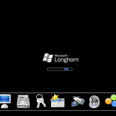
I know - this disgusts me as well :) Unfortunately, I do not think I can change this, as I have modifed the standard "Redmond" splash to create this. However, I will keep trying to change this.
Great, simply. Keep on this masterpiece (the whole set I mean). Just a little thing: on my 1400x1050 screen, the "KDE" with the wheel and the "3.2" are too aliased. Could you create a 1600x1200 version?
you call these things crap?! omg flat is a masterpiece
Thanks, you are too kind :) I only created this to improve on my poor previous attempt at creating a splash - though this one didn't really turn out as planned...