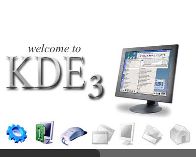
When you buy something with "Microsoft" on it, you help Windows, Office, Outlook, Internet Explorer and so many other things from it.
If X-Box is cool you will buy it instead of GameCube or PLaystation2 ?
I think there is so much better hardware to use than Microsoft's.
Even if I liked this splash screen, I would not use it cause of the mouse pic.
When someone, who is not realy good in computer, come to your home, he will see the mouse. When he will meet friends, he will say "Microsoft is good" and people will by some XP or some 2000...
It's hard for me to explain but I realy think we have to boycott it and to leave no chance ! Cause even if in the one who don't like Microsoft we use things from it we let no chance to alternatives...
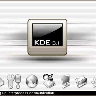
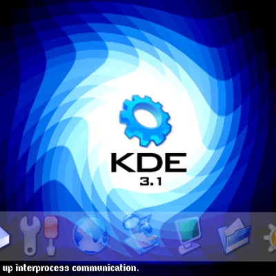
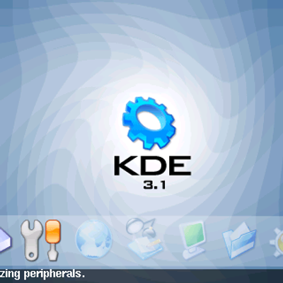
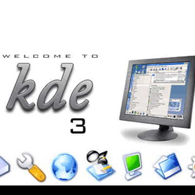
Lovely splash. But one hitch. The K at the right doesn't go too well with thte othr icons. Make it more photographic. Take the slick K for example. Otherwise it's gorgeou and very professional looking, elegant, smooth . I can go on and on...


Ratings & Comments
19 Comments
ok, you are all right, i uploaded the old ksplashwhite and the new ksplashwhite as ksplashwhite2.
I also think that the old icons went better with the overall style. Maybe you really should upload the (very) old version and your latest version.
The previous text was IMHO nicer. I'm glad that I downloaded the old version before this update.
thanx for the advice, many people say the same, i change again to old text style.
Maybe you can include the new splash top as an alternative in future releases? (Read: I liked the new variant :-)
That is nice:) Realy good work:)
How do I install this?
This looks great! Especially because the monitor on the pic looks exactly like the one I use... (too bad the ones below are white ;-)
thanxx
You dare using a Microsoft mouse on a Splashscreen in Linux! ;-)
In fact my mouse is microsoft. I don't see any problem with using a microsoft mouse pic in a kde splash.
got a m$ mouse as well and I think there#s no problem with that. Their software obviously is useless but their hardware is really nice :)
Hey fellows! I was just kidding, don't ya know the ;-) sign? No really, the splashscreen is really nice! BTW: I also use a M$ mouse...
When you buy something with "Microsoft" on it, you help Windows, Office, Outlook, Internet Explorer and so many other things from it. If X-Box is cool you will buy it instead of GameCube or PLaystation2 ? I think there is so much better hardware to use than Microsoft's. Even if I liked this splash screen, I would not use it cause of the mouse pic. When someone, who is not realy good in computer, come to your home, he will see the mouse. When he will meet friends, he will say "Microsoft is good" and people will by some XP or some 2000... It's hard for me to explain but I realy think we have to boycott it and to leave no chance ! Cause even if in the one who don't like Microsoft we use things from it we let no chance to alternatives...
The nicest splash to date, imho. Big thanks.
It's absolutely awesome! :o)
Lovely splash. But one hitch. The K at the right doesn't go too well with thte othr icons. Make it more photographic. Take the slick K for example. Otherwise it's gorgeou and very professional looking, elegant, smooth . I can go on and on...
The contrast on tux is too sharp in comparison to other icons. Make him a bit softer to look at if u know what i mean.
What Tux? There is no Tux anywhere in this post....are you insane?